While the works on show in the 2012 Fleisher Art Memorial Wind Challenge 2 exhibition are both complex and stimulating, you’ll need to work a bit with them to get there. The three Philadelphia artists with work in this show, Tim Portlock, Bill Gerhard, and Micah Danges, all create visual works that place the artist in a non-traditional relationship with the work and use experimental means to create these pieces. Though rousing on an intellectual level, this exhibition will not necessarily attract any newcomers to the art world. It does, however, show the level of artistic experimentation that is alive and well in Philly and that the Fleisher Art Memorial is continuing to single out with their Wind Challenge Series.
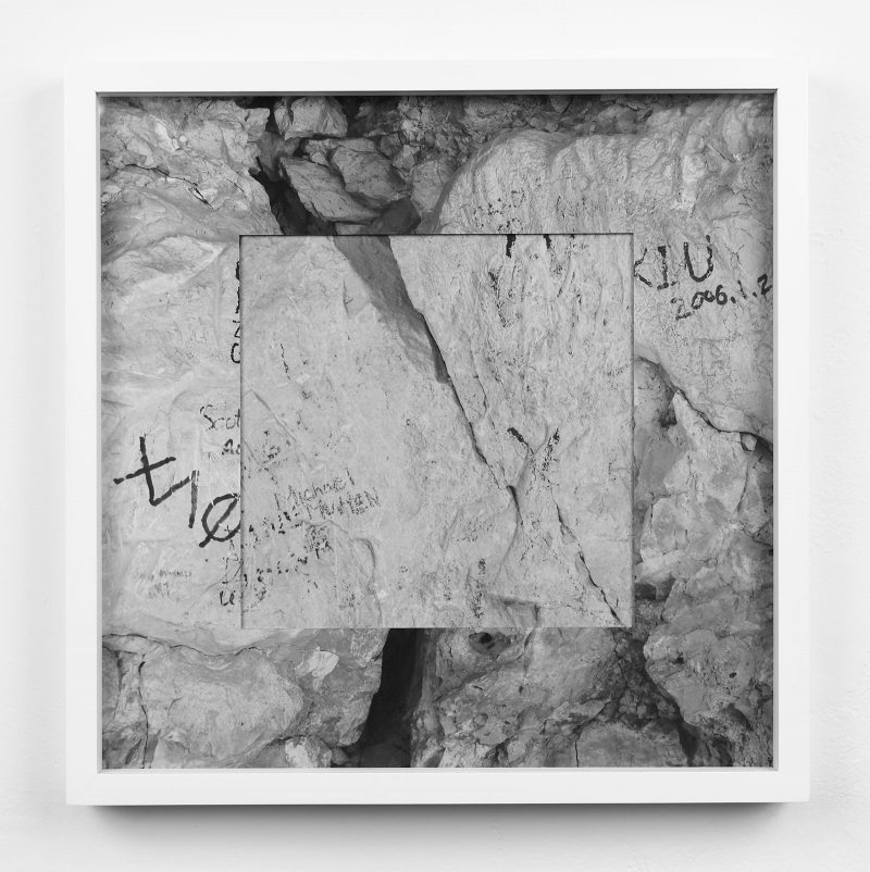
Micah Danges has experimented with partially blocked or obscured photographs in the past. In this show, Wall Writing (Grand Canyon) incorporates such an abstraction more naturalistically than anything else in his portfolio (viewable online). The eye bounces back and forth between outer and inner images of rock with illegible handwritten messages. Both components are equally opaque, and like an illusion of a standard matted image with more of the same at its center, the eye is tricked into a puzzling search for a point of access to the image.
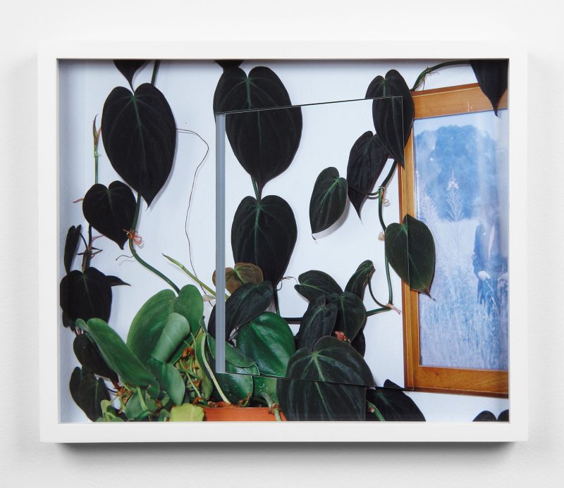
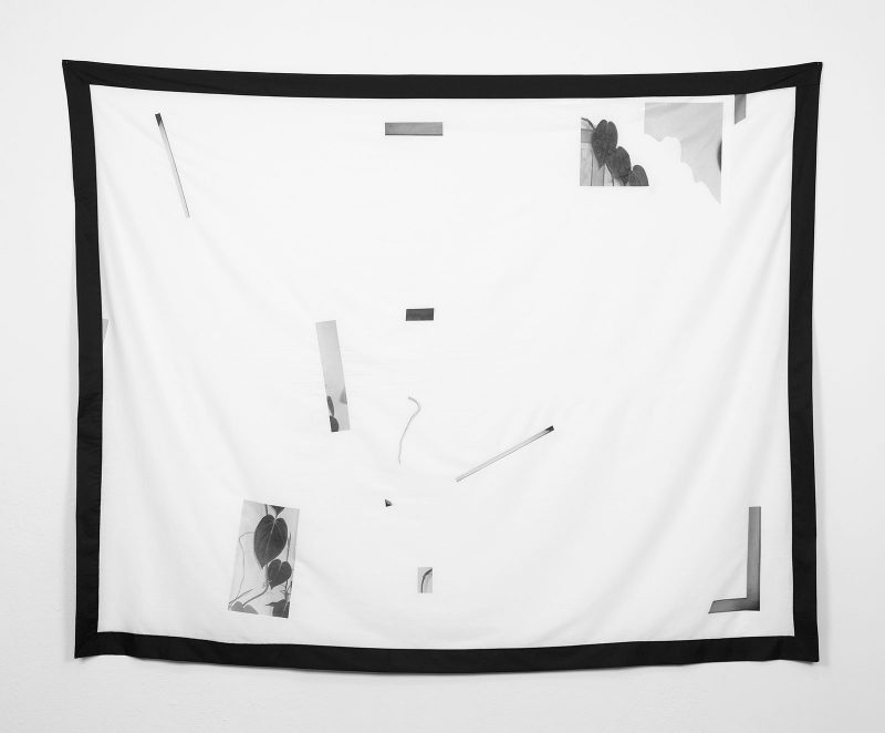
Trained in photography at Kutztown University (BFA), Danges now works with sculpture and mixed media pieces and says in his artist’s statement that his interests have shifted to “the details surrounding the focal point of a photograph, not the subject itself.” Bathroom Scene places peripheral, framing images of vines as the central subject in a layered collage. The composition again misdirects the eye, luring the viewer rightward into an unreal reflection or image of a field where he searches for a familiar bathroom mirror.
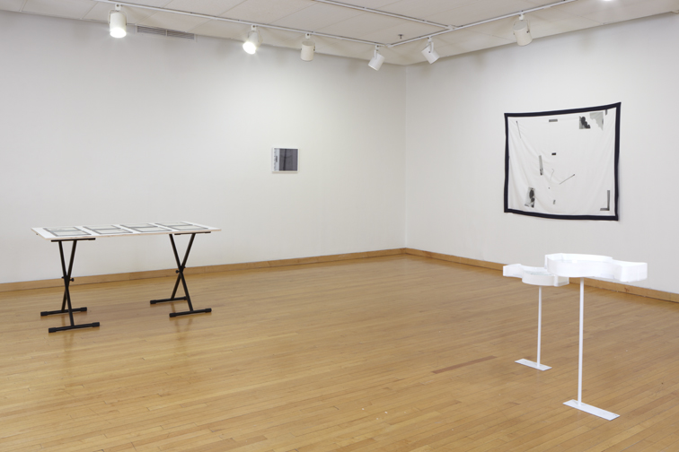
Intriguing as physical representations of photographic images, the Bouquet pieces float between the artificial and the real. These sculptures present a surface that is almost flattened like a photograph, with artificial cut-out images of flowers floating in a shallow plastic basin of water. The real water in these pieces is markedly more alive than any photograph could ever be. However, other experiments by Danges that strip away “subject” and play with our attention in the show are not as successful, like Untitled (Soft Version), which strips so much away that virtually nothing remains.
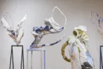
Tim Portlock’s works resemble pieces from 19th-century American landscape painting, but are made as three-dimensional digital environments programmed by Portlock in his computer using video-game design software.

Based on images of foreclosed, empty buildings in Las Vegas, Portlock’s landscapes on display have radiant, painterly skies and evocative cloud formations. While the level of detail is high in these pieces, they still fall far short of the visual standards of recent mass-market video games reviewed in The New York Times’ Art section. Thus, these works lack something and have not yet reached the level of either the paintings or the video games they rely on as guideposts.
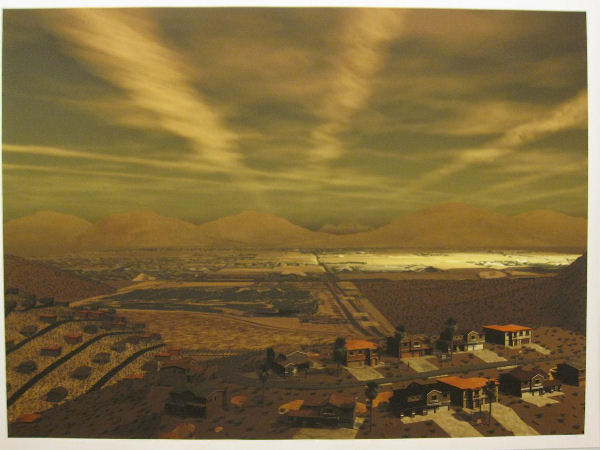
The artist is intentionally reimagining the visual tradition of American landscapes as symbolically evocative, but choosing to do so with barren urban terrain. Earlier works (viewable online) in a similar vein re-imagine West Philadelphia as a blighted wasteland. But this attempt at a social conversation seems pretty heavy-handed, given that real-life levels of blight in Philadelphia are already some of the worst in the country. Wouldn’t realistic images of local urban decay make a truer and thus more effective statement about the failings of our current government and economic systems?
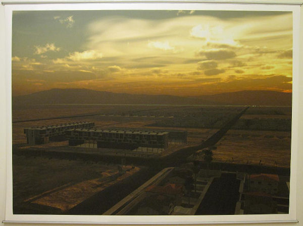
With a leap of imagination, the viewer can almost enter Portlock’s three-dimensional environments and imagine the artist working here and there like a digital sculptor and landscaper. But without that effort of placing yourself in the picture, the viewer only has the final, static view of these printed-out worlds, and these views feel like less than the sum of their parts.
Portlock’s works reflect a world-view in which art can no longer achieve the sublime, and his chosen medium does not follow the expectations of traditionally aesthetic or sublime beauty.
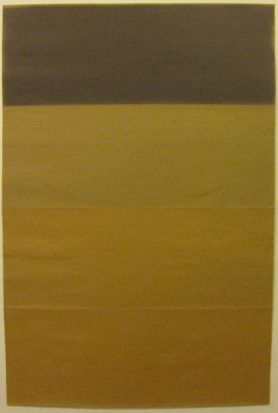
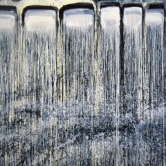
Bill Gerhard’s offerings in the show are further explorations in a medium he has worked in since 2003, creating compositions with sun-burnt paper. These works are made by being left outside and exposed to natural light. Virtually erasing himself from the work, the artist does not color or shade his own pieces, but organizes his materials to capture an organic process.
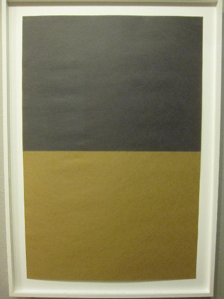
The exposure over time of paper to sunlight creates varying hues on paper, including a delicate blue-black (see above) where the natural grains in the paper are strongly emphasized. The straight, strong lines between different periods of sun exposure feel like artificial demarcations of time – such as months and days. But in work this delicate, every detail matters. Carefully preserved folds in the papers unify the material of some compositions to extravagant effect. In those made of multiple slips of paper placed together, the contrast between sheets feels jarring and confusing.
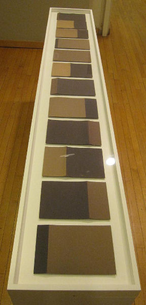
In the series 01.11, 02.11, 03.11, 04.11, 05.11, 6.11, 07.11, 08.11, 09.11, 10.11, 11.11, 12.11 twelve pieces form a calendar year of exposures, made on the 11th of each month in 2011. But the year does not form any pattern for the eye to follow, or yield any illuminations about the nature of time or sunlight. At this point, the work goes against the grain of experience – there is a perceivable pattern of sunlight and darkness that we mentally associate with the passage of a year, but each piece here seems disconnected from its neighbor.
The chance implicit in the creation of these pieces shares a common element with the game-playing of a John Cage composition. Gerhard alternated his folding and exposure patterns within the one-year series, perhaps showing that no matter what commonalities they share, no month is ever exactly the same as its neighbor.
While delving into new artistic fields is always admirable, it’s still necessary to interrogate the motives and message of any piece of visual art. The Fleisher Wind Challenge 2 exhibition has elevated three noteworthy innovators of the local art world, but these works may not yield more than superficial visual stimulation for many viewers.
Fleisher Wind Challenge 2 will be up at Fleisher Art Memorial until February 13, 2013.
–Sam Newhouse has written articles since 2012 for theartblog.org under the pen name ‘Ben Meyer,’ and in 2013 and beyond will be writing under his own name.


