When an illustration show opens in Delaware, chances are that it is somehow related to Howard Pyle, arguably one of Wilmington’s most famous artists. In 1882, Vincent van Gogh wrote that Pyle’s sketches in Harper’s Monthly struck him “dumb with admiration.” In the 21st century, Pyle’s reputation remains intact: he is still widely known as “the father of American illustration.”
The Delaware Art Museum’s exhibition, State of the Art: Illustration 100 Years After Howard Pyle attempts to examine Pyle’s legacy through a cross-section of illustration from the past century. Intended to augment the museum’s usual audience of longtime Pyle enthusiasts, the show widens the scope of traditional illustration to include MAD magazine caricatures, popular Pixar animations, and large-scale paintings.
David Apatoff, guest curator of State of the Art, believes that contemporary illustrators are long overdue time in the museum spotlight. Author of the popular blog Illustration Art and an intellectual property lawyer by day, Apatoff purports to measure illustration “by the very same yard stick as what is called ‘fine art.’” Commercial art is often stigmatized when it is first released, asserts Apatoff, but this condescension dissipates over time; after all, works by N.C. Wyeth, Norman Rockwell and Howard Pyle now grace the walls of the Metropolitan Museum of Art. [Ed note: The Philadelphia Museum of Art just debuted a new acquisition of an N. C. Wyeth illustration, The Trial of the Bow, the first to enter its collection. More here.]
Historically, American illustration’s main venues were magazines like Collier’s and the Saturday Evening Post. When these began to lose subscribers, photography became the more popular tool for editorials and advertisements. As time progressed, oil on canvas paintings transformed into computer graphics and moving and talking animations. State of the Art seeks to locate “Howard Pyle’s DNA” in this type of illustration and to give the public exposure to, in Apatoff’s opinion, “the very best illustrators of today.”
The exhibition highlights eight illustrators working in diverse aspects of the discipline. Organized loosely by category, the works are grouped as follows: advertising, conceptual design, sequential art (comic strips), painting, editorial, character design, and animation.
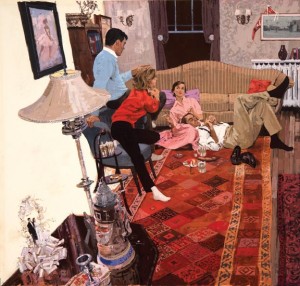
The first artist presented is Bernie Fuchs, who originally illustrated car advertisements in Detroit. Fuchs then shifted from a photorealistic style to more expressionistic work, tackling timely social concerns. Apatoff sees Fuchs as a clear descendant of Pyle: “He was very good at taking what would be a traditional Howard Pyle scene and kind of tilting the landscape and skewing the perspective and goosing up the colors, turning it into something that a photographer could not do, which is why he was so popular.”
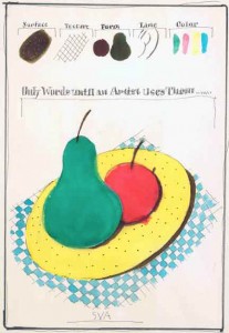
Also active during the 1960s, Milton Glaser was less interested in imitating reality than in creating conceptual art. His poster for the School of Visual Arts explores artistic representation and human perception. As photography took on the role of representing ‘the real,’ illustration was evicted from the representational and forced (or freed) to engage on a more abstract level. Apatoff holds that Pyle would not have had the audacity or the audience to create this new type of work. The curator understands the art of the show’s six remaining illustrators as operating along the spectrum created by Bernie Fuchs (representational), on the one end, and Milton Glaser (conceptual), on the other.
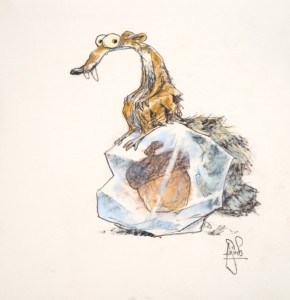
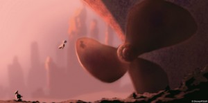
Peter de Sève produced an oeuvre embracing both Pyle-esque detailed renderings for the New Yorker, as well as work for modern animated features. Among his most well known accomplishments are the characters of Uncle Fungus and Scrat in the animated feature, Ice Age. “Pyle was all about storytelling. He wrote and drew. I think he’d appreciate [Ice Age],” states Apatoff. Ralph Eggleston also works with animation, mapping out the scenes in Finding Nemo and WALL-E. Less refined than de Sève’s drawings, Eggleston’s are rough preliminary sketches. He is the “grand strategist,” weighing considerations that Pyle never had to contemplate, including translating pencil drawings into computer designs.

Sterling Hundley combines the narrative tradition of Howard Pyle with Milton Glaser’s conceptual bent. His illustration of William Henry Harrison utilizes clever compositional elements to depict the President both standing at a lectern and, if seen sideways, in a casket.
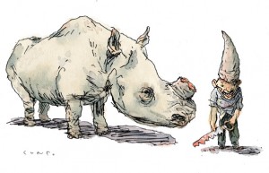
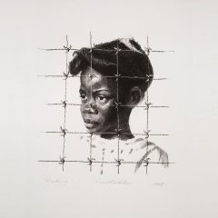
John Cuneo’s pen-and-ink drawings are rife with political commentary, a result of this century’s increased editorial freedom. Poacher, a portrayal of a man wearing the bloody horn of a rhinoceros, provokes a visceral reaction.
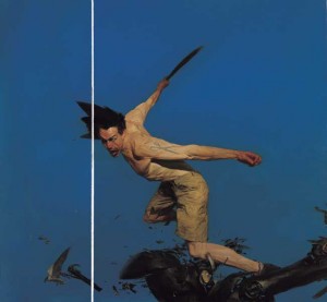
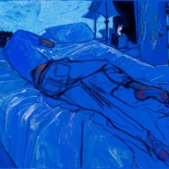
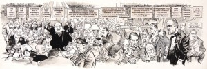
Phil Hale’s psychologically complex work has appeared on the covers of Joseph Conrad and Stephen King novels. His paintings are action-oriented and examine the existential struggle between humans and machines. Hale straddles the worlds of fine art and illustration, refusing to identify with either label. Apatoff identifies Mort Drucker, the final illustrator in the exhibition, as a fine artist as well. He likens the MAD magazine illustrator to Honoré Daumier, whose 19th century satirical caricatures are now widely praised.
Overall State of the Art presents a strong, visually striking array of well-executed illustrations and paintings. The show was clearly well funded and carefully put together. Given that Delaware is such a small state, and that this exhibit takes on such a grand enterprise, it will likely receive much local attention. Visitors should view it in order to form their own opinions regarding whether these artists best represent the state of illustration today and why.
State of the Art also raises an interesting question, which it leaves largely unanswered: Can illustration be considered comparable to ‘fine art’? In his rhetoric surrounding the exhibition, Apatoff makes a point of arguing that illustration is “just as good as ‘fine art.’” When posed the question of how the two are related, however, the curator remained neutral, stating, “They overlap a lot. You can subcategorize contemporary fine art into lots of different subsets. These works are of enduring value. I don’t think that the category of art is a disqualifier. The quality of the individual image is what matters.”
State of the Art: Illustration 100 Years After Howard Pyle, to June 1, 2013. Delaware Art Museum, 2301 Kentmere Pkwy, Wilmington, DE. All images are courtesy of the Delaware Art Museum.
–Maeve Coudrelle holds a BA in Art History and Political Science from the University of California, Santa Barbara, Highest Honors. She has curated for the New Wilmington Art Association and the UCSB Art, Design, and Architecture Museum, and assisted with exhibits at the Delaware Center for the Contemporary Arts and the Delaware Art Museum.


