(Maegan’s review talks about Allyson Strafella’s two bodies of work at Gallery Joe and finds them both evocative of visual note-taking and the private language of journaling.–the Artblog editors)
Allyson Strafella’s studyline at Gallery Joe features a collection of drawings of the traditional sort and those of a less traditional method. Strafella’s trademark is her typed drawings, typically composed of numerous punctuation marks typed together in such a way as to create an image. Aesthetically, I responded to the works’ abstraction and texture. As a writer, I felt connected to her work on a deeper level; it is familiar, like a well-filled and loved journal.
Typing a different kind of story
In “suspension,” the paper is so saturated with ink that the typed marks take on a velvety appearance. In “azimuth,” the marks are more loosely spaced, giving the typed portions of the work a linear feel. At the gallery, it was explained that when “custom marks” appear in the description for Strafella’s works, those pieces were produced using her custom-made typewriter that has an expanded carriage and specially designed keys. When “typed marks” appears, this typically denotes that regular punctuation (Strafella’s preferred mark is the colon) was used to create the piece.
Although her favored tool is the typewriter, Strafella does not use letters; these typed marks are closer to punctuation or symbols. I found this an interesting choice—writers create symbolism with their words, while Strafella uses symbols in place of words. This literal interpretation keeps the same feeling of written symbolism: thoughtfully concealed meanings waiting and wanting to be revealed.
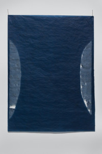
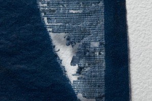
In “contraction,” the carbon paper she typed on is eaten away by the force of Strafella’s mark-making. The piece has ephemeral and delicate qualities; visually, it seems to reference a strange and otherworldly nighttime landscape with a definitively poetic feel, mysterious and moody. In “cut and link” (not pictured), Strafella plays with negative and positive space. The two images play well together, each seeming to reflect the other.
Sketches made by hand with references to the body
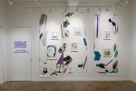
Viewing Strafella’s large installation, “sketch,” in the Vault gallery, I noticed many contrasts in the 95 individual drawings pinned lightly to the walls. The first difference, an obvious one, is that the images are drawn not typed. In “sketch,” each drawing is composed of hand-drawn marks that seem no less thoroughly intentional than her typed marks in the Front gallery. These drawings could easily be called studies for her typed pieces, but they seem too measured and deliberate for that. Even Strafella’s fingerprints have a purpose; they carry the lines and colors from one drawing to the next.
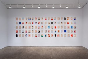
I also noticed contrasts of absence and presence, distance and closeness, stillness and movement. I enjoyed Strafella’s use of plain-looking, beige paper as the backdrop for these colorful pieces. While her typed works denote landscape, the beige paper and sinuous, drawn forms reference the corporeal. Each drawing seems to flow to the next, and reminds you of stream of consciousness writing. Though these drawings are unlike her usual typed pieces, they too seem to be a continuation of that method.

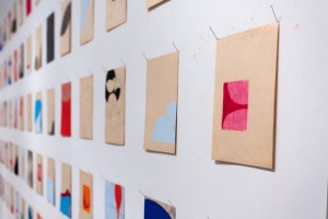
In fact, Strafella’s process of composition recalls the practice of journaling. Each piece, composed of thousands of repetitive strokes, feels like a meditation. Strafella is creating her own language, without all of the rules and hindrances that come along with traditional composition. Her works seem to be more about feeling than explaining, each a mindful contemplation of its own.
studyline will be up until November 16 at Gallery Joe, 302 Arch St, Philadelphia. All images courtesy Gallery Joe.


