[Evan reviews an off-the-wall show that strays a bit too far in pursuit of perfection, and concludes that the paintings’ real success lie in their minor details. — the artblog editors]
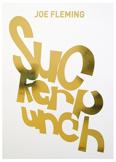
Suckerpunch is Toronto artist Joe Fleming’s first solo New York exhibition, taking place at Mike Weiss Gallery in Chelsea. Here, Fleming displays a series of paintings with a strong sculptural bent, using recycled materials, graphic geometric shapes, and gestural line and brush work. He’s clearly influenced by Pop Art and cultural iconography, and his geometrical forms are evocative and self-referential.
Works fuse with the wall
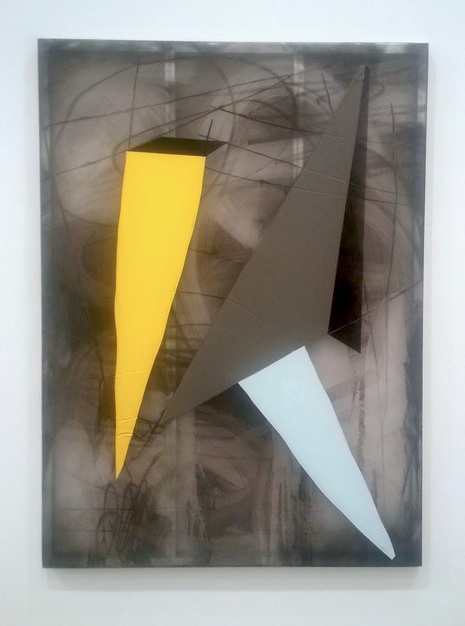
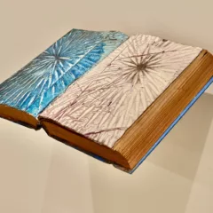
Fleming’s paintings are extremely textured. By using a semi-transparent substrate, Fleming allows the eye to stray from painting to wall and then back out, both confusing and alluring the eye. This is especially interesting when parts of the painting’s backing show through–the metal of the frame becoming part of the surface.
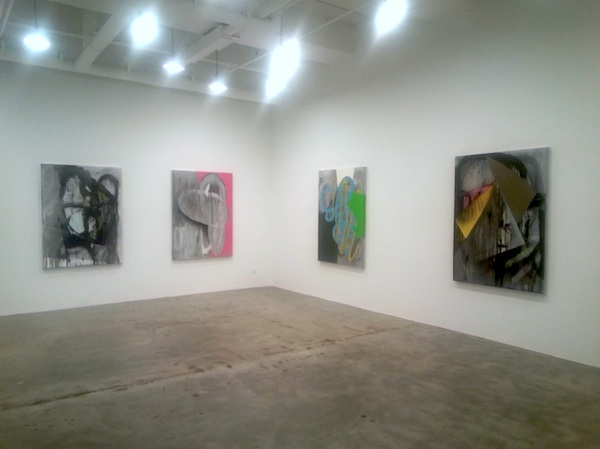
At a distance, the paintings feel like they could be sections of vandalized walls, sawn out of their original environment and hung on the gallery walls. As the viewer approaches, the depth and transparency of the works becomes apparent. Fleming has worked these paintings heavily–they recede as much as they come out. There are deep gashes in the panels alongside Fleming’s brushwork, a contrast that increases the subtle three-dimensionality of the paintings.
Delight in the details
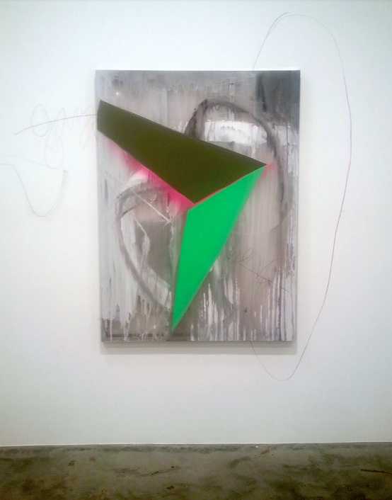
The dichotomy of graphic, solid colors and viscerally wrought backgrounds separates these two elements completely on the wall. There is little interaction, and occasionally the combination feels stale and cold, even indulgent. When it is successful, it is because the implied imagery of the shapes actually engages its background without the two physically mixing.
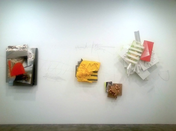
The drawn pencil lines that escape from the works and onto the gallery wall are vein-like connectors between some works. They seem at first to be hastily drawn plans or measurements, or perhaps sketches for a piece of graffiti. I was drawn to this element of the work because of how intentionally it forces the receiving wall to interact with the piece. The unfinished quality of these lines felt like a welcome breath of fresh air when compared to some overworked pieces.
Some of Fleming’s works are unrestrained by their edges or their hanging, floating uncomfortably as if caught in time. These pieces exude gritty materiality and reference signage and markings on the street–they do not seem as hyper-finished. The majority of the paintings are all the same scale, and organized very neatly through the space; this approach is not nearly as successful as Fleming’s less-controlled pieces. Rather than their internal disorder being forced into an external order, they are left unrestrained to inform and converse with the other works.
Suckerpunch does not feel particularly groundbreaking on a larger scale. These shapes and textures have been explored before (a la Cy Twombly), and the graphic nature of these pieces is familiar. What distinguishes this work from the rest, and offers the most promising future, is not the macro but the micro. I hope to see more from Joe Fleming–especially if he refines his hanging and finishing, and focuses more on the details.
Suckerpunch, a solo show by Joe Fleming, is on view now until June 14 at Mike Weiss Gallery in New York.
Evan Paul Laudenslager is an artist and writer currently based in Philadelphia, and is a recent graduate of Tyler School of Art.


