[Andrea continues her gift recommendations for art lovers. — the Artblog editors]
Inside Nick Cave’s “Soundsuits”
Nick Cave: Epitome (Prestel: Munich, London, New York), ISBN 978-3791349169, $65
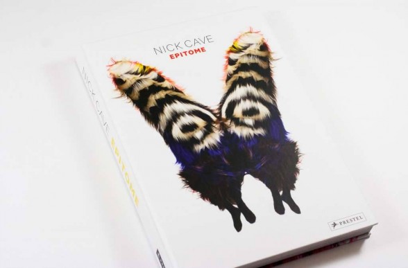
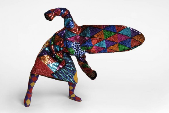
Nick Cave’s performative sculptures, which he calls “Soundsuits,” disguise their wearers and transform them into extravagant creatures of the artist’s imagination. The fact that many of them maintain evidence of the homey materials that Cave employs–including twigs, baskets, crocheted potholders, woven straw handbags, stuffed toys, and small ceramic figurines, as well as pipe cleaners, buttons, sequins, and beads–only makes his creations more magical, emphasizing Cave’s ability to discern the extravagant and theatrical potential of the most mundane materials.

The broad appeal of Cave’s art resulted in the catalog to his large exhibition, organized by the Yerba Buena Center for the Arts in 2010, quickly selling out. This stunning and beautifully-illustrated monograph is an ideal vehicle to make Cave’s work available to further audiences. It illustrates the Soundsuits with numerous, full-page details that enable an appreciation of their individual components and the immense handwork behind their heavily-encrusted forms. It shows them in gallery installations and in action, worn by live models and at various performances at schools and museums, in dance performances, as part of a parade in Lille, and at an event sponsored by Creative Time in Grand Central Station. The book primarily consists of full-page illustrations, and the richness and dynamism of Cave’s extraordinary work is successfully captured by Bob Faust’s design and James Prinz’s photography.
Who’s wearing it? That’s the point
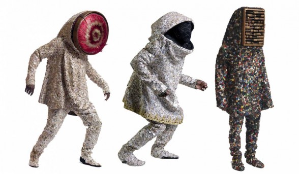
Nato Thompson, who worked with the artist on the Grand Central Station project, discusses the origins of Cave’s art in his reaction to the Rodney King beating in 1991 and the ongoing threat of racism. The Soundsuits obscure their wearers’ race, age, and gender, an act of disguise that Thompson situates within the traditions of public carnivals, Dada performance, community response to urban violence, the manipulation of costumes in contemporary art, and political demonstrations, such as gay pride parades.
Elvira Vyangani Ose emphasizes the political implications of Cave’s work in addressing marginalized communities and empowering them to imagine and construct their own urban, social spaces. She talks about a project the artist is planning in Detroit that will involve other artists and the general community in using art to advance their social agency.

A discussion between Andrew Bolton and the artist covers Cave’s inspiration, process, the relationship between the Soundsuits and their wearers, and Cave’s sense of responsibility as both artist and teacher. The volume illustrates more recent work in formats other than Soundsuits, including both three-dimensional, wall-hung pieces and sculpture, which incorporates racist objects such as signs, toys, and figurines. The book includes a chronology and selected bibliography.
An anthology of “game-changing” design
Lisa S. Roberts, designPOP (Rizzoli: New York), ISBN978-0-8478-4383-1, $35

The shiny, padded, pink cover of this book is so appealing that all it needs is a ribbon to turn it into an attractive gift. Lisa Roberts presents a group of products that she considers game-changing, selected from the “explosion of innovation of the 21st century.” The book will certainly interest anyone who cares about up-to-date ideas and products and wants to know what’s out there–some objects for the mass market, others in highly limited production for those who can afford them.
Roberts is particularly good about explaining how each of her selections meets her criteria–something curators of design collections rarely do–even if readers may quibble with her choices or with the criteria themselves. Lisa Ben Costigan’s book design conveys an enthusiasm for Robert’s choices with clarity and punch.

Roberts selected examples based upon a number of categories: innovative use of materials, some of which are new, others turned to unconventional uses; innovative manufacturing processes or adaptation of processes from a different sector; functional design for technology; radically new forms for conventional objects; designs that introduce the variability of the handmade into machine-manufactured goods; objects that blur the boundaries among art, craft, and design; objects designed to contribute to ecological sustainability; and objects designed to contribute to the public good, such as tools for health, safety, and education.
Design that improves lives

Designers and the design community always seem more intrigued by the unexpected or joke-y than I am; hence the inclusion of the “Looksoflat” lamp by Stefan Geisbauer that at first glance resembles an architect’s adjustable lamp, but turns out to be an LED light source set into a flat, articulated, aluminum cutout shaped like the earlier lamp.
Roberts also includes objects with novel styling, but that I would hardly elevate to the level of game-changing design, such as John Brauer’s “Bin Bin,” a plastic wastepaper basket formed to resemble crumpled paper. Nonetheless, her choices are well within the criteria used by design writers, and Roberts’ appealingly conversational writing makes the design challenge behind each object explicit.

I’m much more impressed by those designs that meet obvious, pre-existing needs, even when their solutions do not involve particularly sophisticated materials or techniques. Deborah Adler’s experience with a grandmother who accidentally took her husband’s medication led to a design, now employed nationally by Target, that overhauled both the bottles and labeling of prescription pharmaceuticals for maximum legibility. That is a game-changer.
Yves Behar designed a modular system that enabled Mexican schoolchildren to have fashionable, custom color-combination eyeglasses at modest prices. And each of Karem Rashid’s re-fillable, filtering water bottles could preclude the need for 299 further bottles to be manufactured, disposed of, and recycled.

A punchy primer on art appreciation
Ad Reinhardt, How to Look: Art Comics (Hatje Cantz Verlag/ David Zwirner: Ostfildern), ISBN 978-3-7757-3768-5, $40
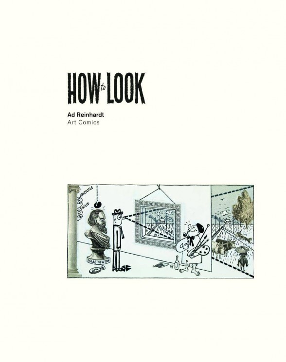
Of all American 20th-century artists who did newspaper illustrations as a day job, perhaps the least likely was Ad Reinhardt. Yet, as Robert Storr discusses in his welcome essay and introduction to How to Look: Art Comics, the comics Reinhardt drew between 1940-48 for the liberal/leftist daily newspaper, P.M., and for several art publications, were more than his bread and butter. They were “a full-fledged but at the same time separate dimension to his larger aesthetic enterprise.” Reinhardt was famously forthright about his view of the art world of his day, and his art comics were one form of his polemic against pretentiousness, middlebrow taste, art cant, and artists seduced by the market. All of this, of course, makes much of his comic work enduringly current.
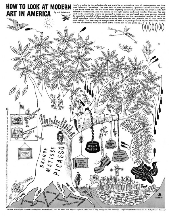
Storr is himself a painter–and art school dean, critic, and curator–who is known to reject the false pieties of the day. He situates Reinhardt’s comics within the satiric tradition of William Hogarth and the collage technique of Max Ernst, and pays useful attention to the serious art historical knowledge behind Reinhardt’s mash-up of medieval book illustrations, Japanese woodblock prints, British satirical prints, and the pedagogic tree chart produced by Alfred Barr in establishing his genealogy of Modernism in “Cubism and Modern Art”. Readers who share the artist’s breadth of art history will get the most out of this compendium.
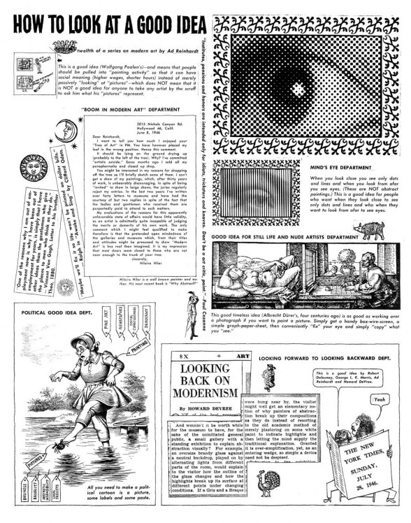
The bulk of Reinhardt’s comics are directed at a less knowledgeable audience, and what distinguishes the series of 25 “How To” comics that he drew for P.M., is the serious pedagogy along with the satire. “How to Look at a Cubist Painting” walks the un-schooled reader, whose objection to Cubism is that it doesn’t “look like something real,” through the 19th-century belief in a fixed viewpoint–illustrated with a viewer in front of a landscape painting that is a literal window in the wall on which it hangs, with the depicted landscape visible behind it–to painting that is current with 20th-century scientific ideas about the relativity of space and time. “How to View High (Abstract) Art” employs the analogy of music as sound we don’t hear in the world around us.
And like George Burns with his line, “Take my wife, please,” Reinhardt used a repeated joke that his readers came to expect: a man standing in front of an abstract painting says “Ha ha, what does this represent?” and the painting returns the challenge, “What do you represent?” For Reinhardt, the subject of what he represented was deadly serious.
The writer, Sinclair Lewis, wrote to Reinhardt, who included the quote in one of his comics: “Let me congratulate you on your P.M. series on modern art, which incredibly manages to be equally informative and amusing. Most advocates of modern art have so unpleasant and high-nosed an attitude toward untutored laymen like myself that they rouse only irritation, but your missionary zeal is so tempered with good nature and humanness that it is a delight.” Reinhardt’s comics will certaily continue to inform and amuse readers, untutored or not.


