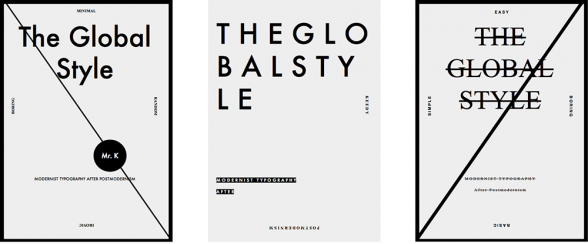
[This month’s Reader Advisor posts are brought to you by our guest editors, the Nicola Midnight St. Claire, or Nicola, as she sometimes likes to be called. Today: Graphic designers, you might just be misconstruing Modernism; what is going on with Hillary’s logo?; and South Korea’s deep-sea diver women in photos. — the Artblog editors]

More on the Graphic Design Front: Hillary’s logo; good, bad, or 9/11 reference?, via the Guardian
More Hillary RE: Designing Woman, via Hyperallergic
Hold Your Breath. Dive In. (Not necessarily Hillary-related), via the Guardian
In Local Design News: This Instagram video makes Fishtown look like the south of France. Where, on the downside, there are majestic thunderstorms and, on the bright side, there are, like, tons of spots to spend your money. The video does acknowledge that Fishtown has “ugly parts,” but talking about those “ugly parts” makes me feel icky, and I don’t talk about icky stuffs. Plus all the street art makes the neighborhood seem alive! Extra credit if you can watch the whole thing without dipping into a coma.


