[Self-described cartophile Jennifer visits two map-inspired shows, searching for a new spin on the age-old tradition of mapmaking. — the Artblog editors]
Maps abound in two recent exhibitions in Philadelphia: The Atlas Imagined: A Collaborative Project at the Athenaeum, which ran through June 6, and Paula Scher and Keith Hartwig: Philadelphia Explained at Temple Contemporary, which runs through July 17. In these exhibitions, maps become objects of group collaboration and charts of dreams, fears, and yearnings.
Immersive and imaginative
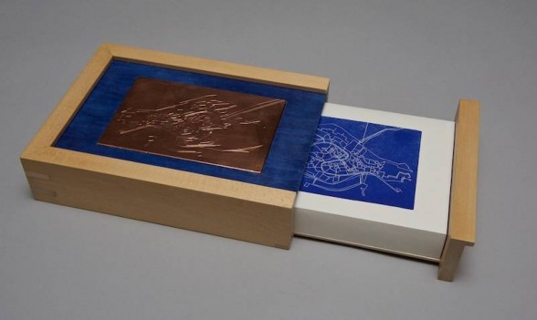
Despite their trustworthy reputations, maps are never totally reliable. Our Internet mapping, satellite technology, and GPS is beneficial, but we often end up recalculating our routes or arriving just short of a destination. Historically, maps recorded names of subscribers or property owners but left extensive areas and diverse people unmapped and nameless.

Maps also evoke and represent desire, future projections, imaginative wonderings. In past centuries, armchair travelers may have moved a finger over the surface a map in order to follow and fantasize about a route. Philadelphia Explained at Temple Contemporary, however, dramatically demands a fully embodied exploration. Here, an able-bodied person can walk a route–the Delaware River, for instance–from one end of the gallery to the other. It’s like we are the little yellow figure in Google Earth, but without the “street level” view. Philadelphia Explained has a 3D, encompassing quality and the installation demands that we look all around, turn in space, invent a personal choreography of looking. The map here stretches across the gallery floor and up the walls; all the parts are unified and connected by the main arteries of rivers or roads painted in ultramarine blue, yellow, or red. We are surrounded by the city.
But it’s not the city exactly. This is an interpretation of a map of Philadelphia based on an original painting by Paula Scher. An internationally famous graphic designer, Scher is also known for her map paintings. In the case of this map, Scher’s original was interpreted by Keith Hartwig, a 2011 graduate of the B.Arch architecture program at Tyler School of Art, who worked with Scher in the Distinguished Alumni Mentoring Program. Hartwig digitized the map and prepared it to be sectioned and shared with over 100 Tyler students who were tasked with painting in details and landmarks.
Imbued with personal stories
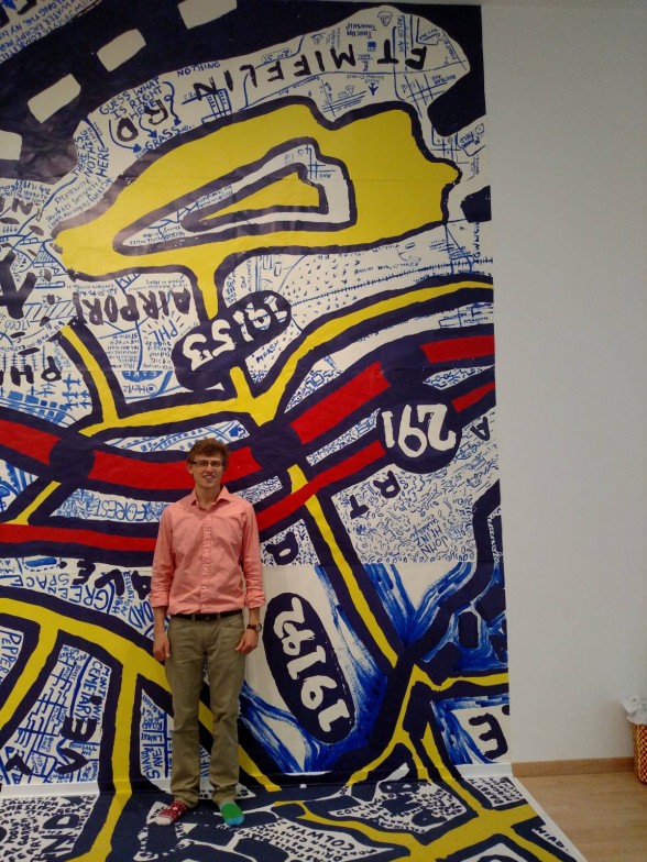
Tyler student Andrew Mazer described this process to me: students were given numbered map segments and charged with familiarizing themselves with their area by visiting, using Google, or pursuing other ways of learning. They used Ultramarine Studio Series paint and a brush of a certain width to fill in the details of their segments–street names, parks, and landmarks. The instruction sheet, available in the gallery, notes, “You are allowed to make mistakes, and all data and relevant information about the areas are encouraged.” Mazer was given a section located near the Philadelphia International Airport. Many repeating, three-leaved shapes signify the marshy land he found there.
Other students included delightful details and information that is so often ignored in documents like maps. One panel shows an area just off Route 309 where “Donna lost a tooth at age 8.” Another region is noted for having “So many stores,” and “Lots of random shit.” Still other portions say in plain language what is more generally coded in demographic maps: “Rich people live here.” The student collaborators bring lived experiences into this expressive map, which becomes an immersive and ambitious story of this city.
In contrast to the full-body, enveloping experience at Temple Contemporary, the 39 maps at The Athenaeum of Philadelphia are smaller and activate the imagination and emotions. The Atlas Imagined exhibition is a result of a collaborative project among 39 members of the Delaware Valley Chapter of the Guild of Book Workers. Each artist made a single map and copied it, either by hand or digitally, 39 times. After a swap, the artists each had 39 unique maps to bind into a book or box. All of the original maps and the resulting books are on display in the special exhibition gallery at The Athenaeum. These books are atlases that chart the imaginations, anxieties, bodies, dreams, fears, lunches, and lost things of all participating artists who were tasked simply with making a map of a place real or imagined.
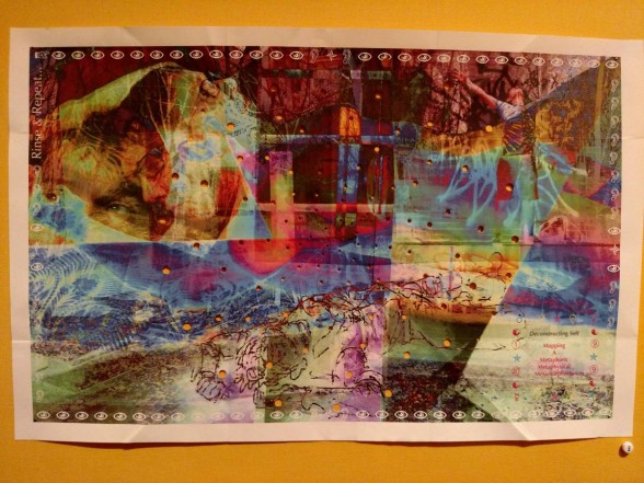
Some of the individual maps are clearly self-portraits. Elena Bouvier layered four self-portraits in Photoshop to “express the emotional nausea” of a month of her life in which she was dealing with a family health crisis centered on “Mom and cancer.” Her multilayered, colorful map is a swirl of imagery and symbols. This subjective mapmaking underscores how maps and the self are always tied together both in terms of the making and also how we look at and interact with maps. At Temple Contemporary, the first places I tried to find on the Philadelphia map were where I grew up and where I live now. I found that in Scher’s conception of the city, my childhood zip code of 19126 appears twice. At the Athenaeum, it’s equally possible to connect the self and one’s history and location to the maps on view, despite their stemming from invented and subjective data. Bouvier’s emotional nausea is familiar terrain, and I am sure many others have navigated the rough new topography that materializes when the words “mom and cancer” collide.
Creative ways to contain huge spaces
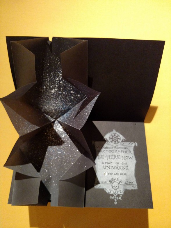
Just as Tyler students adhered to a style guide for their participation in Philadelphia Explained, the artists in The Atlas Imagined were charged with making maps to a certain size, and including a cartouche, title, and their names. Within the small size restrictions, many artists present infinite ideas. For example, a map by Sabrena Johnson represents the entire universe. The zig-zag folded black paper she fashioned is like a page from a pop-up book. It expands outwards, as the universe does, to reveal white and blue dots representing limitless galaxies and celestial bodies.
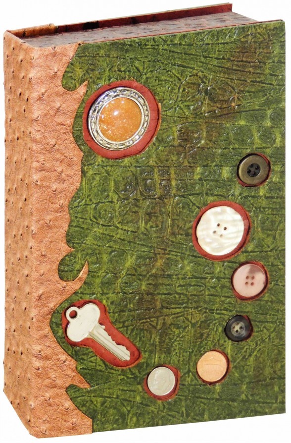
As a cartophile, I found these exhibitions thrilling. The maps allow for various and deeply engaging looking, both physical and emotional. The differences in scale and presentation are also noteworthy: in Philadelphia Explained at Temple Contemporary, we may feel as though we are in a map in the “box” of the gallery; at the Athenaeum, there were 39 small maps in each box or book. (By the way, these boxes and books are examples of exquisite hand-craft.) Above all, these exhibitions show how maps may be physical objects that describe locations in the world, but also conceptual abstractions that illuminate the shadowy landscapes of the self.


