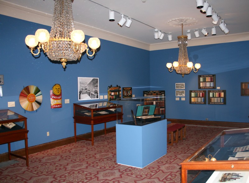
In the classical atmosphere of the mid-19th-century Athenaeum, Color in a Can: Early Marketing of Paint in America connects the past and the present nicely. Designed in an Italianate revival style, the building’s gallery is decorated with glittering chandeliers and vivid blue walls. In this setting, the exhibition links early promotional claims about the universal, protective and aesthetic character of industrial paint with current marketing strategies and today’s ambivalence about consumer culture.
Through a selection of paper brochures, trade catalogs, colored wooden samples, and paper cards, as well as a remarkable hand-operated apparatus, Color in a Can offers rare insights into the beginnings of advertising signs for manufactured, pre-produced paint. Drawn from material collected by the Athenaeum’s former executive director, Roger W. Moss, the exhibition documents the growth and promotion of the paint industry and follows its marketing strategies from the late 19th to the early 20th century. Starting in the middle of the gallery, let’s take a closer look at some objects that help to tell this story.
A Bible for decoration
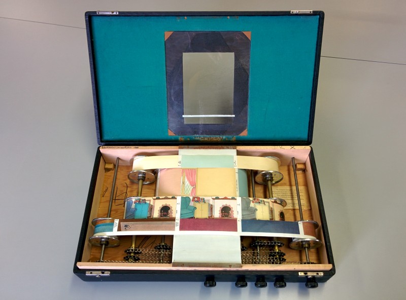
Strategically placed in a vitrine in the center of the room, the “DeVoe Decorative Colorguide” exemplifies the relationship between marketing and consumer behavior in the early 20th century. Arranged in a suitcase-like case, depictions of five different housing interiors (trim, walls, furniture, ceilings, floors) and four rooms (kitchen, bathroom, dining and living rooms) are printed on paper and wrapped around metal rollers. Turning the hand dials on the outside of the case reveals various combinations of matching colors through a viewing window on the case top. This mechanized apparatus was an innovative and practical item for salesmen and customers. Just like flipping through today’s decoration Bible, the IKEA catalog (with its spectacular print run of over two million), this historic color guide educated the public in classic design principles at the same time that it encouraged an early do-it-yourself generation in home decoration. This unique equipment advertises a wide range of colors, presents their diverse uses in domestic settings, and demonstrates the professional-looking results of quick-drying paint. Furthermore, it illustrates aesthetic concepts and promotes design models for middle-class households in the first decades of the last century.
Hues for all
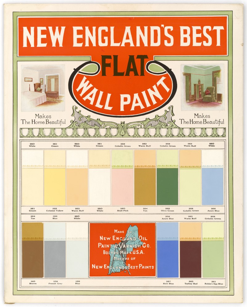
During the Gilded Age boom that followed the Civil War, exterior paint and interior colors became widely available. The nation’s expanding settlements, populations, and industries were crucial in the early developments of industrial paint manufacturing. New train routes, especially in the northeast, carried paint to customers, satisfying their desire for simple ways to enhance their homes. Painting companies such as the Breinig Brothers, the Averill Chemical Paint Company (whose founder patented the first prepared paints in Ohio in 1867), and the Lowe Brothers Company provided the population with convenient and consistent colors previously unimagined. Initially advertised on color boards, and later more practically on portable color cards and in booklets with both color samples and house images, these promotional objects served to illustrate ideal combinations of interior and exterior colors. For example, “New England’s Best Flat Wall Paint,” from the early 20th century, depicts a simplified guide to decorating according to contemporary tastes. The results of these manuals are still visible today in picturesque Victorian villages such as Cape May.
Colored with concern
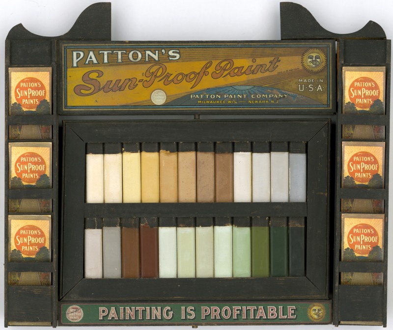
The small plate “Are You Going To Paint,” located in a vitrine on the right-hand side of the gallery, demonstrates another marketing strategy from the beginning of the era of industrial paint production: the idea that manufactured paint was more hygienic and less toxic for customers. In contrast to the slogan from the 1870s, paint associations first agreed in the early 20th century that lead could be poisonous to workers in factories, too. The wooden plate depicts the strategic combination of the company logo, color samples, and two caricatures, one showing an image of a painter in 1776 dangerously brewing his own colors and another showing a painter in 1876 using harmless ready-mixed cans. Besides illustrating health and safety concerns, this humorous comparison hints at the negotiations taking place around labeling guidelines and protective coatings, which started in the late 19th century. Paint’s ability to protect is featured prominently in the marketing campaign centered on the slogan “Save the Surface and You Save it All”. In this sense, “sun-proof” paints not only preserve the exterior lamination of properties but also, figuratively, protect the cozy little household inside.
Founded in 1814 as a library and museum, the Athenaeum of Philadelphia is remarkable for its architecture and decoration. Visitors should be sure not to miss the end of the show, which takes place in the upper library, with its faux marble pilasters, stucco, and light fixtures. Given its exploration of academic issues related to historic preservation, the exhibition feels entirely appropriate for this architectural setting.
At the same time, the exhibition’s exploration of marketing strategies speaks to contemporary consumer culture. The historic objects colorfully announce the kinds of popular designs that, much like today, helped to form consumer identity and satisfied people’s desire to represent their identity visually. In this sense, the exhibition reveals a subtle intrusion of the public sphere into the private space of the home, and raises questions about our relationship to marketing and products today. Although the world depicted in Color in a Can is anchored in the past, it has important ramifications for understanding our current millennial generation, which values individual expression and appreciates handmade crafts and a DIY ethos, but whose market-driven entrepreneurship and merchandising campaigns simultaneously encourage our desire for consumption.
Color in a Can: Early Marketing of Paint in America is on view until April 22, 2016 from Mon – Fri, 9 am – 5pm, and Sat 11 am – 3 pm.
Further reading
Moss, Roger W. (Ed.): Paint in America: The Color of Historic Buildings, National Trust for Historic Preservation, 1994.


