Writing about the Art Commission is an exercise in reflecting on our public spaces. We ask our installations to be site-specific, so it’s important to also know our sites. This month’s site to consider is the Philadelphia Free Library at Parkway Central.
In 2014, the Free Library announced Building Inspiration: 21st Century Libraries Initiative, a $60 million campaign to update their libraries. The plan included the “restoration and modernization of neighborhood libraries across the city” as well as “the renovation and expansion of the Parkway Central Library.” While Tacony and Lovett library branches underwent major renovations, the plans for the Parkway Central branch at 1901 Vine St. included only a reconfiguration of its existing floor plan, with no planned additions or rehabilitations of the building’s façade.
As Siobhan A. Reardon, President and Director of the Libraries, says, “This is not just a physical transformation—it’s a deeply human one.” The plans by Kelly Maiello Architects show a shocking shift in how libraries are preparing for the digital age.
A library without books
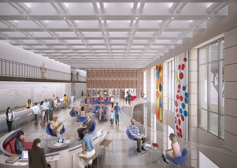
Currently, 65% of the Parkway Central building is allocated for staff and storage. The new library design will reconfigure the library’s spaces to add public space on the first floor, create programmed spaces, and alter the grand staircase to create new access points into different common areas. Tens of thousands of square feet will be made available for public use. Many of the old steel shelves (the “stacks”) will be dismantled and discarded, and most shockingly, the majority of books will be stored offsite at the University of Pennsylvania’s Pennovation Center—accessed exclusively by request. This plan follows Temple University’s library renovation reported by Mari Shaw, which sees 90% of their books in storage (albeit on site) and available by “bookbot,” with only 10% of the collection available for browsing.
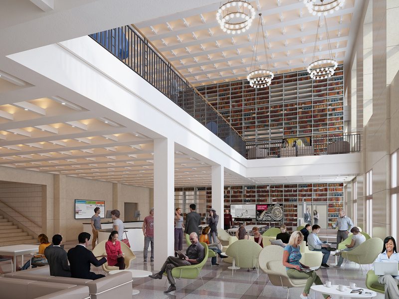
Think about that–the Central library will open up its spaces, and hold much fewer books. In the ‘Common Area’ rendering, the higher stacks of books along the wall is a wallpaper, not actual stacks of books. Main spaces will now be dedicated to job readiness programs, youth workshops, and free-to-use or gather public space. A library simply can’t compete with a modern world that keeps the whole of its information online. Instead, libraries are shifting away from their role as temples of information, and leaning into new function as gathering space, teaching space, and community center.
Commissioner Alminana weighed in: “I can’t help but fascinated by what [the Free Library] is trying to do… I used to work in a library and used to give books to people, I was the interface between the stacks and the readers… I think there needs to be some explanation, that this is where the books used to be.”
Tunnel books
This is the architectural context for Colette Fu’s presentation of her artwork for the library. She was selected for this Percent for Art Opportunity after an open call, which received 112 applicants, but Fu was ultimately selected by an independent panel for this $64,900 commission.
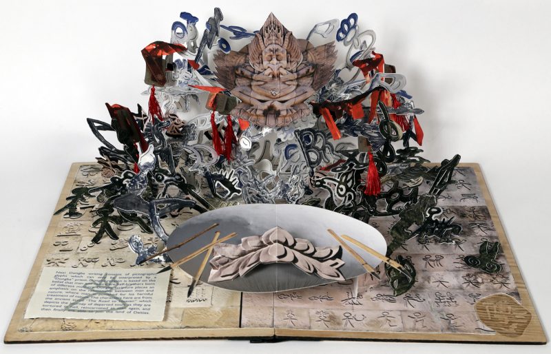
Colette Fu is a Philadelphia artist who makes elaborate pop-up books, in the genre of ‘moveable books.’ Fu stated that this genre was meant to elevate the craft of bookmaking, to excite and inspire. And when she looked at the empty metal stacks, running the length of the library, she made the connection to tunnel books.
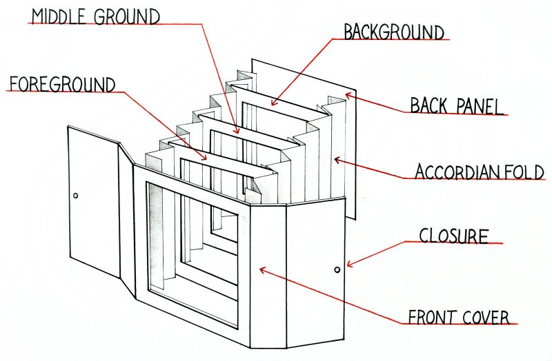

A tunnel book consists of a set of pages bound together, viewed through a hole in the cover, creating a dimensional scene inside. Fu will create four tunnel books, protected in acrylic boxes, sized 30″ x 30″ x 24″. Two of those tunnel books will be based on photos of the empty stacks, and two will be populated by content from future teen poetry slams. These acrylic boxes will be placed among the new book stacks, and will draw a line of continuity of the book form, from historical models to the iPads and kindles of today.
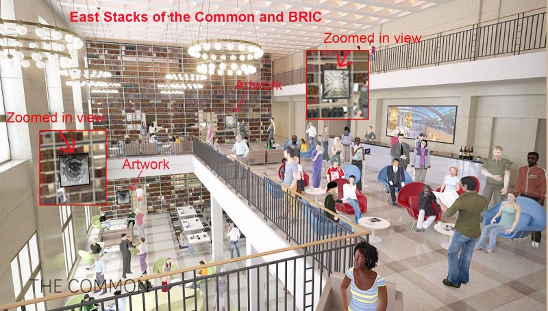
As an arts administrator who often works with non-artists, I advocate quite a bit for what an artist brings to the table. One of those skills is an artist’s ability to make unlikely connections. For example, let’s revisit the wallpaper of book stacks. This is, literally, a rendering of what a book stack in a library used to look like. I’m sure it will be high-resolution, and impeccably installed, but ultimately, there’s no poetry in the gesture. But a great artist like Fu can weave poetry into the fiber of the work itself. We can appreciate how Fu’s beautiful photographs of the empty metal library stacks reflect the technology of the tunnel book. By creating a tunnel book of empty stacks, Fu is recalling an elevated form of bookmaking to serve as memorial to the empty shelves created by the library’s move to modernize, making way for people by sending off its books. Fu’s gesture is self-referential, poetic, and highly celebrated by this Art Commission, who bypassed Conceptual Approval to gave this proposal the green light for production and installation.
Other notes
- Smith Playground, at 25th Street between Snyder Ave and Jackson Street, received Conceptual Approval for a new playground design.
- Margot Berg noted that the project does trigger the 1% ordinance, and will undergo a selection process.
- The American Street Plaza, at American Street, Girard Avenue, and 2nd Street, is getting a redesign. (You might know it better as the location of the Don Quixote sculpture).
- Quick history lesson: the statue was a gift in 1997 from the city of Ciudad Real in La Mancha, Spain. The Spanish delegation visited Philadelphia in 1994 to meet with American Street Empowerment Zone, offering Don Quixote as a emblem of progress.
- Although the design team hopes to restore the Quixote sculpture as part of the project, Berg noted that this work would require private fundraising for refinishing, and creating a new mold to replace Quixote’s missing helmet.
- In September 2016, the Office of Transportation and Infrastructure Systems (OTIS) received approval to replace 600 new bus shelters across City.
- While the Percent for Art bus shelters along Chestnut Street were set for removal, Plan Philly reports that due to exceptional public and Commissioner opposition to the plan to replace these iconic artistic bus shelters with digital advertisements, the City withdrew its proposal one day after the Art Commission meeting.
- Plan Philly reports the artwork in question as being installed in 1999, 17 years ago. Although Percent for Art artworks are permanent installations, permanent is often defined as a 15-year lifespan. This definition is helpful in determining if proposed bolts, finishes, and other materials are eligible for upgrade or withdrawal. With 17 years of service, one could say the bus shelters are due for attention.
- Sigh, a new proposed billboard at the Philadelphia Parking Authority lot at 12th & Wharton Streets, sized at 74 square feet, but not be illuminated at night. This is a highly residential area, and it was revealed that the presenters had not met with the community about this proposal.
- We’ll continue to see these proposals as long as city council sees advertising as the savior of our city. Consider this the “gateway ad.” The package that PPA submitted to the Art Commission included a letter to L&I from the Commissioner of Public Property authorizing permits for five PPA sites. The implementation of those billboards will follow the procedures set here.
- Commissioners asked the group to withdraw the proposal, and come back if they wished. They were unconvinced by many details in the proposal, including the legal standing to place a billboard at this site.


