Presenters to the Art Commission typically show up twice. Teams must receive Conceptual Approval first, and then come back to address specific questions in order to receive the Final Approval that clears the way to a building permit. This April, Commissioners heard updates on SEPTA’s 30th Street Station head houses, the Discovery Center at Strawberry Mansion, the Holocaust Memorial, and the American Street Plaza. In this article, I will focus primarily on the updates for the Holocaust Memorial, proposed for 17th and Arch Streets.
Plans for Philly’s new holocaust memorial
The idea behind the memorial, that the Holocaust needs to be remembered to prevent future tragedies of this magnitude from happening again, is more relevant than ever. We are living in an era of rising antisemitism, with a president endorsed by the Ku Klux Klan, and who has been slow to condemn recent antisemitic acts. While that president’s Press Secretary uses Hitler as a benchmark of evil behavior in his metaphors, he misremembers so many of the details of the Holocaust that it’s unclear whether he understands the horror of these events. Our moment makes it clear why we need a Philadelphia Holocaust Memorial.
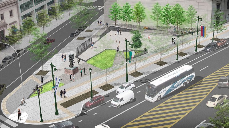
I wrote about the initial proposal in the December Art Commission Check-In. Back then, the Art Commission asked the team—a partnership of The Remembrance Foundation, design firm WRT, Post Brothers, Fairmount Ventures, and the Center City District—to return to present the then-unfinished portion of the project, namely, the text on the six memorial pillars, which were blank at the time.
Juxtaposing and justifying
Eszter Kutas, project manager at Fairmount Ventures, eagerly laid out the concept. These six pillars represent the six million people that perished in the concentration camps during the Holocaust. The pillars are meant to be read in pairs, which juxtaposes a fact or idea from the Holocaust with its opposite idea. So, for example, a paragraph about the “master race” idea is paired with a paragraph explaining “equality.” “Totalitarianism” is paired with “Democracy; ”death camps” with “protecting life & liberty,” and so forth. These text pairings are linked visually by a text alignment called “justifying,” in which the text either hugs the left or right margin of a page, or, here, a pillar. Here, the texts are justified left versus right so that are interpreted as a pair of opposing concepts. For example, text explaining “Human Equality” is justified right (hugging the right side of the pillar), while “The Master Race” is justified left. “We didn’t want to lose the 6 pillars as a symbolic approach,” said Kutas. But, by prioritizing the symbolism, the team designed a forgettable exhibit.
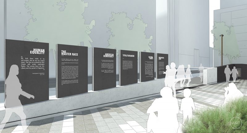
In granting Conceptual Approval last December, Chair Alan Greenberger stated that the Commission did not want to “wordsmith the panels,” but rather wanted an opportunity to see the design before approving, as well as review the intent. Thus, with few comments and general praise, the Commission granted the design team Final Approval, clearing the way for this memorial park to be built, as proposed.
Reading in public
The problem is that the pillars presented today aren’t designed for an outdoor space. While the six pairs of ideas is a clever conceit, the sheer amount of text presented would be more appropriate for an academic paper, or a museum exhibition. All the text is deeply relevant to the Holocaust survivors that will gather here to reflect and share their experience with the greater public. But this park will also attract nearby office workers sitting down for lunch, or a group of tourists, or a family with young children. Public art has the unique challenge of trying to be legible to every single one of these audiences. And unlike in a museum, or in an academic setting, there’s no expectation that the audience will engage. The audience is voluntary, and the work must create the interaction in order to share its message. These six double-sided pillars of text present so much information, that I can’t imagine a casual visitor reading more than one panel, and even if so, retaining much more information than they already knew.
Recent events have sharply re-iterated the need for this memorial. And any improvement to the current, largely unused lot at 16th and Arch is a welcome change. The new memorial park will also include an eternal flame playing on a video monitor, a remembrance wall, and a tree planted by children at the Theresienstadt concentration camp. But this month’s presentation of six text-heavy pillars fails to understand the context of the site. A public park is a democratic public space, open to all types of public use. That openness has the potential to bring a message like Holocaust remembrance to an entirely new type of audience. But by relying so much on text to tell the story, the designers of these pillars fail to capitalize on the surrounding context of the public park. It’s a shame to see these pillars fall short of the ideals of the memorial.
Other notes
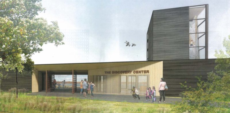
The team from the Discovery Center at Strawberry Mansion returned to present a new design, their previous plans having been over budget. A partnership between Audubon Pennsylvania, Outward Bound, and Philadelphia Department of Parks & Recreation, the Discovery Center will provide public access and an interpretive center and bird viewing station to the little known “East Reservoir” in Fairmount Park near the Strawberry Mansion neighborhood. Next month, the Office of Arts, Culture and the Creative Economy will return with their presentation of the Percent for Art artwork.
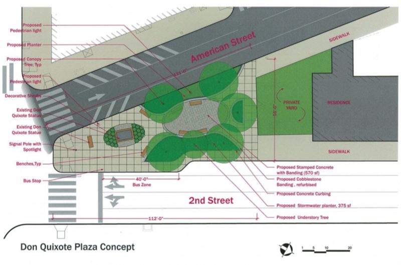
The American Street Plaza received Final Approval for a redesign of their lot at 2nd and American Streets. More exciting, the design team has begun referring to the site as “Don Quixote Plaza,” referring to the public artwork that anchors, and now represents, this park. Long live Don Quixote Plaza!


