Fine art printers, I learned this summer, are an unusual lot. They employ stone slabs (or metal sheets) and ink and acid, rollers and presses that are nearly the same as the tools Johannes Gutenberg used in Mainz, Germany in the 1450s.
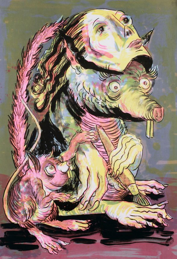
Precise, literate, collaborative and absolutely fun, I discovered the young print duo Liz Born and Gabe Hoare of Hoofprint in all their wonderful messy ink glory in the Pilsen neighborhood of Chicago in a building that once was a funeral home! I found some of Liz’s and Gabes own works echoing that of several artists from the Chicago Imagist world – Jim Nutt, Ed Paschke, Roger Brown and Ray Yoshida… but they seem to not have much time to work on their own pieces!
When I walked in Gabe was pulling prints for a local artist with Lya Finston, their summer intern.
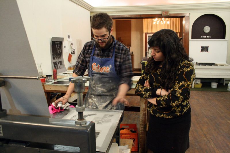
Matthew Rose: Hoofprint’s origins seem more like how rock bands start – art school collaborations, friends of friends, exhibitions and suddenly you two are in a very interesting business producing prints for great artists in a lively workshop environment. Tell me about your history.
Liz Born: We were both displaying work at a group show that a mutual friend put together. There were maybe 20 artists in the show and Gabe and I were the only nerds who wanted to do live printing at the event. I showed up with a big Ziploc of ink packs and some blocks. We were printing them on shirts, and someone presented a chunky-knit sweater. I was skeptical, but Gabe printed it with surprisingly crisp detail. It was impressive! We got cocky and ended up crushing a block in an attempt to print on a messenger bag later that night, but it was an overall triumph.
Matthew: I sensed that kind of enthusiasm! Where were you before Chicago?
Gabe Hoare: I moved to Chicago in the winter of 2011 after completing my undergraduate degree at University of Florida and a set of internships at Robert Blackburn Printmaking Workshop in NYC and Tandem Press in Madison, WI. I worked under master printers, Phil Sanders and Deb Chaney at Blackburn. These guys put me ‘through the ropes course!’ I then spent about six months assisting at Tandem press, and got to print for the likes of Judy Pfaff, Robert Cottingham, Sam Gilliam, and Suzanne Caporael. When I arrived in Chicago I met John Himmelfarb and worked on a three dimensional woodcut project! It took about 6 months to complete! Soon afterwards I met Liz at the live printing event…
Liz: I had recently finished my BFA at School of the Art Institute of Chicago, was working at Spudnik Press as a studio monitor and screen printing tech, and had interned at Chicago Printmakers Collaborative. I had more experience with community shops, in contrast with Gabe’s experience at print shops that focus on publishing. To this day, I specialize in screen printing and relief, and do more teaching. Gabe is our resident lithographer and etching expert, and heads up publishing, although our roles often overlap.
Matthew: What about your own art making?
Gabe: It can be hard to balance one’s own art practice with the amount of time it takes to become a skilled technician, so on the spectrum of artist vs. printer, most people fall closer to one end or the other.
Matthew: So art school allowed you to become artist technicians?
Liz: The ‘art school’ experience is not always the best in terms of receiving a comprehensive technical education. This is something we talk about a lot with our interns, and with high school students we teach. At a liberal arts college or an art school like SAIC, you are being taught how to think, and how to be an artist.
An apprenticeship model – and working closely with mentors– is the best way to learn any craft. Almost all of my technical skills were developed after college, working with Angee Lennard at Spudnik Press; Bryan Saner, a carpenter and performer, and as an assistant for Ryan Kapp, operating a screen printing autopress.
Gabe: Neither of us have an MFA, nor do we have plans to go back to school.
Matthew: Can you tell me about some of the more demanding projects you’ve worked on? For example large prints, multiple colors, huge editions or artists who wanted to produce something strange and unique?
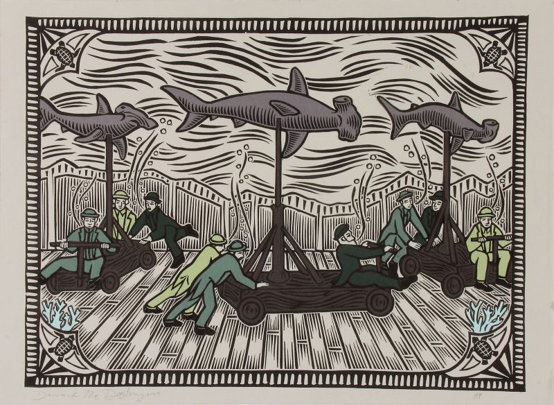
Gabe: We embarked on a large-scale print portfolio that eventually morphed into “Prints of Unusual Size,” an end-of-the-year showcase we put on annually. We provided 15 artists with 40 x 60” woodblocks to carve, both in our shop and at their own studios. When the blocks were returned to us, we pulled small editions of each block on canvas. Getting decent prints at this scale proved to be a daunting logistical challenge for our team.
When we started out, we were getting very weak impressions because canvas has the capacity to absorb much more ink than paper. We worked through this problem for days in the studio. The solution that we discovered was to soak and blot the canvas and pull it through the press at extreme pressure with no blankets, so the canvas was directly against the drum of the press. The resulting prints had very rich dark blacks, like peering into a black hole. After much troubleshooting (and some wasted canvas) everyone was satisfied with the results.
Matthew: You also work with mezzotints and stone…And what exactly is a mezzotint?
Gabe: Yes. We worked with Douglas Bosley to print one of his enormous mezzotints. Mezzotint is an old and extremely laborious process. Invented in 1642, the surface of the copper plate is pitted with thousands of tiny dots that hold ink. The artist uses a steel ‘rocker’ with a row of fine points on the end to impart a texture on the whole surface of the plate. When inked, it prints a rich, luxurious black. The artist then scrapes and burnishes the surface, establishing highlights. The smooth areas wipe clean when the plate is inked. It’s similar to drawing with an eraser on paper prepared with charcoal, but much more physically demanding.
Matthew: How large was the print…and the edition?
Gabe: Doug’s plate measured 24” x 40” – an impressive scale for the medium. Usually a copper mezzotint starts to break down after several impressions, because the metal is very soft. Before editioning, we constructed a large electroplating tank to steel-face the copper printing plate. This zaps a thin layer of steel onto the surface of the plate, reinforcing it while still maintaining the detail of the artist’s marks.
Over the course of three long days we pulled around 40 impressions from the plate. Doug was doing the all-important job of wiping the plate while I assisted with handling large sheets of German etching paper, operating the press and stapling the prints up to the wall to dry.
Matthew: And you are also screen printing….
Liz: Yes. Gabe and I also do a lot of collaboration with prints that have screen printed and lithographic layers. We’ll often have an artist create a key drawing on a litho stone, and then make color layers with screen. When working across processes, it’s really important to have a solid registration system.
Matthew: In that kind of collaborative process, what unusual pieces have you worked on?
Liz: A few years ago, artist Vesna Jovanovic brought in some old x-rays of her teeth to expose to screens (from when they used to give you those x-ray films!) If you’ve looked at those films, you know that they’re not very opaque, even in the darkest areas, and you really need a film that is opaque in some places and transparent in others to get a predictable result with a screen prepared with photo emulsion. I ended up shooting the same film five times to five screens, all with different exposure times. This is called a threshold print. We printed the screens in progressively darker inks, from more information to less information.
Matthew: Curious. How did that work out? Seems like a lot of ghost-like layers…?
Liz: The result was very subtle—not at all like the polarized, graphic look we usually associate with the screenprinting. And, it was important to Vesna and I that we didn’t simply scan and digitize the films. This would mimic what has happened in real life, with the discontinuation of analog x- rays, and the loss of that kind of ephemera in our lives. By replacing the artifact with a digital doppelganger— something is lost. Digital manipulation is a great tool, and we use it as just that—a tool, not a final means of production.
Matthew: When I was in your studio in early August you were working on a black and white litho print…
Gabe: Lithography is an elegant process, with nearly limitless possibilities for the artist. The lithographic limestone is a surface that is equally receptive to grease and water. The artist draws directly on the stone with a variety of greasy drawing materials: lithographic pencils for passages of fine shading or greasy crayons and liquid tusche for more bold, painterly effects.
Once the artist has completed their drawing, the printer processes the stone with an aqueous solution of gum arabic and nitric acid. This mixture attaches to the non-image area of the stone and is repelled by the greasy drawing material. The gum arabic stencil protects the non-image area.
Liz: For those familiar with screen printing, an analogy can be made between the gum stencil of lithography and photo emulsion stencil of the screen. Both are blocked-out areas that do not receive ink and, on the print, the paper is revealed—the non-image area.
Matthew: So the litho print is a reverse of the drawing but very faithful to the artist’s marks…
Liz: Yes! What’s great about lithography is that it preserves the autographic mark of the artist’s hand. Most processes change the way one’s drawing looks. A carved line looks different than a drawn line, and that’s what’s desirable, for example, about woodcut. But it means that the marks are transformed by the tool, like a game of telephone. Lithography though doesn’t change the way these marks look, which is why many people see lithographs and assume them to be original drawings.
