Of the famous cluster of photographers associated with influential MOMA curator, John Szarkowski, a group that included Diane Arbus, Lee Friedlander, Garry Winogrand, Joel Meyerowitz, and William Egglestson, Tod Papageorge is perhaps the least famous. Among the youngest of the group, at a mere 25 Papageorge quickly bonded with Winogrand, spending days in the mid 60’s walking the streets of Manhattan with the elder photographer and the slightly older Meyerowitz. In time he forged his own style from the powerfully influential photographers he had fallen in with, one simultaneously more diffident and precise than either of his mentors (although Meyerowitz would veer radically to the precision end of the spectrum when he later took up large format photography in the mid 1970’s.) And while he would eventually become one of the most influential practitioners and teachers of his generation, his solo exhibition career didn’t really get underway until 1976, and more surprisingly, he did not publish a monograph until 2007, when both Aperture and Steidl released compilations of his work from the early 1970’s: American Sports, 1970: Or How We Spent the War in Vietnam, from Aperture, and Passing through Eden, from Steidl.
Writing and curating superceded art practice
Ironically, Papageorge’s earliest and perhaps most enduring fame would come as a curator and writer. Like Robert Adams, another visual renegade from an English Lit graduate program, Papageorge is a superb writer, especially on the subject of other photographers. In 1977 he guest-curated Public Relations, a major exhibition of Winogrand photographs for the Museum of Modern Art, also writing the introductory essay for the accompanying book. Despite having won two NEA grants and a Guggenheim fellowship for his own work, the Winogrand show and book immediately thrust Papageorge’s curatorial and literary skills into a bigger spotlight than his own photography. And though by then his solo exhibit career had kicked-in, he remained less known for his own photography than for his eloquent writing, and ultimately, his influence as a teacher. As the Walker Evans Professor of Photography at Yale, he mentored the likes of Philip-Lorca diCorcia, Lois Conner, Abelardo Morell, Andrew Bush, Susan Lipper, Gregory Crewdson, An-My Le, Anna Gaskell, Steve Giovinco, and Katy Grannan… and the list goes on.
Part of the fault is Papageorge’s. While Arbus, Friedlander, Winogrand, Meyerowitz and Eggleston put out books beginning in the 1960’s, it was decades before Papageorge’s work began to appear in any significant printed form. He has said in interviews, tongue planted firmly in cheek, that it was because no one asked him to. But he evidently, didn’t try very hard, either.
Maybe the work was not radical enough
There is also the possible problem of his work being insufficiently radical. He shot on the street, sort of like Winogrand, but not quite. He didn’t shoot in color (except that, as his new book reveals, he once did.) He pioneered the use of larger format film, using a Fujifilm 9x6mm camera for the Central Park photographs that comprise his 2007 book Passing Through Eden, and 2014’s Studio 54. But he didn’t leap directly (or ever) from the inconspicuous Leica 35mm to a huge 8 x 10 inch view camera to shoot color film, as did Meyerowitz, or slightly later photographers such as Stephen Shore, and Joel Sternfeld. The use of these large cameras that could only shoot one image at a time, requiring tripods and long exposures, demanded an entirely different, more contemplative approach, one that, coming in the late 1970’s, had a revolutionary impact on art photography.
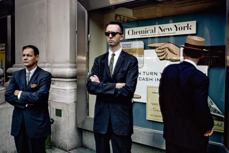
Instead, Papageorge used medium format cameras that precisely duplicated the long rectangular aspect ratio of 35mm film in much the same way he used his Leica, snapping candid photographs on black and white film of people in the street (or in the park; or in the club) producing finely detailed, gorgeously luminous images that were simultaneously serene and spontaneous. They were extraordinary, but incremental, like 35mm on steroids.
Aside from the few who saw his exhibitions, his mastery of editing and sequencing didn’t become apparent to a broader audience until the release of his books, despite these skills being amply displayed in Winogrand’s Public Relations, a task that required Papageorge to whittle down the thousands of prints Winogrand made, and then sequence them for the exhibit and subsequent book. Since 2007, Papageorge seems to be playing a bit of catch-up with three (and now four) books, periodical publications, and various exhibits. Now, in his late 70’s, he has, along with Meyerowitz and Friedlander reached elder statesman status (“man” being an important root) in that generation of New York-based, MOMA-associated, testosterone-infused street photographers.
Early color photos in book and exhibit but why?
Dr. Blankman’s New York, Papageorge’s most recent book from Steidl, reaches back to his beginnings, “re-discovering” his early, and quickly abandoned work with color film. Importantly, the pictures Papageorge shot on Kodachrome in the mid-60’s were self-consciously excluded from his “serious” work. In his Afterword, David Campany notes that Papageorge took all of the photographs in the book in little over a year, acting on the advice of Winogrand and Meyerowitz that having a body of color work would help the young photographer win commercial assignments. He goes on to point out that many of the pictures were taken at the end of the day after shooting on the street with Winogrand where, presumably, he shot what he considered his more personal work in black and white. In a sense then, to the extent that you can ever say a photographer’s effort to learn a new variant of the medium is like practicing an instrument, that is what Papageorge was doing. But not until many years later was there a “recital,” and by then his approach had become decidedly more formal, and less “streety.” He paid scant attention to the results of his 1960’s color work and really did not look at them again until a few years ago, spurred perhaps by curiosity and by an even later return to color work, this time in 2009, with his flaneur’s view of Rome, in Opera Città
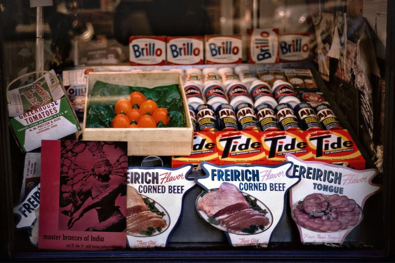
Beyond the obvious justification of filling out the oeuvre of an influential artist, what makes this worth turning into an exhibit, and then a book? A good reason to go beyond checking that single box is what it can tell us about our understanding of photography, and specifically street photography, in that era. Something we have learned over the past decade about street photography in the 60’s and 70’s, is that there are gaping holes in the dogma stating that only black and white photography was taken seriously until William Eggleston scaled the ramparts of MOMA. Helen Levitt and Gary Winogrand both produced significant bodies of color images that didn’t emerge until much later (the Winogrand archive at the Center for Creative Photography in Arizona includes 45,000 color images. Expect to see a major publication built on that work at some point.) Meyerowitz, of course, was shooting in color long before that work became known, as was Saul Leiter. And in recent years, heretofore unknown street photographers who shot in color, such as Fred Herzog and Vivian Maier, have reached large audiences. Whatever museum and gallery curators thought, photographers were interested in color from the get-go. The problem with color wasn’t that it wasn’t “serious.” The problem with color was that it was obscenely expensive, absurdly slow and finicky, and a pain in the ass (and expensive) to print. Street photographers, in particular, went through a lot of film. Spending a few dollars on a roll of slide film, another few dollars processing it, and considerably more money making a print (which was usually of mediocre quality) simply meant that every frame of color easily cost 10 times as much as a frame of black and white, and when you’re talking about shooting many thousands of frames a year, you weren’t likely to shoot a lot of color unless someone with deep pockets was paying for it. Hence, despite the obvious interest photographers took in the medium, it generally comprised a small fraction of their work. But what work exists naturally arouses a lot of interest.
Youthful photos, with a deft feel for color and some whimsy
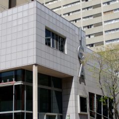
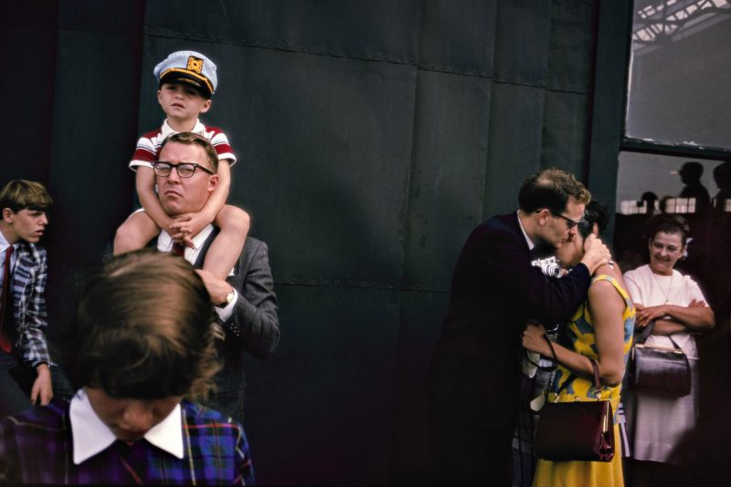
If Papageorge’s intent was to develop his chops for commercial work, you wouldn’t know it from the images in Dr. Blankman’s New York. Still working in 35mm, these are street shots very much in the style that came to mark his more mature work in American Sports, and even employs some of the subject matter that he explored in Passing Through Eden. It is youthful work, more tentative and derivative than his later work, but nonetheless demonstrates a deft feeling for color, and already shows his interest in the found poetry of truncated signs, and clashing messages. Shooting at the end of the day (apparently) the pictures often benefit from the lush saturation of the so-called “golden hour” before sunset. Many of the shots appear to taken at dusk, or at least under cloudy skies, and you have to admire Papageorge’s ability to both hold the camera steady and find subjects that didn’t move during what had to be excruciatingly long exposures.
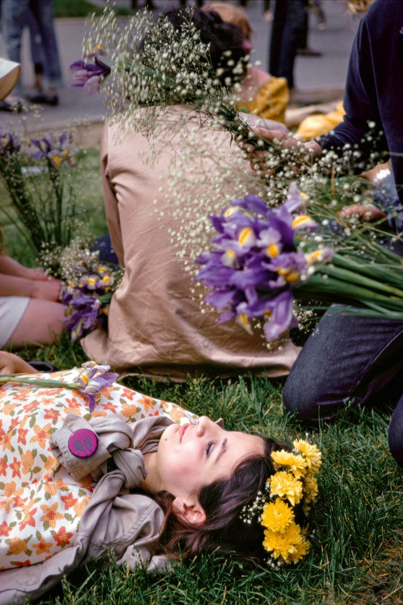
Probably because of those long exposures, many of the images are of store windows where Papageorge builds multi-layered collages that mix textual and still-life elements with the internal and external theater of human interaction.
But there are also plenty of shots that carry the whimsy typical of New York street photography of the era, and many of these would work nearly as well in black and white.
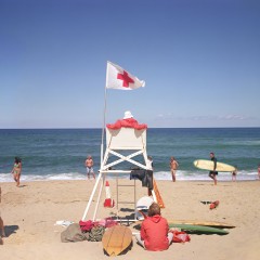
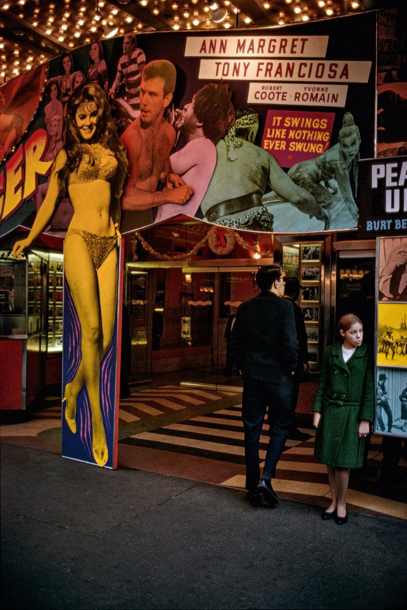
Several of the pictures hint at the coming work Papageorge would do in Central Park, with bench sitters, sun-bathers, and preening couples, all of whom we could note, don’t move very fast and are thus amenable to the slowness of ASA 25 color film, or medium format cameras loaded with black and white. In the Kodachrome, the softly luminescent color seems to presage the glowing, higher resolution black and white of a decade later.
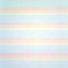
Indeed, the classic street stuff aside, the most interesting aspect of these pictures is Papageorge’s comfort and facility with color. Frequently images use complementary tones to isolate or emphasize subject matter, warm against cool, underlining the “outsideness” of certain subjects.
And occasionally, he lets color simply carry the image, as in a shot of a man rushing by carrying a blurring side of red beef, a picture that says “meat” with an emphasis that Tri-X couldn’t have delivered.
A brief foray into color, abandoned until taken up again in the 1990s
It’s this natural affinity for the medium that makes me wish that Papageorge had more money to buy film back then; or that he could intellectually disentangle his preconception of commercial photography’s ownership of color from his natural instincts with the medium; or that he had been older and farther along in his development and better able to recognize what he was accomplishing. As it is, there was only this brief foray into color work for Papageorge, and it was not until the early 90’s that he took it up again, when others had already made the art world safe for color.
Dr. Blankman’s New York isn’t ground-breaking work, not now, and not really when it was shot either. But it fills in our understanding of an important artist, one who would not have warranted this publication had he not done his later work. It also adds to our understanding of how color film found its way into the art photography world, which we now understand occurred gradually, carried out by many, and that evolved from existing approaches. In other words, like just about everything else that looks revolutionary in culture, it had precedents. And it’s good work. And it’s a Steidl book, which is pretty much synonymous with beautiful.
Tod Papageorge, Dr. Blankman’s New York – Kodachromes 1966-1967
Tod Papageorge
Published by Steidl
ISBN 978-3-95829-108-9


