Sean Scully: The Shape of Ideas is a survey exhibition of Ireland-born, London-raised artist, Sean Scully, whose paintings are characterized by rectangular blocks, broad stripes, and an austere color palette. Throughout his 50-year career as an abstract painter, Scully rejected portraiture, Minimalism, and Pop Art and the resulting aesthetics of his oeuvre are fascinating, if not a little humdrum; his work contains little personability, lacks conceptual rigor, and does not contain any reference to mass media. The amount of intrigue his work garners will vary greatly from viewer to viewer.
Scully’s work has a bit of a reputation as not being as well-liked as some major art institutions would advertise. (Although he is hardly the only abstractionist in this position, he is one of the wealthier, living ones.) The Shape of Ideas is a challenging exhibition precisely because Scully’s dissentient approach to painting is alienating. It is unfortunate however that The Philadelphia Museum of Art does not expand on how the work could be valued, should a viewer feel apathetic towards Scully’s style. Instead, the gallery text sells Scully’s creations by describing how the newer rectangles and stripes have subtly changed from the previous rectangles and stripes.
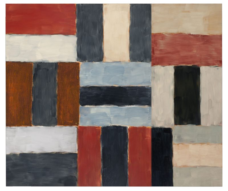
To discuss a typical composition for Scully, let’s look at “Chelsea Wall #1” (1999). The picture plane is divided into a grid of thirds and within each segmentation, rectangular blocks line up against each other to fill up the space. The top left corner of “Chelsea Wall #1” contains two horizontal blocks – red and white – stacked on top of each other. The bottom right corner has a black vertical rectangle pressed against three horizontally stacked blocks. The rhythmic shifting of block orientations and a steady color swatch establish a simple image. After a moment of looking, slight deviations in the pattern become apparent. For example, the aforementioned vertical black block in the bottom right corner of the painting appears to be a continuation of the vertical black blocks in the segment adjacent to it.
Throughout Scully’s paintings, rectangular shapes are painted with a soft edge. Each contour is rounded and wet and the meandering edges either overlap or reveal glimpses of the underpainting. In the gallery text, we learn about a young Scully and his trip to Morocco, where he learned about textiles and became inspired to work in grid patterns. Just as in textiles, the forms in many of Scully’s paintings seem to interlock and suspend each other with a gentle force.
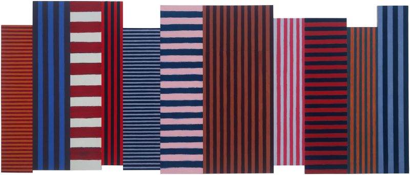
A different type of suspension occurs in Scully’s earlier works. The paintings created between the mid 1970s through the mid 1980s primarily consist of multiple sections of stripes. Here, the illusion of weightlessness is achieved by allowing each panel to follow their own rhythm. The stripes do not evenly line up section to section, which causes the picture plane to pitch forwards and backwards. The most famous of these compositions is “Backs and Fronts” (1981), a multi-panel work that abstractly depicts a New York City skyscraper landscape. The disjointed collection of stripes reflect how multiple buildings visually rest on top of each other in an urban setting.
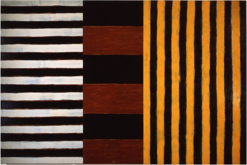
Scully uses dark colors in nearly every work he has created in the last 50 years. In darkness, space retreats, and it is this retraction that Scully seemingly finds crucial to his paintings, for reasons visual, or emotional, or habitual. The effects are varied; in “Heart of Darkness” (1982), the black stripes contrast with a luminous yellow to create a vibrant burst of golden hour light. In “Black Blue Window” (2021), a solid square of cool black appears over murky blue and gray stripes, creating a visual void— a window that looks out into nothing. In his series “Wall of Light,” the dark paint plays a conceptual role, darkness being materially paradoxical to the title of the series and perhaps theologically important to the concept of divine light.
Throughout the exhibition there are sketches, watercolors, drawings, and other works on paper that correspond with each body of work. These smaller works are installed behind columns, around corners, wherever in the room is the least visible. The best reason the Museum musters for their inclusion is this sentence, “The integration of works on paper throughout the rest of the exhibition shows the interrelationship between mediums that is central to understanding Scully’s approach.” Perhaps more meaning could have been gleaned if the display featured notes from the artist himself, in addition to these studies. Perhaps such documents do not exist.
While these works do not add much to the viewing experience, they are a continuation of the first hallway where The Shape of Ideas begins. This hallway, typically used by the Museum to show works on paper, is filled with a collection of Scully’s printmaking endeavors. This section is our first introduction to Scully. Here, we learn about his beginnings as a high school drop out and as a printer’s apprentice. Most importantly, we learn about his background as a typesetter. Although there is no curatorial text that states it outright, it seems apparent that Scully’s subsequent artwork pulls a tremendous amount from the practice of typesetting (aligning small blocks together to create a print of text). Both as a young typesetter and as a life-long painter, Scully organizes rectangular shapes together onto a plane, considers how space can be filled to capacity through a linear structure, relishes the harmony that comes when something is visibly in its correct place, and utilizes tight repetition to achieve success.
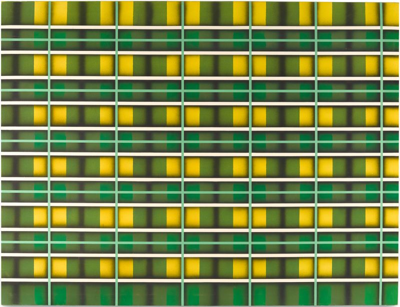
The two most visually stunning works in the exhibition happen to be the two earliest creations: “Inset #2” (1972-73) and “Green Light” (1972-73). Because the show is structured chronologically, they are the first works to be seen after the prologue of Scully’s work as a printmaker. They represent the artist’s earliest inclinations towards linear design, though they possess a bright maximalism that the artist purposefully abandoned for the rest of his career. They are the last remnants of what was created before Scully pursued paintings that were, in his own words, “as stripped down as can be before you have to leave painting.”
There is admiration to be had for an artist who early on decided to be unfashionable. Clearly this decision has paid off for Scully. His legacy, however, is in tremendous danger if exhibitions as unimaginative as this one are how art-viewing publics engage with his work from now until the future.
“Sean Scully: The Shape of Ideas,” on view at the Philadelphia Museum of Art through July 31


