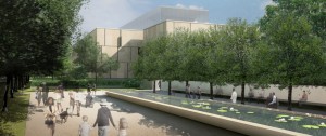
It’s no news that we on Artblog are for the move of the Barnes to the Parkway. We’re excited about the new design and can barely contain ourselves…even though it does look a little like the Youth Study Center (just kidding). It looks a little like the Paul Phillipe Cret Barnes building in Merion, too. So stop whining everybody…neighbors and Robert Venturi alike. Here is architecture critic Inga Saffron’s review of the building in today’s Philadelphia Inquirer. Lots of video and pictures and links at this site too. Check out the full press release and copious images at the Barnes website.
