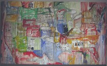
 Why, I asked myself, was I so enjoying the show inspired by the Lewis and Clark expedition at the galleries at Moore College? After all, it had a lot of realistic landscapes, which I’m always griping about.
Actually, it took me a little bit of time to get into the landscapes in the show.
But this show, which was curated by Curator of Contemporary Art Rock Hushka at the Tacoma Art Museum, is a show of ideas, and the landscapes are so much more than just pretty scenes. In the context of the Lewis and Clark Expedition, it’s a show about nation building, nation destroying, philosophy, racial assumptions, cultural values, change, politics, ecological transformation and place.
Hushka, before the reception last night, delivered a slide lecture right next door to Moore, at the Academy of Natural Sciences, which has its own Lewis and Clark Expedition exhibit of artifacts. The small crowd in the auditorium hovered at about 30 or 40, and the temperature in the auditorium hovered at what seemed like 60, but we who had braved the cold to get there were happy to hear the talk.
The art exhibit, “Lewis & Clark Territory: Contemporary Artists Revisit Place, Race, and Memory,” three years in the making, drew work from artists who live along the route of Lewis and Clark.
I don’t mean to give the impression that this show is all landscape. It includes sculpture, photos, and conceptual work, and its themes, as the title proclaims, are place, race and memory. It includes work from Native Americans as well as mostly Western artists and even an artist from Pennsylvania. After all, “Philadelphia was the logistical and philosophical home of the expedition,” said Hushka.
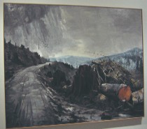 The painted and photographed landscapes in the show reflect some expected modern concerns like nuclear pollution at Hanford, Wash. (“The Hanford Reach” series of photos by Mark Rewedel), or clear-cut foresting in Michael Brophy’s “January,” a fierce, denuded landscape under lowering skies (right).
I know that people all over the United States are painting works about destruction of our planet, so in a sense, this isn’t so unusual. But it’s an angry painting of impressive scale, and the landscape is huge, the deep space suggesting that the destruction that’s visible up close goes on to the horizon and beyond. The orange tree trunk sliced open is a raw body part, and the black land and skies remind me of the landscape of “Mad Max.” This takes the convention of the grandeur of the West and uses it to show the grand scale of destruction.
Nearby is Leo Saul Berk’s “Ribbon,” a sculpture made from a single tree trunk, milled to become a single, long piece of veneer that Burke rolls up and then unrolls into a spiral shape in the gallery (image, left below).
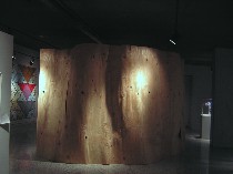 The subject matter of “Ribbon” is similar to Brophy’s, but the method and allusions are contemporary, like Richard Serra’s steel “Torqued Ellipses” and also Louise Bourgeois‘ “She Lost It” nautilus-shaped maze that was at the Fabric Workshop and Museum in 1992-1993.
The knots in the wood provide natural peepholes and patterns of light in the 101-inch high walls, but even with those outlooks, the barely one-person wide interior passages press on anyone who enters. And the remarkableness of its fabrication brings up issues of commerce and the plywood industry (Berk got a plywood factory to stop production and shave the veneer for him, Hushka said) as well as the welfare of trees and their remarkable physical qualities.
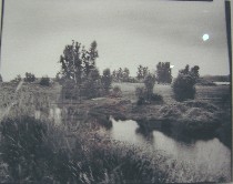 Even work that glorifies the landscape contains questions and worries, unlike the glorified images of Western landscape art from 200 years ago by Albert Bierstadt. I think here of Susan Seubert’s “Ten Most Popular Places to Dump a Body,” a series of 10 photos taken in the Columbia Gorge of unsurpassed natural beauty — and menace. The locales are based on law-enforcement records showing where bodies were found (right, one of Seubert’s series–the lights right are reflections on the glass, sorry).
The imagery of these photos remind me of European landscape painting. But the multiple ironies in the title place these works in contemporary times.
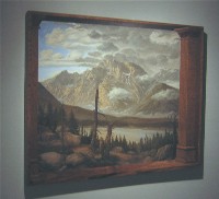 Even Kent Moylan’s painting, “Mt. Moran and Thor Peak,” which grabs the nature’s grandeur theme and runs with it, is the antithesis of Manifest Destiny and expansionism, with its trompe l’oeil, angled frame of tourist-hotel architecture expressing disillusion and limits and perspective (image, left).
Maps as an expression of landscape also have a presence in this show–speaking to politics, nationhood, the division between conceptual space and the land itself.
Jaune Quick-to-See Smith’s map, “Indian Country Today,” alludes to Jasper Johns’ map paintings and prints in red, yellow and blue. It also alludes to Indian prior ownership of the land, to the newspaper “Indian Country Today,” the most popular Indian publication across the nation. Smith layers her states over headlines and articles from the paper, rich with political content.
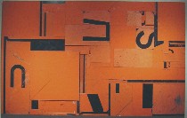
Robert Yoder created a different sort of chart made from Seattle’s old plywood road signs, the directions chopped up so you don’t know where you are going. The rectangle is painting and map shaped, and the chunks of signage make their own physical topography from objects that used to interrupt the landscape and certainly didn’t improve upon it.
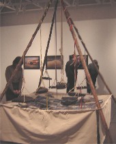 Corwin Clairmont’s take on landscape is more emphatically sculptural. A member of the Confederated Salem and Kootenai Tribal Nation, his “Asphalt Storm Clouds Over the Reservation,” made of teepee poles, maps, pictures and chunks of floating asphalt show the impact a contested road plan would have on reservation land. The photos of the landscape, pre-road, are strewn over the impersonal roadway maps. Without the title, this piece would lose its bitter humor, its visual charms not quite able to carry the concept on their own.
I also enjoyed Clairmont’s conceptual take on the “1855 Treaty of Hell Gate,” a copy of a treaty between the western Montana and Idaho tribes and the U.S. government. He printed the treaty on cards the size of picture postcards and showed a stack of them, a demonstration of how worthless the U.S. government’s promises turned out to be–not just in this treaty but in all the treaties with the native tribes. As instructed, I pocketed one.
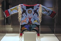 Native American work runs the gamut from work like Smith’s and Clairmont’s, which come out of international contemporary art traditions, to the extraordinary traditional bead work on Lakota tribesman Thomas Haukaas’ “Special Boy Shirt,” created as an act of mourning for a young child who was killed by gang violence (right). The imagery shows the creation myth of buffalo spirits pussing up a man through the black hills.
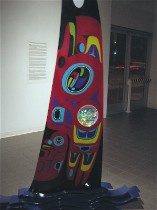
Striding the two cultures is Marvin Oliver’s “Orca,” a sort of totem made of glass. The fabrication method, which makes use of laser technology, is Oliver’s invention (left below, detail of “Orca,” a blade of glass emerging from waves of glassy water).
 Background information about each piece is on the wall labels, and I enjoyed almost every piece in this show.
Others in the show in show are: Victoria Adams, Anne Appleby, Jackie Larsen Bread, Ron Carraher, Corwin Clairmont, Sally Cleveland, Chris Faust, Joe Feddersen, Juanita Growing Thunder Fogarty, Pat Courtney Gold, Linda Oyatewaste Haukaas, Maynard White Owl Lavadour, Rachel Maxi, Dorothy Morgan, Megan Murphy, Martin Red Bear, Peter Rostovsky, Bently Spang, Terry Toedtemeier, and Alice Wheeler.
Check out the upcoming programs relating to the show at the Moore College gallery website.
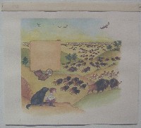 Also, on your way into the show, check out Moore College of Art Adjunct Professor Robert Byrd’s illustrations for a Ranger Rick article on Lewis and Clark. I found the information about the illustration process pretty interesting, and was amazed by the detailed visual information about the expedition, its equipment, the animals and the landscape included in the illustrations. I spoke to Byrd at the reception Friday, and he said that he spent a lot of time researching the facts before he started work on the illustrations.
And while I’m urging you to check out stuff, the whole Lewis and Clark series of museum and institutional programs around Philadelphia for this year’s 200th anniversary celebration include not just the photo show at the Art Museum (see Roberta’s post), but also an exhibit of artifacts from the expedition at the Academy of Natural Sciences, and a display this summer of some of the original journals at the American Philosophical Society, which commissioned the expedition and therefore owns the journals. (I learned this last bit of information from Roy Goodman, the society’s assistant librarian and curator of printed materials, who was also at the reception Friday.)


