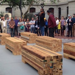
Quiet, a little sad, introspective, and not a lot of beauty. Those are how I’d sum up this year’s Whitney Biennial, now celebrating its 75th edition. After the ebullient excess of 2008, in which more than 80 artists exploded beyond the bounds of the museum, taking up residence in the nearby armory, and pock marking Central Park, a mere 55 artists certainly reflects a societal time of retrenchment and self-reassessment.
It’s as if America is no longer the youthful shiny penny it used to be. Well, that would be right. It’s not. And this is the Whitney Biennial that reflects the new world order.
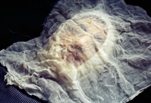
People–art’s favorite subject–are not beautiful in this exhibit. They are distorted and injured here.
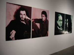
Stephanie Sinclair‘s gruesome photos show Afghani women who survived self-immolation. Lorraine O’Grady‘s portrait of Dorian Grey-like photos pair Charles Baudelaire and Michael Jackson as they age. Michael Jackson’s transformation from beautiful young African-American man to the whitened melting flesh of a white-woman-wanna-be is devastating. Baudelaire, for all his own issues, holds up a lot better over time. The themes of grotesque humanity come out in Storm Tharp’s drawings, Nina Berman’s family-album-like photos and Jessica Jackson Hutchins’ ceramic body parts on a sofa.
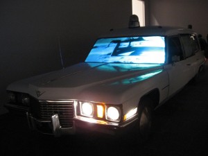
The can-do country can’t do when it comes to cultural imperialism. Kerry Tribe‘s video installation about a real-life medical failure and Bruce High Quality Foundation‘s video installation of the American Dream and its cliches in movie clips projected on the windshield of a giant white hearse–both tell the story of our cultural crash.
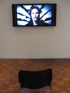
Videos were where the action was in this biennial. Marianne Vitale‘s drill-sargeant harangue, Patron, had me cowering–as intended. The lowly chair in front of the high video is the wayward student’s seat in front of the teacher. Obey your out-of-control government.
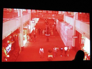
And Josephine Meckseper’s Mall of America has a similar message, only the control freak is American commerce and not the government. Franz Kafka’s Amerika comes to mind.
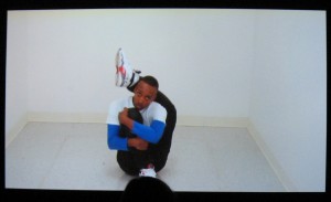
Rashaad Newsome‘s mesmerizing videos of vogue dancers are beautiful and surprising–at least they were to me. The relationship of the dancers to the camera as well as the stylized dancing were pretty trippy. I’d like to see Sharon Hayes’ “Parole,” over again and in its entirety. Hayes’ installation is a ramshackle enclosure, a sort of transient corral. The videos, which focus on women, were filmed in several foreign cities, and the language had a sense of falling apart. Hayes’ installation is a ramshackle enclosure, a sort of transient corral. The videos, which focus on women, were filmed in several foreign cities, and the language was shifty. Its meaning seemed to fall apart.
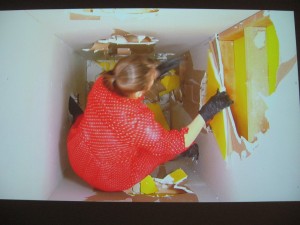
Tearing apart a constrictive room is the action in Kate Gilmore‘s video of her can-do self. And it bears comparison to the constrictive space in which Newsome’s vogue dancers perform. There’s a theme here of an America that is quite different from its own propaganda, an America that has far too long believed its own rhetoric, now proven meaningless.
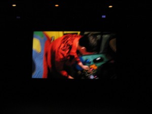
The noise music video by Ari Marcopoulos shows preteens creating a noise that’s both wonderful and hard to listen to. They are the worm within–invasive threats no doubt to their parents’ peaceful, suburban existence. The parents are the nation. The kids ‘r’ us. This video also stands out for its beautiful, saturated colors.
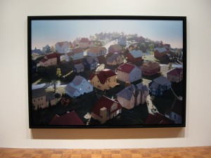
Though beauty in the show wasn’t much of a presence, it was there–James Casebere‘s enormous photos of tabletop models of suburbia are beautiful surreal landscapes of a giant social mistake (at least that’s how it looks to me), not that far from the messages of Marcopoulos, Meckseper and Vitale.
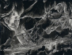
Another beautiful great escape from reality is offered by Roland Flexner and his gorgeous, small sumi ink landscapes of the mind. Also, Lesley Vance’s gorgeous, painterly abstracts serve as a reminder of the still-life tradition.

Tan Tram’s photos of a young boy imagining himself as a superhero seem like the most hopeful works in the exhibit.
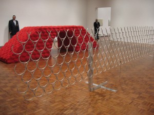
The great suburban showdown also expresses itself in sculpture, in Robert Grosvenor’s giant garden feature which ties for my official Tactility Prize along with Piotor Uklanski’s fabulous theatrical burlap hanging, which seems to belong to a different exhibit altogether. While I may not know what it’s doing here, I like it.
The catalog of this show is a disappointment–cheap in quality, not in price. But women have a big presence in the show–about 50 percent! Mirabile dictu. All in all, this Whitney Biennial is reading the sign of the times.
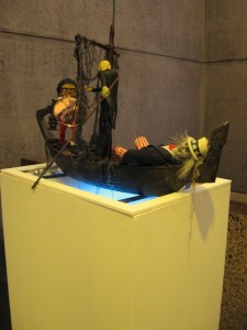
In a year when we lost the King of Pop, it’s no surprise that there’s a second Michael Jackson piece in the show. Floating on a pedestal above a glowing dry-ice miasma, Daniel McDonald’s theatrical kitschy sculpture of Jackson in the lobby transitions viewers in and out of the exhibit. Jackson is helping a poor Uncle Sam cross the River Styx by offering the boatman, Charon, a giant shiny copper penny to pay their passage. Jackson holds it up like a shield, but the shiny penny can’t shield any of us from the new world order.


