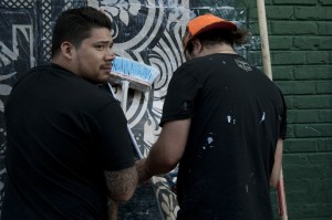
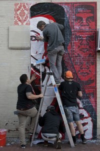
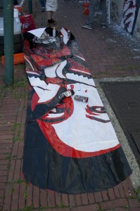
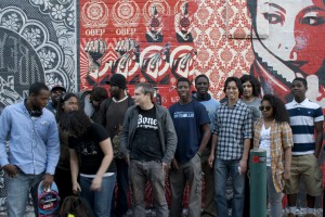
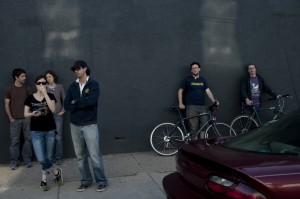
On April 23rd, Shepard Fairey, of Obama-poster fame, rolled into Philly, taking a break from installing his show at Deitch Projects. The Mural Arts Program found him some sanctioned walls, and by Friday afternoon, Fairey’s team had begun wheatpasting on West Girard Avenue with a crowd of excited onlookers: students from Mural Corps, community business owners, and the local media.
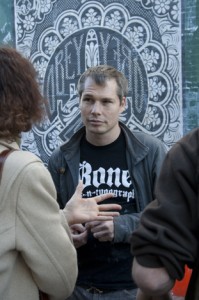
Fairey’s body of work has had a consistent graphic language for a long time now. This particular language was developed with the OBEY campaign in the 1990s, where the high-impact renderings let non-sequiturs fracture a public space normally bound by the reasoning of advertisements. I was curious, then, how Fairey made sense of a very similar visual vocabulary being used quite differently—to connect and build community—for the Obama poster. So I asked Fairey about it. I also had a chat with his long-time team member, Dan Flores. Below is some of our conversation.
Shepard Fairey: When I first did the OBEY pieces, I was interested in the spectrum of human psychology. In terms of images, it was the mysterious and open-ended stuff I liked. If you questioned it, you questioned other things.
David Muenzer: And your use of the vocabulary of dated-advertisements and socialist-realism? The “propaganda-poster” look?
SF: I don’t think people—rebellious people—like being told what to pay for, they [see an ad] and they reject this.
DM: But the Obama poster does something quite different in that same vocabulary?
SF: Well, with the world at that time—the Bush era—not to be completely non-committal seemed better. With all the double-speak, it was important for me to show that you could be for something. Being committed and direct in a time of open lies was a counterpoint to the dominant flow of information. During Bush, it was not then difficult to decipher [the direct endorsement of Obama] as a critique. As questioning indoctrination. Even though it departed from my “brand.”
DM: A more practical question. This mural, and others, are really large and technically complex. Are they composed beforehand, after scouting a site, or are they more improvisational?
Dan Flores: The designs are modular. We have different images in different sizes, so we can respond to the location. We were originally going to use that wall [gestures to the wall across the street, which is uniformly gray and stuccoed], but the texture would be bad for pasting. So we switched.
DM: And this image here? Who is the large face?
DF: It’s actually a picture of his wife Amanda. He uses her a lot. She appears in the Houston mural as well.


