In a week when Korean scientists announced a cloned dog, and a couple of weeks after our fearless leader announced that schools ought to teach “Intelligent Design” to counterbalance evolution, the group show “Becoming Animal” Contemporary Art in the Animal Kingdom” at MASS MoCA, an exhibit of work by 12 artists, seems even better than when I saw it a few weeks ago.
But what makes this exhibit good is that the individual pieces of art, for the most part, go off in their own dreamy directions, unfettered by any curatorial dictum of what the show might be about. So I’m just going to wade in or weigh in on the work that struck me as particularly interesting for one reason or another.
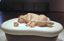
Patricia Piccinini’s “The Young Family” is utterly fabulous and creepy. Piccinini may be all about ecology, but this piece takes a leap into the people as beasts or beasts as people. The flesh and hair, the family with their tight relationships so like our own, the near human-ness is a shocking reminder that we aren’t so refined under the cloth and the beasts aren’t so beastly as we like to pretend (image at top, “The Young Family”).
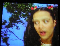 The vision of “nature” in a video from Tokyo artist Motshiko Odani, “Rompers,” looks a lot like the green dell in “Willie Wonka and the Chocolate Factory,” intense greens with candy colors all around. The main focus is on a cute-cute, singing girl sitting on a tree branch, swinging her legs. But she’s got strange, amphibian eyes and a long tongue that shoots out to capture a passing bee in its forked tip. Other features here include June Taylor bees dancing, and honey-dripping orifices (we won’t go there) in the tree bark. Mutant birds and frogs with ears dart through the frames, too. The piece is mesmerizing. I sat through it twice.
Odani also had a stuffed baby deer fit with metal orthopedic devices, a sharp reminder of how differently we think of animals than of humans. The devices look like instruments of torture although they are holding up the little creature, perhaps enabling it to walk.
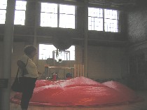 And when it comes to beasts and mechanics, Brian Conley’s “Pseudanuran Gigantica,” or fake frog, was a giant orange bladder that blew up and emptied and made frog noises. The mechanics of it all reminded me of Tim Hawkinson, but the focus was not on the artist but the frog. I don’t know that I thought it was so enlightening about our relationship with frogs, but it sure was funny and served as a nice reminder of the miracle of how creatures can do what they do and be what they be (for our posts on Hawkinson, go here and here).
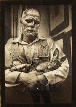 Sharing the space with Conley were two Joseph Beuys pieces. The photograph taken during a Beuys performance, stole my heart, “How to Explain Pictures to a Dead Hare,” probably because someone else took the photo. Beuys is covered with honey and gold leaf, which doesn’t really transform him from human. He looks utterly lost and sad as he talks to the dead rabbit cradled in his arms. As an image, it communicates beyond the hermetic limits of Beuys’ loopy ideas. Beuys also had an installation up, borrowed from the Philadelphia Museum of art, “Lightning With Stag in its Glare.” The lightning is a literal lightening shape cast in bronze–not so pleasing and a reminder of a certain other lightenings sculpture around here that no one likes–and all around are chunks that look like poop and body parts plus an ironing board (the stag) and a cart (well, a goat of course). The single picture overpowered all this sturm and drang.
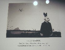 South African artist Jane Alexander’s pictures are of masked people transmogrified into a strange otherness. They stand in familiar but surreal-seeming spaces in the context of a land where race issues and exploitation linger (image from the “African Adventure Series”–this image “Bom Boys, Lonely Boys, Fancy Boys, Sexy Boys; National Road 1: Bom Boy with workers and traffic.”
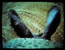 Back to the video realm, Sam Easterson attached tiny video cameras on to creatures big and small to get the world from their point of view in “Animal, Vegetable, Video.” The ongoing series offers sound as well. In the video (video still to left) we hear the rabbit or whatever it is chomping continuously, for example. At first I thought the creatures were faux and this was an act of imagination. I like it better my way.
Winning the award for the funniest videos was Ann-Sofi Siden’s “NK, QM Visits the Perfume Counter,” part of her “The Queen of Mude Museum” installation. In it, the queen, naked but for boots and a thick coating of mud, goes shoping for perfume in a real department store. One of the sales clerks says, “Excuse me, do you have permission to do this?” Clerks spray perfume in her direction and she sniffs like any customer would. And when it looks like the jig is up, she heads for the door, calling back to her videographer, “Whatever happens, hold on to the tape.”
Roberta and I had seen a different piece of this series at the 1999 Carnegie International, when Mud Queen slithers her way into the home of a psychologist. The piece was dense with psychological tension and symbolism–mother-daughter, animal-human, civilized id-untamed libido– that weighed it down. But the perfume en-counter, which is earlier work, stays light as air at the same time that it makes similar points.
I was too tired at that point to give Siden’s museum installation serious consideration.
 Rachel Berwick’s“Lonesome George” installation included a brief video of a giant turtle startling and drawing in. Berwick invites us to sympathize with the great beast terrified and responding to some off-camera threat (no doubt the camera and the human beast behind it). What makes the video pack a punch is the point of view from the ground looking up. The video stands head and shoulders above the rest of Berwick’s installation of white sails and fans. But I liked the bench for viewing the video.
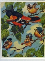 And in the realm of painting and collage, Michael Oatman borrows and alters familiar, kitsch images. His “Familiar Songbirds,” 2 and 3, are kind of obvious but not so obvious. In the context of the show, it’s nature fighting back. But without the context, it’s Hitler Youth singing and dancing, more of an anti-war, anti-conformity message. Either way, the kitschiness of the source material saves them from heavy-handed didacticism. Oatman also had a really great pair of horizontal scrolls of collage and spray paint on paper that tackle the perfect world of advertising and the American dream home (image left, “Familiar Songbirds III”).
Others in the show were Mark Dion, Kathy High, Natalie Jeremijenko and Nicholas Lampert, whose enormous black-and-white digital printed drawings of machine-beasts were papered on the wall.
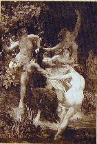 Lampert’s work talked directly to work in another exhibit, “Creature Discomfort: Hybrid Humans on Paper,” of beautiful prints from the likes of Durer and Bosch and Goya, put the theme of man as beast and beast as man in some art historical context. I am including this particular print, “Nymphs and Satyr,” attributed to Felix Bracquemond, c. 1873, because of its relationship to work I had seen and loved by William Villalongo at the Studio Museum in Harlem (see post)


