 I’m just plain crazy about murals. I drive extra miles just to pass by my favorites. I love them because they bring art out of the gallery, and they have to make a transition from private treasure to something that reflects the public and its values. That’s a tall order, and not all murals succeed.
I’ve been mulling over murals lately, wondering why some are more successful than others. I haven’t been able to come up with a formula, yet.
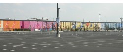
With this in mind, I went for a look at the city’s newest largest mural–a whopping 30,000 square feet–painted by artist Don Gensler on the west side of the old Acme warehouse on Darien Street, facing Lincoln Financial Field.
The Philadelphia Eagles paid for this mural, which is so long that you can’t take it all in at once (see photo detail above), even if you’re standing way back in the Linc parking lot. To see both ends, you have to move your head.
The big mural involved a big number of people. About 250 children contributed images of themselves and their hopes and dreams. Somehow, Gensler had to come up with a design that incorporated the children’s images with his own in some coherent, overall design that would be acceptable to the corporate sponsor.
Did he succeed? Yes and no.
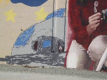
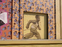 But the weakest part wasn’t the kids’ contributions. Gensler made what they contributed look great, like the scribble-scrabble picture tucked in near the giant kneeling figure (shown above), or the little cartoony images polka-dotting the area around the giant runner (shown left).
Close up, the mural is pretty satisfying. In fact, it’s the surprise of the kids stuff, busy, crunchy, non-standard, emerging from behind the giant, professionally designed figures that gives the mural its zing and helps carry it along from panel to panel.
But from far away, the details disappear behind the impact of the intense colors and the giant figures. Without the links of the crunchy details in sight, the mural does not hang together, and many of the giant figures seem expected, predictable. The repeated running figure of a cute little kid seemed glib, and it fails to tie the panels together.
 Other giant figures work with panache. Take this one, which, here in Sports Central across from the Linc, looks like a kid with something else on his mind. Somehow, Gensler managed to tip his hat to the sponsoring corporation with a running child and still tuck in a reading, pensive child. That surprise–and the ambiguity of the reader’s posture– helps keep the mural alive.
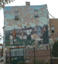 I don’t always like a mural the first time I see it. Sometimes I think a mural is boring or trite or uninspired until I pass it for the 14th time, and then suddenly it seems a welcome part of the neighborhood, like the Karl Yoder Cedar Park mural at 49th and Baltimore (shown). One day, the tree against the sky took on a magical glow I had failed to notice previously. Now I look for that magic every time I pass by.
Some murals never get better, like the corporate paean to nursing at Broad and Vine. It never rises above literal.
With these thoughts in mind, my guess is I’ll grow to love this mural too. But it isn’t really love at first sight.


