 There’s a whole cohort of African-American artists who have achieved prominence in the past decade for their work that seems to use racist stereotypes and to undercut them. I’m thinking about Kerry James Marshall , with his “Rythm Mastr” comics, Michael Ray Charles with his advertising and comic book images and Kara Walker and her antebellum-style silhouettes.
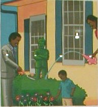
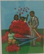 For our first stop in New York on Thursday, we visited the group show “Internal Excess” at the Drawing Center in Soho (I went to see local artists Astrid Bowlby’s and Christine Hiebert’s work hanging in the Big Apple). The premise of the show seemed kind of wobbly in relation to what hung, but one new name that was a standout to me was Lamar Peterson. The affect of his style is pure children’s-book, school-book illustrations of happy, Ozzie-and-Harriet families. The colors are intense and beautiful and flat. But the content is bitter, with too-wide grins on the African-American family members shown watering and trimming the white Bush topiary in their garden (top), or raking the blood red autumn leaves that cover the child like tar and feathers (right).
The work, with its clarity of intent, its control of color and line, and its anger left me breathless.
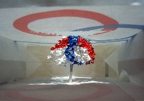 Other work that was new to me and of interest was a group of fast-food and other brand-name emblazoned paper bags holding tiny paper cut-out trees, which were cut with amazing detail out of one side of the bag by artist Yuken Teruya (image show is similar to those in show). Each bag was beautifully detailed and pristine, but I want to see what else she has to say with her amazing technique.
I was not surprised by the presence of a completely non-drawn item in a drawing show, given that drawing has taken all works on paper into its domain, but I just want to complain that the designation seems silly and counter-intuitive.
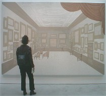 We dashed off to Chelsea after the Drawing Center, and among the work that was a surprise to me were some large paintings by Kevin Zucker at Mary Boone Gallery, a gallery I usually love to hate. But the work seemed kind of interesting to me. Its architectural content, severe perspective and enormous scale made the paintings seem like stage sets or real spaces, waiting for the viewer to step right inside. With the bottom edge above floor level, the paintings barely held on to their window/painting qualities. They wanted to be floor-to-ceiling openings into a new room.
The austerity and tight lines (produced with the help of digital renderings) of the work reminded me of blueprints and architectural elevations, but I’m a sucker for color, and the minimal color seemed repressed, as did the spaces themselves. Paintings on the other side of the gallery were grayed out, wall-papery still lifes, decorations for the old-fashioned spaces in the large pieces. For the life of me, however, I cannot figure out why anyone would find this as interesting subject matter in the year 2003. The multi-step technique of transfering the computer imagery to the canvas, however, seemed kind of interesting, but a lot of work without enough payback.
 Some likable tiny paintings, mostly portraits, by Connecticut artist Helen Byler caught my eye at George Billis Gallery, perhaps because they had a touch of Philadelphia conservatism mixed in their style. This series of a dog catching a tennis ball also brought to mind the Eadweard Muybridge studies of people and animals in motion. But Byler brings affection and humor to the images, avoiding Muybridge’s tone of a Victorian science experiment instigated by a preternatural curiosity.
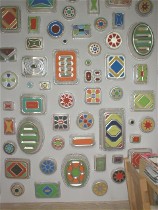 And crossing the line between 2-D and 3, between fine art and folk art, the painted baking tins of B. Wurtz at Feature Gallery caught my eye. Feature’s displays have caught my eye before. And the Vincent Fecteau piece mentioned in yesterday’s blog was also at Feature.
Wurtz’s pans are found objects (or donated objects), and his painting highlights the variety of forms such a seemingly straightforward consumer good can take. I am reminded of African baskets woven of colorful phone wire and of hubcaps. Wurtz is also working the space between collecting and creating. And at the end of my day, it felt like an easy place to be.


