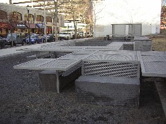
Andrea Blum, detail of Plateau
Any number of local organizations have been reminded in the past year of what a crap shoot a commissioned artwork is (no point in naming names once again).
The latest organization to roll the dice and lose is the University of Pennsylvania, which has recently installed a piece of public art, “Plateau,” on 40th Street, at the western edge of the campus (except that’s not really accurate, since Penn continues to creep further and further west, building by building).
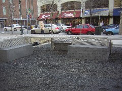
Plateau and stores across the street
In Plateau, artist Andrea Blum has created tables and benches dividing the campus green ending at 40th between Walnut and Locust streets, and the “community”–I put this in quotes because the building on the other side of the street belongs to Penn, too–a row of shops and restaurants. The 15 x 150-foot-plus Plateau, of perforated stainless steel and of concrete, in photographs appears nearly invisible.
But in the real world, it looks dark and menacing. It’s uninviting, even forbidding, a sort of no-man’s land.
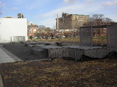
62 degrees, no customers
When I say no man’s land I mean it. It was a balmy 62 degrees and sunny yesterday, so I headed out to see if Plateau’s dark gray benches, tables and screens would attract the lunch-time crowd. Not a man or woman or child ventured across the dark gray concrete lip and the black gravel underfoot to use Plateau.
I totally get that the committee (which included the ICA’s Claudia Gould and Penn’s campus architect Charlie Newman–people with some visual expertise) might have thought the piece would be kind of transparent and invisible, matching the gray, rectilinear cityscape, a sort of low, non-fence fence with a shady pavillion at each end.
They made a mistake. Since Plateau’s erection, a flurry of articles in the Daily Pennsylvanian and one in the University City Review have attacked the thing. Not that attacks on a new public piece means that much.
I called Susan Davis, the sweetest lady on earth, who heads the Philadelphia Redevelopment Authority’s Percent for Art program. She said that all new public art projects elicit strong negative reactions when they first appear.
Then she defended Plateau: “It’s a terrible time of the year. … Let’s give it a chance when the planting is done and the lights are on and the weather is warm.”
But I can’t seem to find anyone at Penn who thinks any planting or landscaping remains to be done. Yesterday, the weather was warm enough for people to sit on the benches. And the lights are indeed on. I’ve included a night image to prove the point.
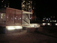
Plateau detail at night
And speaking of night, Plateau is definitely improved by the lighting. But the spaces still look chilly and uninviting. This is partly because the lights, like the piece itself, have a high-tech, architectural look. They are long tubes that bring to mind office fluorescents. The piece is the embodiment of the TV show, “The Office,” which is the embodiment of the bureaucratic culture at Penn, by the way. So I suppose we can say the artist nailed it.
While that’s well and good, it’s a questionable trait for public art, which must meet a different standard than other art. Public art has an obligation to reflect the way that a community prefers to see itself and its values.
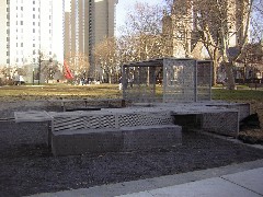
Plateau and brute modern Penn high rises
So part of what’s wrong with Plateau is it reflects the actuality of Penn, and not Penn as it prefers to see itself. As for reflecting values of the neighboring community of Victorian-home preservationists, liberals, libertarians, intellectuals, Plateau certainly missed that boat.
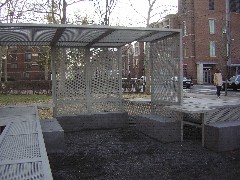
Inside look at a pavillion
Perhaps the cage-like pavillions will provide welcome shade in summer, but that alone can’t ameliorate the grimness, which brings to my mind a prison refectory with the tables and chairs bolted down to resist misuse by the criminals.
Besides, I’d like to raise Roberta’s favorite complaint about so much public “art” these days–why are we squandering one-percent-for-art money on seating arrangements?
There’s some funny background here. The money for this project was held in escrow from past development at 36th and Walnut. At that time, a Vito Acconci seating arrangement was rejected as inappropriate for a variety of reasons. I actually think some of the reasons made sense–too many blocked sight lines inviting lurkers and hiding nearby businesses. But the work was a hoot–little ivy-covered jungle huts for sipping lattes. At least it was quirky and brought greenery to the gray cement expanse of sidewalk.
As for the conventional cafe tables now arranged at 36th, they look fine enough to invite sitters even in cold weather.
Somewhere, I heard that the artist would receive a large payment if the piece were removed (if you look at Blum’s history, she has had work removed in the past). One of my friends, an artist herself, suggested to me that a clause like that was screwy, an incentive to create something ugly. Good point–get paid twice. (However, I do understand why such a clause also makes some sense, given the fate of “M. La Chamarre,” Dubuffet’s Centre Square sculpture removed from its original home by the fates and changing owners).
I’m hoping Susan Davis is right and I’ll have to eat these words in the spring, when the grass grows greener and we have grown accustomed to a wintery Plateau.


