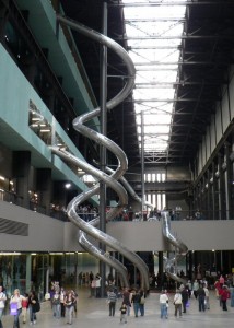
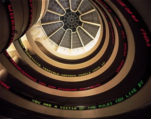
I’ve been thinking for a while about Lobby Art – art in museum lobbies, that is. Not all museums feature Lobby Art; for some, such as the Guggenheim, the Philadelphia Museum of Art or the Art Institute of Chicago, the architecture suffices to create an ambiance for the entry areas, although certain artists, notably Jenny Holzer and Rebecca Horn, have taken on the Guggenheim’s central void to spectacular effect, and one might consider the Tate Modern’s Turbine Hall as the apotheosis of artist project lobbies.
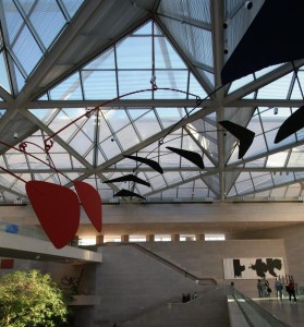
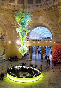
The lobby of the National Gallery of Art’s East Wing is on the scale of an airport, and consequently mostly displays art commissioned for it, (a Calder mobile and Motherwell painting, below) whose gigantism does not reveal the artists at their best. The Victoria and Albert Museum commissioned their own oversized chandelier from Dale Chihuly; it’s not to my taste, but the scale is right, and is probably an appropriate message for a museum of decorative arts. The Metropolitan Museum of Art’s lobby features flowers, for which they have a dedicated endowment; they are the biggest arrangements I’ve ever seen, and spectacularly effective because of their scale (and the florist’s great skill), although I’m certain that museum staff would rather the funds were available for other purposes.
Then there’s the Museum of Modern Art (MoMA). John Yau wrote an article in 1988, Please Wait by the Coatroom; Wifredo Lam in the Museum of Modern Art, about MoMA’s choice to hang Lam’s masterpiece, The Jungle, in the lobby on the way to the coatroom (this was before Tanaguchi’s addition). Yau’s point was that MoMA had no place for an Afro-Cuban artist in its Euro-centric history of Modernism. Well, thanks to Patricia Phelps de Cisneros’ money and influence, Lam and his Latin American colleagues are much more in evidence in MoMA’s current collection galleries; but Lam’s painting in MoMA’s lobby reveals one consideration in choosing Lobby Art: the work’s safety. The Lam could be hung in the lobby because it was under glass, and large as it was, it was glazed because it was painted on paper, since large canvas was unavailable in Havana during WWII. At one point the museum replaced the Lam with a large Milton Avery, which looked dreadful behind glass (or was it plexi?).
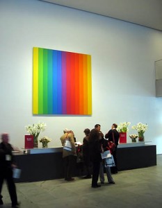
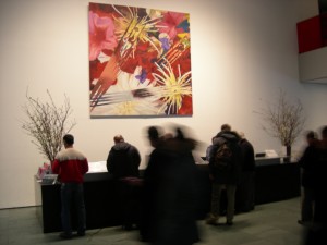
On one wall of MoMA’s current lobby paintings are hung very high above the information desk, which obviates the problem of glass. The paintings are seen from quite a distance, however, which seems to be a major factor in their selection: they need wall presence.
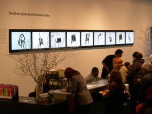
The lower-ceilinged 53rd St. entrance to MoMA’s lobby currently features considerably more imaginative solutions to the choice of Lobby Art. The bank of video monitors above the ticket desk, which usually features information on current exhibitions and programs, has been given over to Arturo Herrera’s series of video drawings, which are part of the fantastic exhibition on the 6th floor, On Line; Drawing through the 20th Century. Exhibiting time-based art on the monitors is a particularly inspired choice, so that visitors on line (no pun on the exhibition title intended) can make productive use of their wait. I hope the museum considers using the monitors for art on a regular basis.
Across from the ticket counter, behind and beside the rare bit of seating that MoMA offers, is a two-part installation by Paula Hayes, Nocturn of the Limax Maximus (on view through Feb. 28, 2011). It consists of a horizontal wall-hung piece (the Slug) and a free-standing, vertical form (the Egg), both of which house rather magical, miniature gardens. Most of the lobby visitors rushed by, but for those who stopped it offered the fascination of actual nature, captured and displaced within MoMA’s temple of culture.
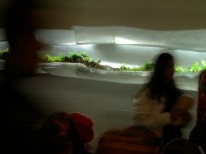

Each terrarium has its own lighting (full-spectrum grow lights), which creates a luminous glow that beacons to the viewer, giving the impression that they might be alien environments come for a brief visit before returning to outer space. I could look at plants all day, and the minuscule size of Hayes’ specimens – the tiniest ivies and begonias I’ve ever seen – fascinated me, as did the question of how she created sufficient ambient moisture in the horizontal Slug, which is entirely open at the front.
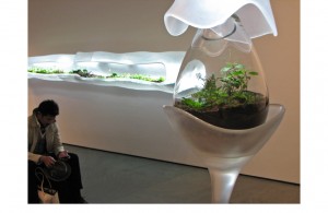
Hays chose the work’s title Limax Maximus, the proper name of a garden slug, after seeing a video of amorous slugs on YouTube. That reminds me of one of the best bits of filmed erotica I’ve ever seen: in Microcosmos (1996, the film was recommended to me by an artist friend), where the fully-depicted sex involved two tender and sticky snails. If any slugs lurked in Hayes’ lobby vitrines, they’d have been invisible to the naked eye. The installation, organized by Ann Temkin, is a rare treat and quite a stretch for MoMA. The fact that it’s accessible to a broad public in no way diminishes its interest.


