Two magazines, Carrier Pigeon and LPV, came in the mailbox recently and while they are nothing alike they both have this in common: enthusiasm. This post will essay Carrier Pigeon’s charms. In another post I’ll write about LPV, a photo magazine.

Carrier Pigeon, a quarterly magazine of illustrated fiction and fine art, launched last fall with a 95-page publication that positively burbles over with its embrace of life’s darker reaches. Throughout the issue, ($25, at outlets in New York or subscribe online at their website) the writers and artists demonstrate that they are the sons and daughters of Cormac McCarthy and Goya: They are on The Road making Caprichos for the modern era.
The oversize quarterly, at 10×13″, is run by artists and dedicated to giving the artists and writers included “unconditional artistic freedom in both direct subject matter and the interpretation of text.” This is wonderful for the 12 artists included in the issue I saw. They are represented in depth, with several images and in some cases several pages worth of images. At some point, the magazine may want to consider adding a curatorial hand, since some of the illustrations were weaker and could have been cut without really hurting the content.

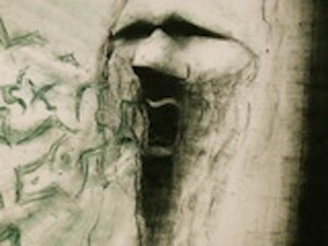
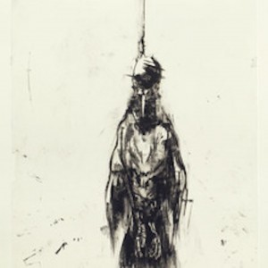
The best of the stories is “Walter’s Ladder” by Brian Thompson, an elliptical tale of a guy building a ladder to heaven. People climb and fall off and everyone’s resigned to Walter’s activity of building a long, long ladder, even when it takes over the neighborhood. The illustrations and fine art run the gamut from doodle-like line drawings to obsessive and decorative drawings to architectural renderings to figures and washy illustrational works. Stand outs are the dead and bleeding-out goose on P. 71 by Yuriko Katori. Also memorably sad, sad are two monoprints on the publication’s inside front and back covers by Russ Spitkovsky— images of dead birds hanging by the neck or feet, in the latter case, with mouth open, wings outspread, for all the world an upside down crucifixion. The cover’s striking image (top) is emblematic of what’s inside. Bruce Waldman‘s “Mountain Scream” depicts a long-haired dude with Ray-Ban-like black holes for eyes whose open mouth seems to be discharging a flock of bats and other missiles. It’s a gripping and somehow hip image, and beautiful in a way. Unlike a pretty carrier pigeon, this fearsome messenger has something dire to announce.
Ultimately, this is not a general interest publication, even for a hard core art and short story enthusiast, unless you’re a fan of this downbeat art and literature. But the future of the magazine — which just completed a successful $10,000 Kickstarter campaign and obviously has fans — lies with the artists and writers chosen. Therein lies the editorial control. Whoever selected the work for Carrier Pigeon’s first issue chose narrowly. But, like I said, it’s only one issue and Issue 2 appears to be slightly different in tone. In any event, the publication’s ambition is high, its paper printout is of high quality and I think we might see this carrier pigeon fly.
Look for more magazine talk, on LPV Magazine, in another post, soon, I hope.


