A few short out-takes from our trip last Thursday.
Tracey Moffatt at Stux
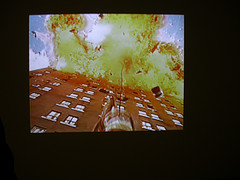
Tracey Moffatt, disaster sequence from Doomed.
Tracey Moffatt’s “Doomed” at Stux Gallery is a video loop that’s keep-it-simple-stupid terrific. The Australian artist (Colette told you about her Scorpio project, also on view at the gallery culled disaster sequences from Hollywood blockbusters and merged them into a melange of murder and mayhem, of bodies falling, cars careening off buildings, fireballs everywhere.
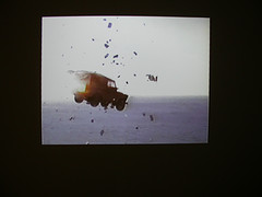
Doomed disaster
There’s a musical score that accompanies that’s right out of the chase scenes of a movie. The piece, projected large in the gallery’s balcony space and also running on a monitor in the window, is a tour de force condensing everyone’s worst nightmare into visual eye candy. Denuded of the context, the short clips still provoke a stomach-churning response. And because you’re free to impose your own story when there is none given (I always feel free to do that anyway) the idea of non-stop devastation, most of it man-made, is political and a commentary on the news of the world.
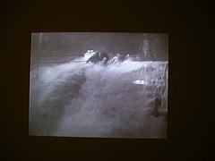
Death by water, by fire, by explosion. You get it all in Moffatt’s compact package.
Hollywood is a follower and not a leader when it comes to depicting issues. But here, Moffatt has shown how they’ve been beating the drumbeat of disaster for years. It’s Action News clips without the cheesy anchors describing the scene. Thumbs up on this.
By the way, the artist was in the gallery when we were there. We didn’t see her til we were on the way out when a large group came in with a guide to see the Scorpio works and they got into a conversation with the artist. (They were talking about how many of them were Scorpios. My comment on the Scorpio project? It’s riding the zodiac to new depths of uninterestingness. Didn’t go far enough).
Justin Lieberman at Zach Feuer
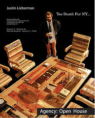
Poster for Justin Lieberman’s exhibit at Zach Feuer Gallery
Justin Lieberman’s exhibit “Agency: Open House” at Zach Feuer is a critique of advertising and corporate culture and the most notable thing about it is the faux board room the artist constructed for some cigarette-smoking group of Madison Avenue mish-moshers, a place where the magic of constructing ad campaigns happens, a place where trickery and thievery are prized and ethics and morality have no seat at the table.
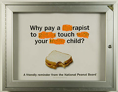
Justin Lieberman, from his show at Zach Feuer.
Lieberman made a book to accompany the show, something I’ve been seeing more and more of. I bought the book ($15–I love the prices of these self-produced books–how do they do it?) and while flipping through the collages I noticed a familiar image. The artist subverts source materials like ads and tweaks them by adding new stuff–like his own image or some white out (ala Andrew Jeffrey Wright‘s The Manipulators). Anyway, the familiar image is a Henry Darger composite with pictures of little girl doll heads (or Jon Benet look-alikes, ie “real” dolls) superimposed on the heads of Darger’s girl warriors. Lieberman’s bio says he’s shown in Philadelphia at Vox Pop in 2004, “A Different World: Oni & Philly”, see post.
The book’s nicely done with a mix of outrageous (hard-core porn images, one of them extremely transgressive involving a woman who looks demented and a horse) and less so. The entirety projected the air of a collage sketchbook–but run through an editing process, maybe even something similar to what would happen in that corporate board room. Question: What image will stir the viewer most? Answer, the porn. Let’s put it on the insides of the front and back cover–maybe we’ll sell a lot of books that way!
Miguel Luciano at Cue Art
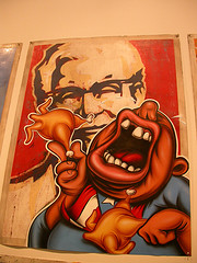
Miguel Luciano’s advertising subversion at Cue Art
Speaking of advertising and its subliminal messages Miguel Luciano‘s subversive posters at Cue Art have a streetwise persona that owes something to Peter Saul and to Barry McGee‘s street art. Luciano’s anti-corporate posters are in some cases a little too close to the real thing to be effective–the message is somehow devoured by the beautiful graphic design and so what you remember is the beauty, which they have in spades. Luciano also constructed a manga-like character with hair made of plantains/bananas. The artist not only has comic-ready drawings of the character in action but also fashioned what looks like a sign ready to go to a comix convention — and a Jeff Koonsian sculptural object — a silver banana which sits in a vitrine in the gallery. Pretty interesting. I have more photos of Luciano’s works at flickr.
Paul Laffoley at Kent
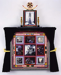
Paul Laffoley
PICKMAN’S MEPHITIC MODELS
2004
Oil, acrylic, ink and vinyl lettering on canvas, curtains
66 1/4 x 50 5/8 in
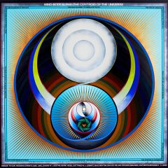
The visionary maker of systems paintings — loopy, psychedelic posters about sex, power, cleansing, energy and the cosmic female — has a show up now at Kent Gallery that spans three decades of work, from the 1980s to 2004, and the newer works involve altars with fabric, bones and other touches. If you’ve never seen the work, it’s a must-see. Lafolley was in a group show, Utopias, I saw at Kohler Art Center last summer (see post).


