Student shows are up and running, some already gone and more coming soon. What I get to see of these shows is generally a little random. Often I haven’t a clue which show to choose, and even if I do have a clue, I often can’t get there in time.
So here’s a short picture post of some highlight from what I’ve seen.
Moore College of Art and Design’s graduating seniors show, at the Galleries at Moore, up until May 18, is great, and the illustration students rock the gallery. I admired every one of them. Here are a short sample just to give you a sense of the quality and the wit.
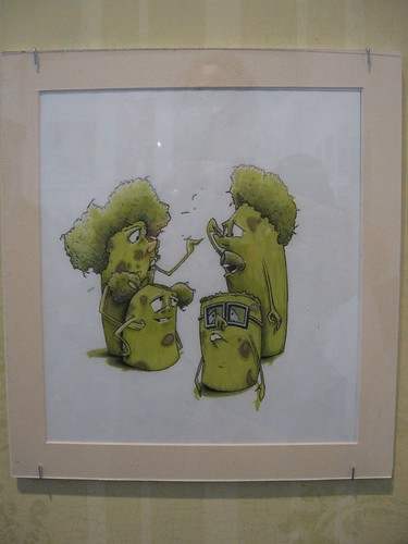
Kristen Travers’ pickle people look like the next generation heirs to the California raisins.
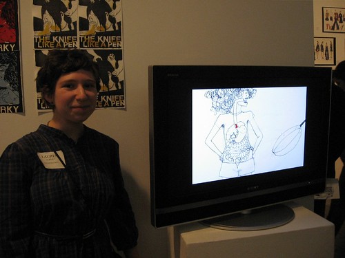
Lauren Albert with her video Like a Pen
The video Like a Pen by illustration student Lauren Albert follows an ordinary girl who becomes a supergirl shark of the sea and swallows and friend. Love and hate become confused and the imagery is delicious. You can see it on Albert’s website here.
Other illustrators who caught my eye were Katie Glisson, Angelina Wakely, and Ebony H. Segers, the latter drawing portraits of African American heroes for a retelling of history.
The fine arts were not as strong as a group, but here’s some of what I thought was great–
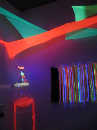
Stacia Eve Paul, Synthetic Experience installation
Stacia Eve Paul’s installation of black-light glowing hair and fabric turned a space into a funhouse. I don’t know that I got much out of this on the level of ideas, but it made great looking, and Stacia herself donned a dress that also glowed. I enjoyed the synthetic hair piece–it’s the 3-D ribbon painting update on the right, and it takes the girl identity thing into the zone of entertainment and light shows.
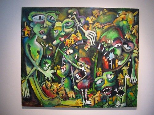
Donna Blichasz’s large painting, My Mind Bridges the Gap Between Us, is German Expressionism with a sense of humor. She and her friend Kellyann Catenacci, whose painting was sort of similar, but not, and also pretty great, made some wonderful collaborative drawings together under the name BlinchiCat. Natch, I had a soft place in my heart for the collaborators. Besides, they made good work!
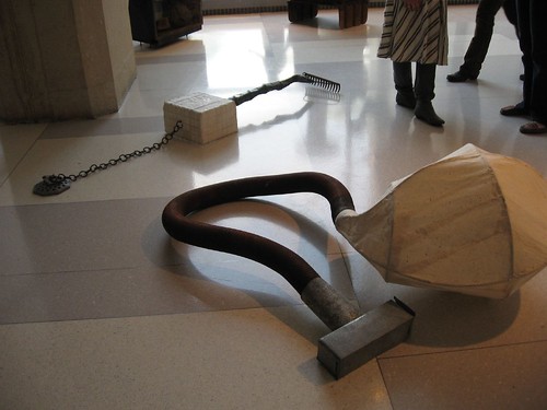
Here are a couple of Victoria Senseny’s what-is-it sculptures:
Senseny commanded the front space by the windows near the guard desk. Other work I admired was by Samantha Hill (she’s in a show we’re curating for Projects Gallery, so I don’t want to say more, right now), Cat Badger, Taryn Brooke Holloway and Krista Rothwell.
I was impressed by how well-organized the exhibit was. Each student stood next to her work on opening night, with business cards mounted on the wall for the taking. Very professional.
I also stopped at one of the Tyler School of Art exhibits of senior work in an enormous raw space at Broad and Cecil B. Moore.
Here’s some info sent us by Marilyn Holsing about the show, which is put on by the Department of Art & Art Education:
Tower Investments very generously loaned our department a huge raw space at the corner of Cecil B Moore and Broad Streets (1600 N. Broad St, second floor) for our 40th annual student show and our Senior Seminar Show which we have combined this year. Pepon [Osorio] and a small crew of students transformed the space into a first class temporary exhibition space by building walls. It was a huge undertaking.
Not only is the space spectacular but so is the student work which includes everything from traditional painting and drawing through digital work and sculpture.
The tone here reflected the tone of the school–hey, kids, let’s put on a show! Here are a few samples of work I especially liked.
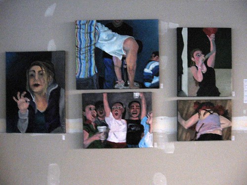
Nicole Roche‘s suite of paintings about her friends partying hearty capture the wildness–and seediness–of drunken bar scenes. No one else’s work looked anything like these (one of the problems with this show overall were lots of class groupings with assignments flattening the individuality of the students).
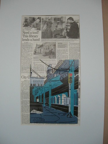
Sarah Lu, The Urban Environment, 2008, series of 5, reduction print and lithography on newspaper with collage, 22 x 12 inches
I liked Sarah Lu‘s prints in which the newspaper page becomes the urban grid itself, and the way the print appears works kinds of the way that in real life the eye settles on something in the larger context and sees it in color while all else fades back.
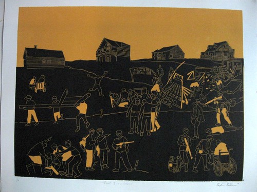
Benjamin Tellie, Four Lonely Cabins, two color reduction print
Benjamin Tellie‘s prints interested me for how his ghostly outline style of drawing matched the ghostly, non-photographic quality of his subject matter–depictions of his grandfather’s experiences in WW I. The scenes look rather unlikely to me, with soldiers and the injured and men with guns all milling around–but that’s part of their charm and mystery.
There was lots more there worthy of mention, but I’m stopping here. The Tyler show will be up today and open until 6 and Thurs May 1 and Fri May 2 and Mon May 5 from 12 to 6. However part of the show may be taken down on Monday due to a time crunch.


