We dithered and waffled on what to see in our day trip to New York last week finally settling on shows in Chelsea and Soho that talked to our concerns about beauty in contemporary art. Beauty is back of course. That’s nothing any observer of the scene has missed by now, with gorgeous public art by Anish Kapoor and the embrace of beauty in even the most tetchy conceptual realms (Kara Walker). But is it “beauty” or beauty? Is it something wry and ironic or a new push to aesthetic pleasure. In a world of electronic and cyber-bombardment whose aesthetic is cold-cold-cold and pretty but not really beautiful (Jeremy Blake and a few others excepted), how do you really define beauty?
Our selected stops included big fish and smaller, some international superstars and a couple Philly folks. Here’s a quick trot around the block with us as we try to get a grip on the good, the bad and the beautiful.
Perfection
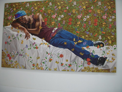
Kehinde Wiley, Morpheus, 2008, Oil on canvas, 108 x 180 inches (274.3 x 457.2 cm), Source Imagery: Jean-Antoine Houdon
We started with what we thought would be the most beautiful and most satisfying visually, Kehinde Wiley, and, it turns out we were right. Of what we saw on Nov. 14, Wiley’s monumental paintings at Deitch Projects, are the most blushingly, awesomely, unapologetically beautiful. Their colors, their layering, their compositions (stolen from old master paintings of religious torture victims and wounded soldiers), their subject (elevation of the black male to new dignity and reverence) — everything comes together in these huge works.
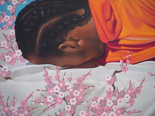
In the press release for the show, Wiley talks about his work in the context of “a type of artistic malaise that exists in current dialog in art where joy is perceived as suspect and where absolute beauty is regarded with disdain.” He got that right. And his work throws down the gauntlet, asking why not embrace the beautiful and paint the human figure. Richard Prince turned the figure in art into a joke (the pulp fiction nurses…the Marlboro man). Wiley’s claiming it back.
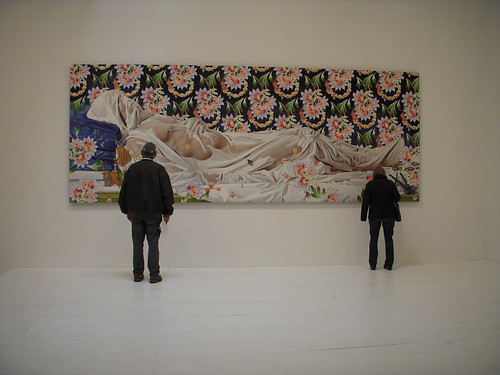
Kehinde Wiley, The Veiled Christ, 2008, Oil on canvas, 82 x 216 inches (208.3 x 548.6 cm), Source Imagery: Giuseppe Sanmartino
Popping these classically-posed figures into flattened, decorative, cyber-influenced space, Wiley suggests a new world where East meets West and old meets new, where lotus or cherry blossoms rain down, Tetris-like, covering the figures with their own kind of feminine beauty. The one work that includes a realistic background, A Dead Soldier, based on a Velasquez painting, is less successful for being a conventional quote from an old master and not something new.
Wiley’s works raise the issue of perfection, something that usually goes hand in hand with beauty. Using sources that are truly aiming for perfect beauty, the works posit a contemporary beauty that’s masculine, feminine and universal.
Imperfection
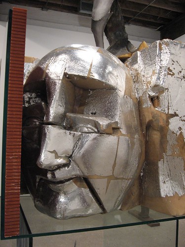
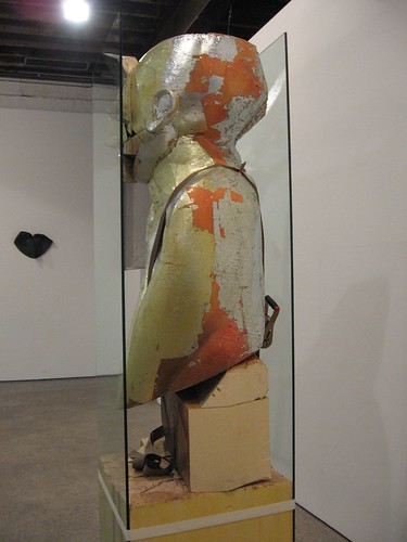
Matthew Monahan at Anton Kern Gallery.
While he’s not creating beauty, Matthew Monahan is definitely all about the idea of what is beautiful. His figurative sculptures are like post-apocalyptic Greek kouros figures that have been trash-picked by a mad archeologist trying to make sense of them. Monahan uses declasse materials (for the New Museum’s Unmonumental he sculpted a piece in florist’s clay). He draws on paper, crumples it up to make it 3-D and places it in a vitrine. Trash of ages, left for me, let me find myself in thee.
Can the Apocalypse be beautiful?
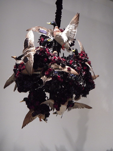
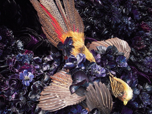
Petah Coyne‘s astonishing array of taxidermy, black velvet and faux roses (red and black) in mountainous piles or low-slung like deadly oil slicks is not so much ugly or beautiful but inexplicably horrible. In a show titled Vermillion Fog she installed one room as Dante’s Inferno and the other as Unforgiven and says the work alludes to literature and film. That may explain it, but it doesn’t redeem it.
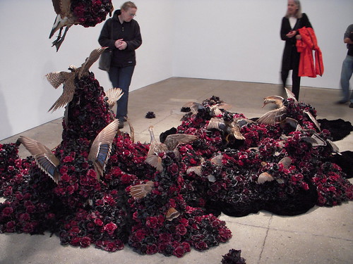
Petah Coyne at Galerie Lelong
We want to compare this with works by that other maker of messy installations, Ed Kienholz. Issues of death and destruction raised in a context of horror and ugliness are hard to look at and are not meant to be beautiful. But this show’s attempt to conjure the abyss seemed more about the darkly decorous than about real human concerns. It’s Victorian at a time when we need to move the discussion forward and not back. We know people who love the show but we — who have loved Coyne’s work in the past — left disappointed.
Film noir beauty
Zhang Xiaogang‘s evocation of life in what looks to be a prison or military base (bare walls that are half grey, half green, bare lightbulbs, surveillance cameras and unremitting sterility) has the kind of dreamy film noir aspect that is hard to call beautiful except in the way Edward Hopper paintings can be beautiful with their yellow light playing over the surfaces not really illuminating but calling attention. It’s seductive and tinged with danger. The large and larger paintings at Pace Wildenstein (25th St.) fetch beauty queen prices ($1.5M, $750,000) and several were sold. Slumber No. 2, an extremely big face tilted down with eyes partly closed is the most arresting image in the show. The skin is so putty colored the person might be a statue and the patch of yellow balanced against the deep black shadows somehow turns this image into a living death mask.
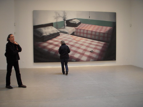
Zhang Xiaogang
Green Wall – Two Single Beds, 2008
oil on canvas
9′ 10-1/8″ x 16′ 4-7/8″ (300 cm x 500 cm)
Pace Wildenstein
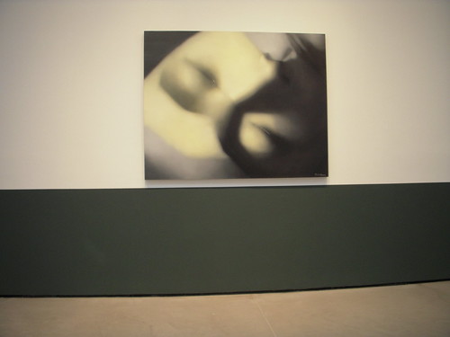
Zhang Xiaogang
Green Wall – Slumber No. 2, 2008
oil on canvas
63″ x 78-3/4″ (160 cm x 200 cm)
Pretty vs. beauty
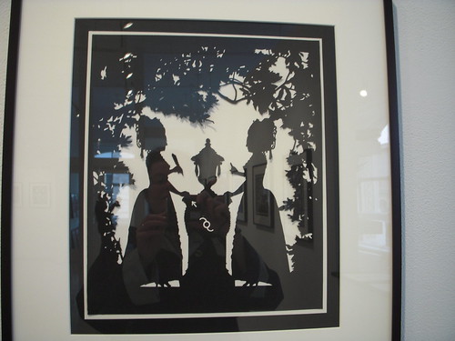
The virtuoso cut paper works of Robert Cumming at Janet Borden remind us of Philadelphia’s master of cut paper, Joe Boruchow, now showing his work at Bean Cafe. (We did a studio visit with Boruchow–look for a post soon.) Cumming’s fancy, lacey cuts are lovely and yet we looked for some deeper content and didn’t really find it. Pretty, or beautiful? Boruchow gives you content to burn in works that don’t shy away from politics and social commentary. Where his works surprise, Cumming’s deliver the expected.
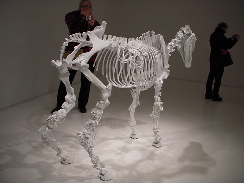
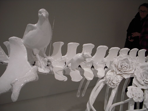
Allesandra Exposito‘s horse world at Mixed Greens is an odd complement to Cumming’s cutouts. Her white painted (real) horse skeleton is like a 3-D cutout. Here the artist has decorated the bones with little florets, some sprigs of asparagas, a bird, a rat…it’s another nature morte in the vein of Petah Coyne yet there is whimsy here — if not beauty.
Now a pause for our local affiliates
artblog pal Rob Matthews‘ show at Daniel Cooney made us happy. Rob’s drawings of his family (the show’s called Kindred) are beautiful but they’re full of his personal spiritual quest. The show’s over now but we were pleased to see that even in this economy five pieces sold!
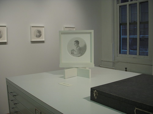
Rob Matthews show at Daniel Cooney.
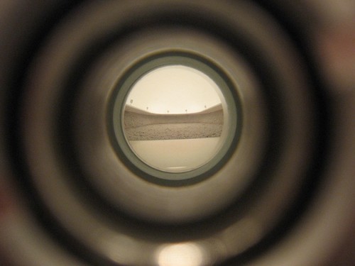
Mark Shetabi, The Public Sphere, peephole installation showing a rock-concert crowd in the thrall of the charismatic Freddy Mercury, lead singer of Queen
In Mark Shetabi‘s show at Jeff Bailey Gallery, his peephole installation, The Public Sphere, has the magic of trompe l’oeil in it, which seduces the same way beauty does.
Ivan Albright already did this, Cindy.
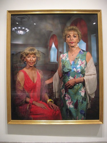
Cindy Sherman at Metro Pictures
Cindy Sherman, who also trades in visual trickery, on the other hand, did not charm us one bit. Maybe we’re a little sensitive to the subject–the folly of aging ladies looking for the fountain of youth. But these are pitiless works–brittle caricatures of made-up, face-lifted women, posing for conventional portrait photographs, and Sherman, herself of a certain age, lost our sympathy here. We took a quick look and ran for the door.
Seduction by spectacle
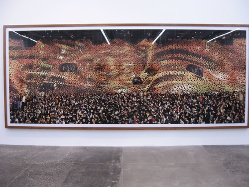
Andreas Gursky, one of several photos of the Cocoon nightclub in Frankfurt, Germany, at Matthew Marks.
Andreas Gursky‘s photos taken in the mega-size Cocoon nightclub in Frankfurt, Germany, also trades in visually ambiguous images. Even after examining the scenes–1,000 teeming bodies dancing in the club; and in another shot the architecture of the club without the fancy lighting–we still couldn’t quite deconstruct what our eyes were seeing.
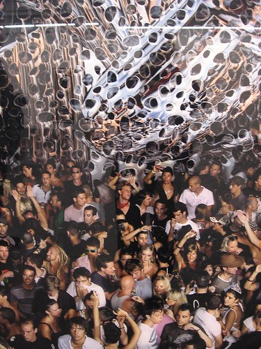
Andreas Gursky, detail from a photo of the Cocoon nightclub in Frankfurt, Germany
So Gursky (and we, too) got to have our cake and eat it. We saw the basics and we still enjoyed the magic of the photos and their seamless trickery. We also loved how the subject matter of a crowd being manipulated by a performer, in this case a DJ, spoke to Mark Shetabi’s crowd being manipulated by Freddy Mercury. There’s a dangerous, bacchanal quality to the mindlessness of the crowd that both these artists capture.
More eye puzzles
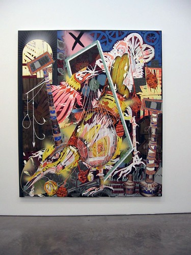
Lari Pittman, Untitled #4
102 x 88 inches
Cel vinyl, acrylic and lacquer spray over gessoed canvas over wood panel
Lari Pittman, at Barbara Gladstone Gallery, also trades in the whiz-bang seduction of the eye. Again, it’s not traditional beauty; in Pittman’s case, it’s a trippy puzzle of layers of paint and imagery that makes us think of thanka art. We asked the gallery staff if Pittman was using printmaking to create the layers, but the answer was no. Apparently, we were not the first the ask the question!
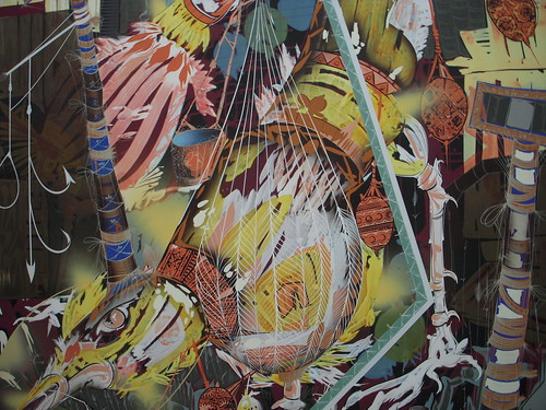
Lari Pittman, Untitled #4 detail,
102 x 88 inches (full painting)
Cel vinyl, acrylic and lacquer spray over gessoed canvas over wood panel
Interestingly, this work manages to hold on to the psychedelic ’60s without looking one bit old!! There’s some cartooniness and pop going on, but there’s also the sometimes bad-boy subject matter–like toilets.
But mostly, it’s the layers and the ambiguity of what’s happening here that thrills in this work. Pittman was featured in the PBS Art 21 series last year.
Beauty of imperfection
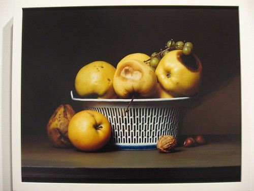
Sharon Core, a still life after Raphaelle Peale. The bowl is pretty close to a white porcelain bowl Peale often used in his still lifes. At Yancey Richardson Gallery.
And speaking of trompe l’oeil and its relationship to beauty, Sharon Core‘s exhibit Early American shows photos of still life set-ups based on the work of 19th century still life artists, particularly Raphaelle Peale. Core comes out high on the beauty scale. Part of the success here of these photos is that they look like trompe l’oeil paintings–a nice double twist. The painted table in each still life is critical to the illusion of paint. The photos capture the still life painting’s close examination of each fruit and object in its view–a morbidly obsessive occupation. At the same time, appropriation and reproduction issues keep these otherwise old-looking beauties fresh and up-to-date. Core was in the show Creative Consumption at Rosenwald-Wolf Gallery (selections from the West Collection focused on food and consuming of resources). Her work there was based on Wayne Thibaud‘s cake and pie arrays.
Pretty satire
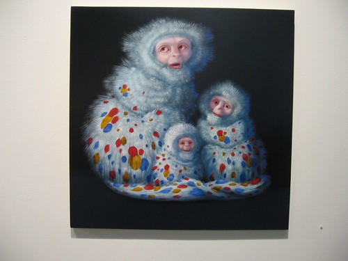
Laurie Hogin, Wonder White, 22 x 22 inches, oil on panel
Not so much beautiful as Pop pretty, Laurie Hogin, at Schroeder Romero, still manages to create something we were happy to look at. Hogin borrows tongue-in-cheek kitschiness for her satirical images of animals–stand-ins for humans in a world gone wrong.
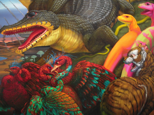
Hogin alligators, detail from her painting The Sleep of Reason Produces Monsters (Diorama with Rozerem), 68 x 84 inches, oil on canvas
What keeps Hogin from falling into kitsch and illustration is her serious content.
We have to reject the idea that beauty is only skin deep. Maybe it’s fairer to say that “pretty” is only skin deep. Beauty has to have some kind of idea or content that rubs and provokes and raises questions about its very nature. And lately, it seems to us that beauty, long in the art world trash bin, is making a comeback.


