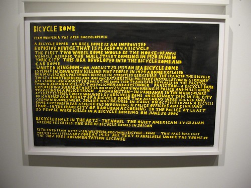
Anthony Campuzano, Bicycle Bomb, 2008, ink on board, 20 x 30 inches
Two Philadelphia galleries are showing art with lots of words–both shows with tie-ins to current exhibitions at the ICA. The galleries are the blue-chip Locks and Fleisher/Ollman, and the shows they have mounted are tip-top.
At Fleisher/Ollman, the group exhibit Rich Text is keying off Touch Sensitive: Anthony Campuzano, an ICA exhibit of the artist’s text-based art.
Besides Campuzano’s drawings which highlight the humor, the horror, the politics and other subtextual meanings revealed by news stories and notes taken out of context and given weight by the sheer effort of drawing the words, Rich Text includes 21 other contemporary, text-inspired artists.
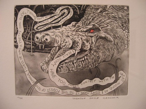
Trenton Doyle Hancock, from Bye and Bye, 2002, portfolio of 9 etchings on paper
17 x 14 inches ea.
Some of them are well-known national and international artists–for example Mel Bochner, Kay Rosen, and Trenton Doyle Hancock. But the Philadelphia artists included, some better known than others, look every bit as strong as the big-name imports.
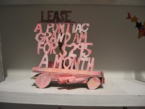
Mark Mahosky, Lease a Pontiac Grand Am For $295 a Month, 2001-08, cardboard & paint, 6 x 5 3/4 x 2 3/4 inches
Philadelphia’s Mark Mahoskey fills four homey little wooden shelves with 41 rickety mixed-media constructions (mostly carboard, paint and wood), each the material embodiment of pop culture slogans, words and phrases like Buy Me 0 Down 0% APR, or Ditty Wah Ditty.
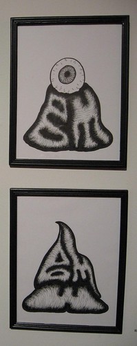
Corporate Logos 2008, micron sharpie on paper, 11 x 8 1/2 inches, each
IBM (right top), BMW (right bottom)
Andrew Jeffrey Wright‘s micron sharpie drawings thoroughly subvert the pompous corporate logo, from his scatalogical BMW to his IBM surveillance rebus to his super-caffeinated, super-wired Comcast. The off-handed freshness gives a sly poke to the values of success, riches and public image.
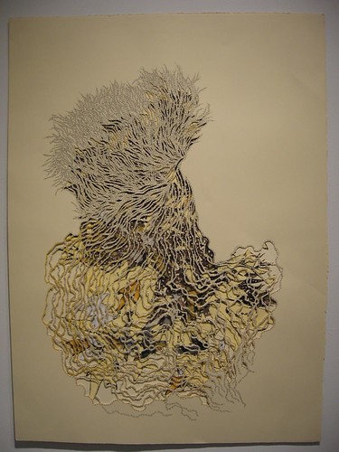
Natasha Bowdoin, Untitled (Trickster Series), 2008, (detail), pencil & gouache on cut paper
Some others in the Philly mix: Natasha Bowdoin’s cut-paper tornadoes of words and wild animals, which talk to Trenton Doyle Hancock’s magic language and wild animal imagery at the far end of the gallery (Bowdoin’s in Texas right now on a residency, and Hancock returned to Texas after getting an MFA from Tyler in 2000).
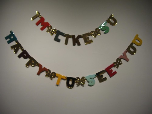
Alex Da Corte, I’m Like So Happy To See You, 2008, paper, enamel, epoxy resin and brass fasteners, dimensions variable
Other home-towners I especially want to note–Alex Da Corte’s insincere welcome-home sign, I’m like so happy to see you, of colored letters pumped with glam resin coatings, and Jayson Scott Musson’s hilarious, anti-P.C. rants against society (maybe these should be zines instead of posters?), and Isaac Resnikoff’s carved, non-functioning books (Resnikoff left Philly for grad school in California).
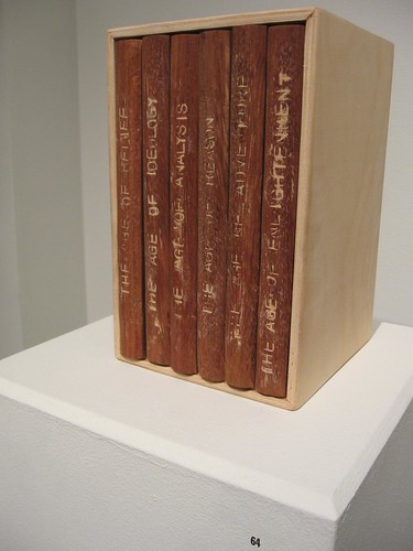
Isaac Resnikoff, The Great Ages, 2008, brazillian, cherry & plywood, 8 3/8 x 5 1/4 x 5 1/2 inches
The overwhelming message in text art is that physical volume speaks volumes–putting the weight back into the overused and the overcooked verbiage that surrounds us.
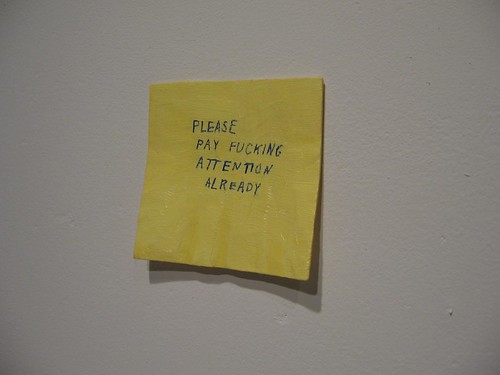
Conrad Bakker, Untitled Project: Postit [Pay Attention], 2009, oil on carved wood
Hence my affection for that Canadian sense of humor in Conrad Bakker’s wood carving of a lowly post-it note, Untitled Project: Postit [Pay Attention].
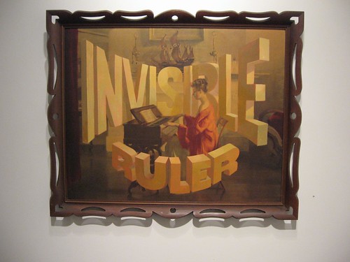
Wayne White, Invisible Ruler, 2009, acrylic on offset lithograph, 28 x 34 inches
The daily barrage of commercial language and lettering becomes monumental in the words Wayne White paints onto found vintage prints (White designed the Pee-Wee’s Playhouse set)!
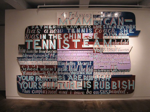
Bob & Roberta Smith, 4th Feb, Tennis Coach, 2007, signwriters paint on board, 100.08 x 109.53 inches
Also using ornate signage letters–on boards that resemble a makeshift wall/assemblage of old-fashioned signs–Bob & Roberta Smith (who is British and one man) makes public signage of off-beat private peeves.
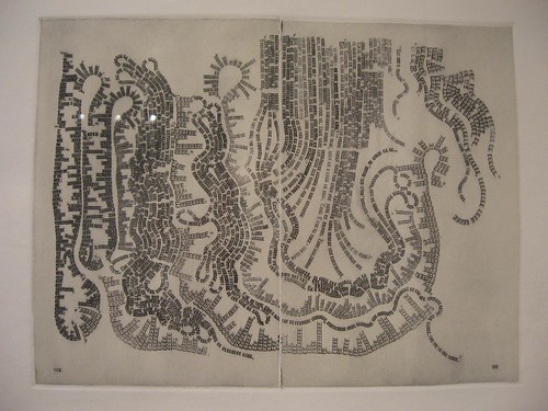
Justin Quinn, Chapter 54 or 6618 times E, 2004, intaglio, 29 1/2 x 21 3/4 inches. The chapter reference is to Moby Dick and the number of times e appears in that chapter–as well as in Quinn’s print.
Taking text in a completely different direction, Justin Quinn determines the number of E’s in each of his images based on the number of e’s in chapters of Moby Dick, separating the letter from its usefulness as language.
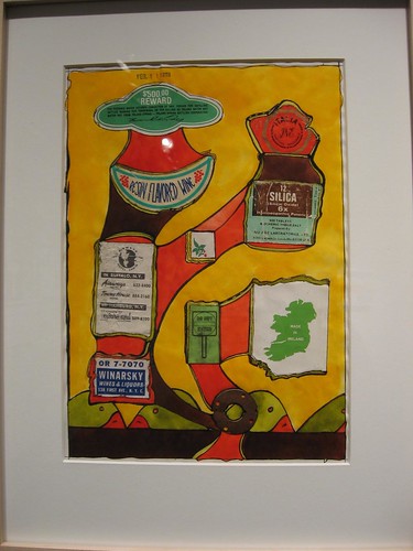
John Evans, February 11, 1978, 1978, mixed media collage on paper, 11 x 8 1/2 inches
Also in the show, work by John O’Connor, Mark Lombardi, Tim Rollins & KOS, John Evans, Trevor Reese, Josh Shaddock, Jina Valentine (ex-Philly-ite), and Jack Sloss (Philly all the way, in flashing neon).
Jane Irish at Locks
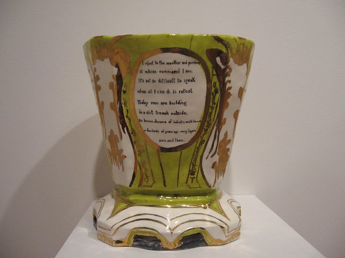
Jane Irish, Devaney, The War Vase, 2008, low fire whiteware, china paint, lustre and underglaze, 12 x 11 x 11 inches
At Locks Gallery, Jane Irish’s solo exhibit Cochin Chinoiserie is keyed to Irish’s inclusion in the ICA’s Dirt on Delight (see Roberta’s post), a wonderful exhibit of clay sculpture. The solo show at Locks celebrates the anti-war activism of the Vietnam era as a synecdoche for the social issues of poverty and wealth and the human condition.
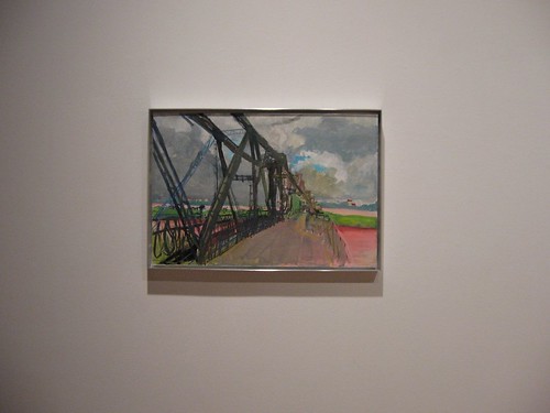
Jane Irish, Hanoi, Long Bien Bridge, 2008, gouache on tyvek, varnished, 16 x 24. This image appears in a cartouche on one of the vases
This show includes 10 new molded vases inspired by overwrought Sevres vases, with their perfect beauty and their association with the obscene wealth of Versailles. Irish’s vases lean and list and billow and wave, emphasizing their deliberate imperfections and humbleness and vulnerability. But they are also gorgeous with china paint colors and gold lustres and decorative motifs, as well as poetry written by Vietnam War veterans.
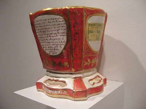
Named after people like poet Tom Devaney or 1960s Free Speech Movement hero Mario Savio, the content helps turns these vases into brave humans and wounded veterans and the wounded earth. They are funerary urns at the same time that they manage to transcend their mortal references.
The poems are moving and profound, and the vases have a presence that begs for being touched (always a good sign in my book).
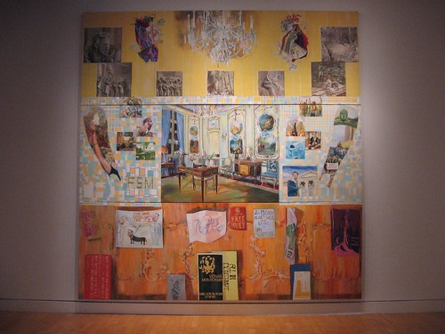
Jane Irish, Resistance Wealth and Heroic Protest, 2001-2, egg tempera on gouache on linen, 32 x 120 inches
The show also includes an enormous, multi-canvas older painting that is a kind of recap of the issues that obsess Irish–the heroism of resistance against the Vietnam War and excess wealth, against the society machine that chews up individuals who are not empowered. I found this painting, which is a touchstone for what Irish is thinking, more locked down than the vases, which offer multiple layers of meaning.
Both exhibits end Feb. 21.
Word art is suddenly a hot ticket. I’m not sure why. (Roberta reminded me that the queen of word art, Jenny Holzer, has a show due to open in March at the Whitney).
I wondered at first if Irish’s work really is word art in the same sense as the work at Fleisher/Ollman, but it is in that it gives a physical form to the words she’s quoting.
Maybe word art feels so right now because we’re watching YouTube instead of reading. I honestly think that people are missing the way a word can take on weight and taste, the way the right word can pop in your mouth or your mind like a grape tomato.


