—In this post Sam tells us about a show with Modernist leanings by two local artists.–the Artblog editors———————->
The focus of Precis, an exhibition by Philadelphia artists Caroline Santa and Mauro Zamora now up in the one-room white box gallery space at Rebekah Templeton, is an escape from the outmoded and perhaps melodramatic implications of modernist composition through an alternative, playful use of its methodologies. This comes across clearly in the playful and energetic works by the two artists, which incorporate modernist tropes such as torn paper, borrowed images, and a light, fluctuating sense of meaning.

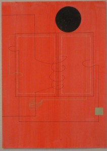
A sophisticated vocabulary to deal with space
Both artists use a sophisticated vocabulary of mark-making and image manipulation to create multi-layered, mixed-media compositions that engage with the viewer in an understated and thoughtful way. They communicate as much with the academic modernist tradition as they do with the physical illusion of space, as experienced through both architecture and the artists’ seemingly complementary sensibilities on this subject.
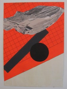
Mauro Zamora’s works on paper, of uniform dimensions, create a shifting sense of vertigo through their manipulation of planes, architectural space, and bold, simple color configurations. His use of a combination of materials — flasche, ink, collage — each with their own distinctive patina and texture, allows the surface of his work to resonate, each image and color distinctive and clear. Zamora bases his compositions on rocks and bones, according to the gallery’s press release, and some of those rocks look like chips of concrete fallen from a de Chirico composition, as seen in “Mineral Right” (above).
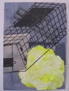
The language of Zamora’s two-dimensional pieces is intrinsically wound through architectural structure, both historical and imagined. In “Detente,” he introduces a layering of form, delving into space through the skeletal structure of a towering building laid atop the faded image of the U.S. Supreme Court building.
Grids of geometric abstraction on the walls and floor
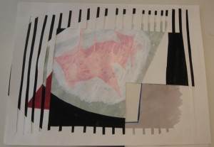
From time to time Caroline Santa uses the same linear rigidity that is present in Zamora’s canvases, but she distinctly favors the fallible, gestural mark. Her pieces lack the strict dimensional boundaries of the canvas, at times departing from the wall entirely to sit on the floor or a table, and the fluidity of movement she creates plays with the rigidity of geometric abstraction. In “Different Angles of the Same Problem” (below), she pushes the fragility of paper to create a vortex of shape and void. This layering allows an interplay within the flimsy paper structure, which is interrupted by gashes and angled slices atop a collection of irregular shapes in transparent gouache washes and empty dark spaces.
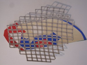
Another experiment with grid facade is “Hard to Know #3,” an oblong layered collage ineffectively restricted by an irregular cage. The dynamic of the muted primary color scheme is reminiscent of color field painting, and lies below the false stringency of the paper grid. If Santa’s goal with her compositions is, as she states, to combine two to five different parts that “sing, collide, clash or simply work well together,” then this work conveys a harmony between restriction and playfulness. Santa’s marks are less concerned with actually mimicking the rigidity of structure than with becoming an extension of an organism that has structure, but is also completely loose and fluid. The kind of openings and closings that are created are imperfect and permeable.
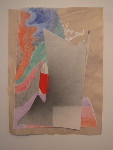
Both Zamora and Santa are interested in creating compositions that are connected to organic movement and architectural structure. They juxtapose abnormal and innocuous shapes with geometric rigidity; while Zamora’s pieces are all restricted to a rectangular sheet of paper, it is within these boundaries that he creates abstract landscapes without even a concept of romanticized nostalgia, favoring the tools of an industrially-minded deconstructionist. Santa’s pieces, on the other hand, are free-form in dimension, and expand beyond a standard size onto multiple surfaces and various orientations around the gallery. In this show we see two very different approaches to free compositions that take in stride the spirit of modernism without being shackled to its literal incarnation.
Precis will be up at Rebekah Templeton Gallery through June 22.


