[Caitlin Tschanz’s post is part of a collaboration between Artblog and Moore College of Art and Design’s Culture in the Classroom program. Caitlin is one of two students chosen by Libby and Roberta to have their art reviews published on Artblog. We are delighted to run Caitlin’s post. — the Artblog editors]
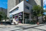
If you head West on Arch Street from Independence Mall toward the heart of Chinatown, you’ll eventually come across a bus depot with an old building nestled between the parking lot and a string of restaurants and eateries; you’ll climb up a flight of stairs until you enter a large room with chartreuse curtains and a breeze floating through the open windows—don’t forget to spot the handful of twenty-somethings mingling on the adjacent couch. Congratulations, you have officially arrived at Space 1026.
Jacob Lunderby’s works raise questions and delight the eye
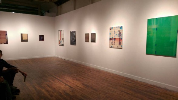
Beyond the unassuming exterior, Space 1026’s gallery space is quite impressive, as is the work of artist Jacob Lunderby, whose show Please Pardon Our Appearance opened on First Friday of October. The title, of course, is referencing Lunderby’s self-described “paintings” which are in actuality “images of windows that have been digitally modified and layered over enamel paint on wood panel,” according to the website. So why the classification? For starters, the works are stunning—a hazy mix of pattern, imagery, and glossy surface. They read more like photographic sculptures, but carry the heft and tactility of oil paintings, minus the texture. In other words, they read too flat to be sculpture, and too sculptural to be photographs, which naturally leaves them to be described as paintings. Or does it? Their 3-dimensionality lends them to be seen as objects on the wall, but the flatness of the surface and crispness of the images renders them as collages, or assemblages at best. They exist as somewhere in between 2D and 3D— perhaps 2.5D?
An update on Mondrian
Conceptually, this series packs quite a punch as well. One piece in particular that stands out is the untitled image that shows a series of white rectangles clustered together on the picture plane, collaged with imagery. The piece brings to mind the work of the late Dutch artist Piet Mondrian, whose work was heavily influenced by Neo-Plasticism; that is, the study of pure abstraction in a work that reduces the imagery or marks to their base elements of line, color, and form. Not only is this image graphically interesting—the striations allude to the objects having once been photocopied or digitally scanned— there is much more of an atmospheric feel to this work, which helps the viewer escape further into the picture plane than most other works in the show.
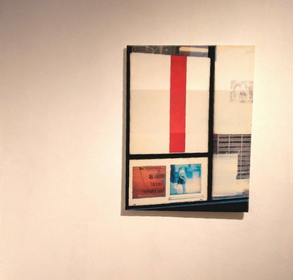
In this regard, Lunderby’s piece could potentially be classified as Neo-neo-Plasticism, because the work takes on much more than the flat temperament of the aforementioned art movement. That is to say, while this piece is aesthetically reminiscent of Mondrian, it has been brought into the 21st Century through the addition of diverse imagery within an asymmetrical compositional foundation; the push-pull effect leaves the viewer to sit with this piece longer than a few moments to truly soak it in.
The successful show leaves the writer restless and questioning
What is most impressive about the show, however, is the sense of restlessness I felt after leaving, a residual longing that has since dissipated. It is not that often that an exhibition implores the viewer to actively be a part of the show’s work, least of all a show full of “paintings.” I left questioning this categorization and its place in the art historical vortex that we are all currently living in. Are they really paintings? If so, why? Is it their 2-dimensionality? Their surface’s texture and material make up? It’s rare to find a show that is both aesthetically and conceptually intriguing, leaving the viewer to ask more questions upon leaving than upon arrival. This is why, in my book, Please Pardon Our Appearance is a huge success.
Please Pardon Our Appearance ran from October 3-29th, 2014 at Space 1026, 1026 Arch Street 2nd Floor, Philadelphia PA, 19107.
–Caitlin Tschanz will receive her BFA in 2015 from Moore College of Art & Design in Fine Arts, with a focus on Painting and Creative Writing. For more information on her work, please visit http://www.caitlintschanz.com/.


