[Here’s an in-depth look at a fascinating four-artist show delving into origins and variations of photography, memory, neural connections, and digital painting. This is the catalog essay of From the Digital Toolbox, curated by Andrea Kirsh. — the Artblog editors]
Now that cell phones and cameras allow everyone to generate digital images, it seems a good time to look at what artists are doing with digital technology. All four artists in From the Digital Toolbox trained as painters; yet each turned to digital tools, either adding them to studio equipment of brushes, paints, and drawing materials, or replacing traditional tools entirely.
The artists were selected because each made different use of digital tools to answer different needs. Nancy Burson persuaded engineers to create new digital technology to visualize the aging process in a way that straight photography couldn’t. Digital tools have allowed Shuli Sadé to model the workings of the human brain. For Tim Portlock, who became interested in virtual reality, it was natural that his imagery would develop digitally. And Siebren Versteeg was interested in the impact that digital media has come to assume in our lives.
Nancy Burson
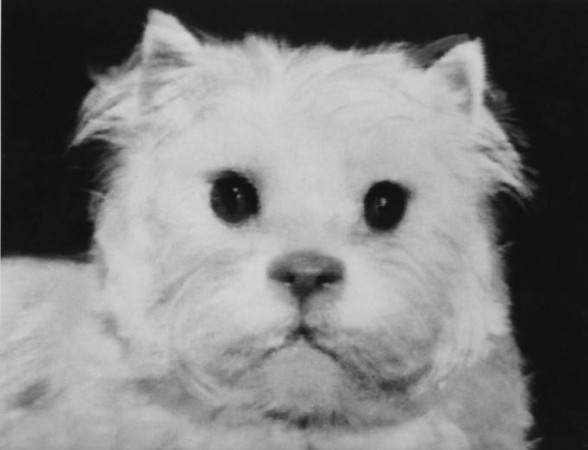
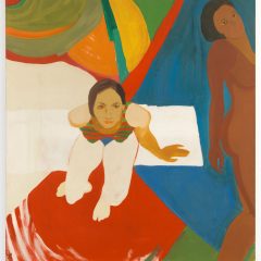
Nancy Burson is the progenitor of digital morphing technology. Long before computers were designed for widespread home use and all art students learned Photoshop, Burson worked with scientists at M.I.T. to create software that answered her needs. She wanted to project portraits into the future, showing how a person aged. In 1976, with help from a professional makeup artist, Burson transformed her face, then photographed herself, to imagine her own aging. She was not alone in her interest. Martha Wilson also used makeup to imagine her future self in Posturing: Age Transformation (1973). But Burson wanted something more.
The 1960s were a time of optimism about collaborative work among artists and scientists. Robert Rauschenberg, an artist known for incorporating everyday materials within two- and three-dimensional collages, and video artist Robert Whitman, worked with engineers to organize the series 9 Evenings: Theater and Performance in 1966, then set up an organization, Experiments in Art and Technology (EAT) in 1969, to further such collaborations.
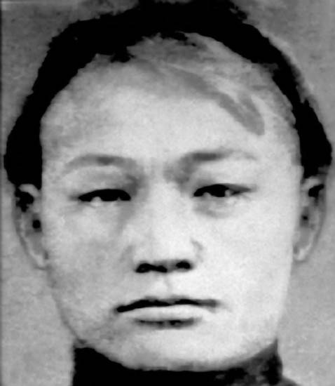
Through EAT, Nancy Burson was paired with an engineer and discovered that computer graphics were not sophisticated enough to help her. She waited, continued to keep up with computer scientists, and in the late 1970s found a willing collaborator at the M.I.T. Architecture Machine Group, now called the Media Lab. She and engineer Tom Schneider developed, and in 1981 received a patent, for The Method and Apparatus for Producing an Image of a Person’s Face at a Different Age. The patent was later licensed to the F.B.I., which has used it successfully to find children and adults who had been abducted years earlier.
Burson continued to work with computer scientists; she developed more complex means of combining images and a faster program that is capable of producing aged images and composites in front of a live sitter. Her pioneering patent was based on morphing images together through a triangular grid, and was a much-improved method of aligning images seamlessly compared to the previous, historic use of multiple exposures. In the late 1870s, Francis Galton used multiple exposures as a way of averaging individuals in his search to identify physiognomy associated with low mental ability–a project that would now be considered pseudoscience. In Family Combination (1972), William Wegman compared a photograph of himself, the genetic combination of his parents, with an image made from two negatives used at the same time: one of his mother and one of his father.
Burson used the new technology to explore a range of questions: what would the average human look like who represented all races according to their prevalence in the global population? Have standards of beauty changed over time? Is there a face of power? What might the missing links between humans and our primate ancestors have looked like? What might someone look like as a different race?
Morphing technology enabled Burson to create photographs of imaginary beings, undermining the traditional understanding that a photograph has a one-to-one correspondence to its subject. Now that common software enables the manipulation of images, we may all be skeptical whether a photograph reflects an actual subject or one censored, smoothed, or prettified at the computer.
This has generated doubt about historic photographs as reliable records; a famous example includes Stalin’s air-brushed purging of images (documented in David King, The Commissar Vanishes: The Falsification of Photographs and Art in Stalin’s Russia, 1997). It has provoked controversy about advertising–are we really seeing the results of the advertised product?–and about the unrealistic images of female beauty that are widely published, and have had negative effects on some adolescent girls. But particularly when Burson began to produce her hybrids, they created a fascination and strange unease. She invoked the artist’s imaginative license to surprisingly credible-looking ends. One thought that follows from viewing her frankly-manipulated images is the realization that many of our stereotypes are also manipulated; we often act based upon what we think, rather than what we see. Burson has always manipulated images that matter, addressing issues such as race, gender, identity, normalcy, and the implications of commercial imagery.
Nancy Burson never gave up painting and drawing, and now draws with both hands simultaneously, as a mental exercise. She began with images, then turned to words, drawing the same word over and over and alternating between right and left hands, in a counterpoint whose extended repetition approaches the act of meditation. This produces dense drawings of great visual richness, and led Burson to think about developing computer software to create image patterns of words. That project is still in development. Burson’s appreciation of the psychological implications of markmaking is evident in the two downloadable children’s books she has written: You Can Draw the Way You Feel (2012) and You Can Draw Love (2014). In both of them, she asks young readers to draw abstract ideas that they may not yet be able to verbalize.
Shuli Sadé
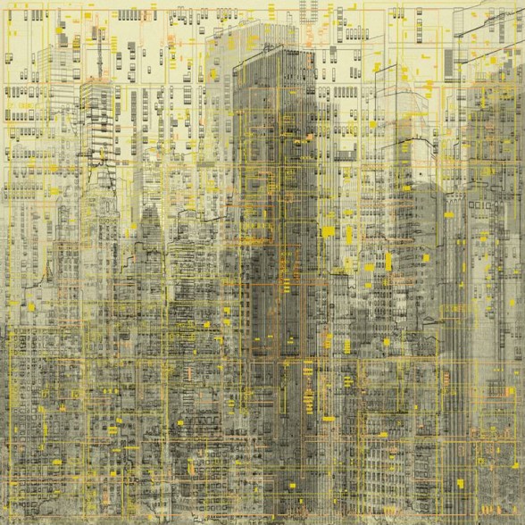
Shuli Sadé has long been interested in our perception of space, time, and the workings of memory. She studied painting, photography, and video at Bezalel Academy of Art and Design in Jerusalem, at a time that it was unusual to work across disciplines; she then studied at the School of Visual Arts, New York. In 1984, she permanently moved to New York, and since 2012 has had a studio at Mana Contemporary in Jersey City, NJ. She has continued to work across media, producing sculpture, photography, installations, video, drawings based upon digital studies, and digital imagery printed on translucent materials that are sometimes backlit.
Since 1991, most of her work has involved photography, although much of it includes handwork as well. She began using photography to document abandoned industrial buildings. Many of them were decaying, and the artist has likened the cycle of their construction and deterioration to the human life cycle. She was exploring both space and time. For one series, she covered architectural photographs with tar, which she manipulated to reveal parts of the images beneath. The tar resembled the sepia of early photography, and she liked both the texture it added and the fact that the material itself never completely dries; the work will continue to evolve, as does life. Coating photographs with tar appealed to Sadé visually, as did its analogy to the way the human brain functions. She has continued to layer images and ideas in her work.
In 2004, she included two videos as part of an installation shown at Art in General, in New York, that pointed to her later work. She used a sequence filmed on a train trip to and from Elizabeth, New Jersey. The trip involved a recursive journey, with the train car defining its own internal space. Sadé compared this to Michel Foucault’s “Heterotopia”–a space set aside, with rules and conventions different from the everyday–a term first formulated in Des Espace Autre (1984). The passengers’ cell phone conversations connected them to locations beyond the train and the landscape through which it traveled, layering another space upon that of the train’s route and the car in which they sat: a contained space that was always moving. This was the beginning of her use of video shot from trains as a metaphor both for an individual’s experience of the external world, and for access to past experiences through memory.
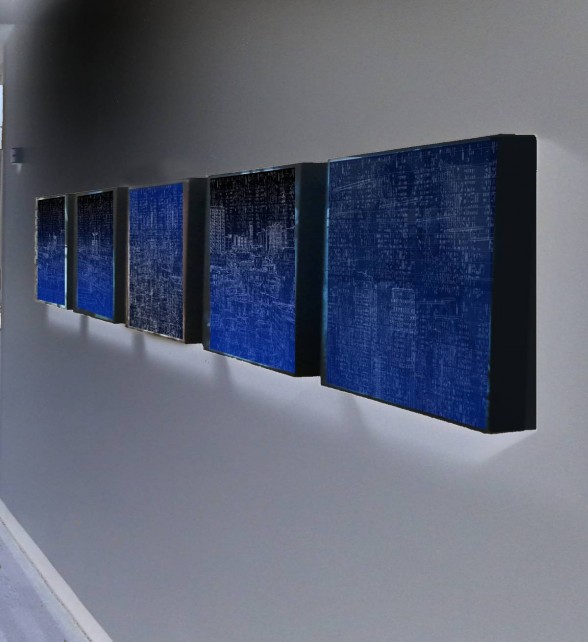
Sadé’s recent work on memory has involved collaboration with several neural scientists. The current understanding of memory divides it into three components: the reception of information; its storage; then, its re-assembly into a coherent memory. It is a self-organizing, biochemical process that includes random elements. Information is broken up for storage in incomplete form, and its reassembly–each time it is accessed–inevitably includes losses, distortions, and additions. Memories are literally created each time they are recalled. Sadé uses a combination of digital and analog techniques to model this process.
The grid, which so powerfully orders Manhattan’s regular layout, is a basic device in Modernist composition; it also turns out to be the form electrical activity takes in the human brain. Sadé has built upon these dual implications of the grid. She begins with digital photographs–largely of recognizable images of New York City. She goes to great efforts to access suitable viewing points, such as the 30th floor of the New York Times building, and often photographs at night, because it emphasizes the urban grid. She pixelates theses cityscapes on a large scale and sometimes in negative form, using Adobe Photoshop. Then, she removes random pixels one by one–without the use of an algorithm–to yield a version of the original image, riddled with gaps. She repeats the process several times, removing different sets of pixels, then creates a composite of overlapping versions. She sometimes adds further layers of imagery taken from urban plans, readouts from scientists’ analytic equipment, and other coded systems, such as teletype.
Sadé’s work involves translations of images, sometimes transformed multiple times, as when she took photographs, pixelated them, removed individual pixels, then used pen and ink to transform these partially degraded images into her huge Engram drawings. The drawings are not the beginning, but rather the end of a process that interweaves photographic, digital, and manually generated imagery. The short video, “Metro Data” (2014) explicates an aspect of Sadé’s process, beginning with a blank screen and adding more and more non-contiguous bits of information until the image becomes recognizable. “Code Breaker” (2015), a wall piece of 40 sequential units, looks at the other end of the process, at the point where bits of information are seen at such close range that they cannot resolve into images. Shuli Sadé suggests parallels between neural data and digital data, mechanical images, and manual images as she investigates the constructive function of our brains in making sense of the world around us.
Tim Portlock
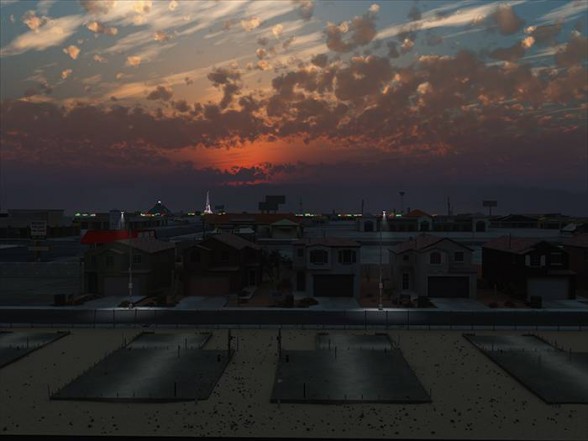
Tim Portlock began his artistic life as a painter working in twin modes: studio work that reflected personal concerns, and outdoor murals directed at a broad public. He became interested in the World Wide Web and virtual reality, and had a job creating a virtual model of Harlem. He was working at the University of Illinois, Chicago, where he was able to use powerful 3D technology that had been developed for military and industrial use. He then worked for the University of Paris IV, making historical simulations of culturally significant spaces. In Paris, he was unable to afford the technology he had previously used, so he modified gaming software to meet his needs. In gaming software, Portlock found a medium that allowed the public and private to merge. It enabled him to employ a vernacular visual language, developed by painters and adopted by Hollywood, to create images exploring the dissolution of the American dream.
His work is routinely mistaken for photography that has been manipulated in Photoshop, and the artist takes pains to distance his work from photography. The confusion arises from the plausibility of Portlock’s effects, the seeming reality of his artifice. He sometimes exhibits his preliminary renderings beside his cinematically panoramic, digital prints to emphasize the constructed nature of his landscapes. It is harder for him to demonstrate the amount of attention he gives to even the smallest details. If he wished, he could buy stock images of lamp posts and fire hydrants, but instead, he creates everything individually, based on extensive research. He also makes photographic studies of the places he depicts.
Portlock is consciously working in the formal tradition of 19th-century American painting, even though he is depicting the repressed underside of the doctrine of Manifest Destiny, and the dire results of a culture enamored with individualism. He employs the pictorial conventions of the Hudson River School painters, whose Romantic images ultimately derive from the 17th-century models of Claude Lorrain and Nicolas Poussin: framing foreground elements that direct the eye to the significant subject in the middle ground, all under an imposing sky. Indeed, some of his subjects, such as his recent series on Las Vegas, exist partly because of the persuasiveness of those 19th-century myths in spurring Western migration. The painters’ visions were no more real than Dorothy’s Oz.
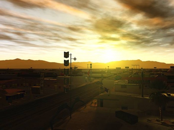
The urban landscape of Philadelphia, where Portlock moved in 2007, was the proximate cause of his mature work. The Ghost City series of 2011 was his reaction to the contrasts he found between the most desolate and abandoned areas–home to impoverished minority residents–and the tourist-oriented center city that prides itself on its historic place in American history as “the cradle of democracy”. He refused to show the residents of the blighted neighborhoods that attracted him, out of an ethical decision not to produce images of people in distress. But he would create powerful, if exaggerated and fictionalized, depictions of the very real ghost town in which they live. Their neighborhoods retain vestiges of the ambitions of better times, but neither the statues that memorialize heroes abandoned by the fleeing middle class, nor the aesthetic Band-Aid of publically sponsored murals relieve their squalor and isolation.
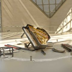
All of Portlock’s work is the product of extensive research. He wants to accurately reflect the social reality of his subjects, and spends a long period reading about a city before going out to study and photograph it. He uses the photographs as visual notes when he begins to envision his pictorial essays. He became interested in Las Vegas, a city with replicas of international monuments, such as the Sphinx of Luxor, the Eiffel Tower, and the Statue of Liberty, that proudly proclaim themselves to be copies. Portlock was interested in the anonymous service workers behind the neon and stage sets, and intrigued to learn that many were immigrants. In going to Las Vegas, these workers were seeking their own visions of the United States as a land of opportunity. Instead, they ended up in the center of the mortgage crisis. He portrays the subdivisions, where new homes face the foundations of neighboring houses that will never be built; yet in the distance, Las Vegas’ Eiffel Tower is still illuminated. The strip architecture that Portlock shows, under the watchful statue of its patron saint, is not Robert Venturi’s model of straight-talking architecture, but buildings to pass by as quickly as possible in order to reach what lies beyond the horizon.
The scale of Portlock’s digital prints, the smallest of which are 4.5′ by 6′, suggests a relationship to something other than the socially conscious painting and concerned photography of the early 20th century. It suggests the grandeur of literary depictions of the dispossessed by Honoré de Balzac and Charles Dickens. It also suggests the luminous, if corrupt, cityscapes and landscapes seen in many films created by Martin Scorsese, Robert Altman, and others. Portlock has forged a biting indictment of the American landscape, using a medium that was developed for escapist amusement and relief.
Siebren Versteeg

Siebren Versteeg explores the impact of digital processes on our construction of self, our understanding of the world, and our own agency. He worked with video, which by then was digital, from his undergraduate days, focusing on it after graduate school as a way to reject his initial, sculptural sensibility. Versteeg returned to sculptural work–sometimes combined with video, sometimes not–but his interest in and use of digital technology continues to be central to his work.
Versteeg’s use of computer software, by his own description, is straightforward. He says he is not a techie, per se, but has learned to write code sufficiently, using a 10-year-old version of Adobe Director to create his own toolkit. He is extremely sensitive to the implications of the digital environment, unpacking the collateral damage from governmental need to track citizens in real time, and the population’s desire for unlimited access to any idea, image, or thing right now. He is also adept at scraping information streams from the World Wide Web and applying them to novel uses.
Some of his work reflects an almost childlike literalness. In a lightbox image from 2004, titled “Videotaping Everything I See,” the artist shows himself blindfolded, during the few seconds when he has stopped shooting in order to change the videotape, so he will not violate his self-imposed constraint. He is also intrigued by the alienation that follows real-time streaming, which collapses any difference between perception of the videotaped present and past. “As the World Turns” (2006) streams synopses of now-canceled daily soap operas, so that fiction is synchronized with life. The use of Coca-Cola’s characteristic typography and color scheme for “Dynamic Ribbon Device” (2003), an Internet-connected computer program and output to a plasma screen, reminds us that someone has to pay for the news and the events that make news–just as someone pays for culture. He suggests that the existential anxiety of the present might be how to live a sponsored existence.
“In Light; Of Everything” (2010) uses computer program output to an LCD touch display to generate sequences of ever-changing digital collages. They combine chromatically matched images, culled from the Web, with code-generated passages that resemble paint. It is a virtual descendent of Robert Rauschenberg’s work, born of the desire to erase the distance between art and life, and composed with a visual sensibility that could also be described as Rauschenbergian.
The program switches colors periodically, and contains random elements so that the compositions will mutate eternally–or at least until the digital platform becomes obsolete, which is a challenge for all digital information, and one the artist has already faced. A New York University computer class working on longevity experiments is using his 2001 work, “Untitled Film I,” as a test case; the work consists of Internet-connected computer programs with projected output, and live streaming from the Web.
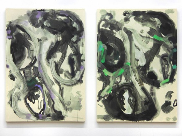
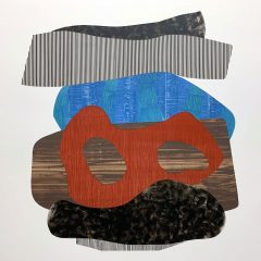
The paint-like passages of “In Light; Of Everything” provoked Versteeg to begin an exploration of painting, its processes, and the decisions involved in its making. He started creating an ongoing series of algorithimically generated paintings. These are neither akin to fairground splatter paintings, nor to the drawings and paintings created by Jean Tingley’s intentionally homemade-looking Meta Matik machines (1959), but rather a conceptual examination of painting’s formal and material aspects, and of artistic judgment. The artist studied the way paint can be applied, and how it moves, through the direction of the brush. The algorithm allows him to set a huge number of parameters, both macro and micro, including the brush type and width; whether it is used wet or dry; the paint’s opacity; viscosity; shininess and thickness of application; airbrushed paint; dripping paint; how often the brush changes direction; how long a brushstroke will be; and the intervals between one brushstroke and another. The algorithm also includes random generators, so that repetitions of the same group of settings will produce significant differences. The longer the algorithm runs, the more colors it uses, so the decision of where to stop the digital record is an artistic judgment.
To make one painting, embodied as a digital image printed on canvas–to surprisingly paint-like effect–Versteeg runs the algorithm for approximately 100 iterations over the course of a week. Then he studies the images and selects which to print. This is not all that different from photographers’ shooting endless, rapid sequences of images, some without looking through the viewfinder, so as to produce one useful shot. While the images are generated by algorithm, the selection is inevitably an expression of the artist’s aesthetic sensibility.
Versteeg recently set up the painting algorithm to generate a sequence of iterations using the same global parameters (macro commands), but differing localized (micro) paint parameters. This yielded multiple iterations, each responding to the other. It also produced the most demanding test of judgment. What are the differences between works with so many values in common, and why do the differences matter? Versteeg’s algorithimically generated paintings are not an attempt to replace painting as usual, made by hand–nor to mock it. Rather, they are an effort to understand the thinking and decision-making behind the process of painting, and to comprehend what it is that our culture so values in colored marks on a flat surface.
Nancy Burson’s work has been exhibited internationally and is included in most standard histories of photography. More than 10 solo exhibitions of her work have been organized by museums and university galleries since 1987. The most recent was organized by the Grey Art Gallery, New York University in 2012. Her commissions include the Millennium Dome, London, Creative Time, the Lower Manhattan Cultural Council, and others. She lives and works in New York City.
Tim Portlock has exhibited both nationally and internationally at venues including Ars Electronica, the Institute of Contemporary Art, Philadelphia, at Tate Modern, as part of the artist collective, Vox Populi. A Philadelphia resident, he is Associate Professor in the Film and Media Department at Hunter College, and was awarded a Pew Fellowship in 2011. He received an MFA in studio art from the University of Chicago and an MFA in electronic visualization from the University of Illinois, Chicago.
Shuli Sadé is the recipient of numerous grants, most recently from the Pollock Krasner Foundation. She has exhibited work throughout the U.S. and Israel, with solo exhibitions at the Brattleboro Museum, VT, the Amalie Wallace Gallery, SUNY, Old Westbury, NY, the School of Architecture, Columbia University, and the Hungarian Cultural Center, NY. Her work is in the collections of the Mead Museum, Amherst, the Haifa Museum, and the Israel Museum, among others.
Siebren Versteeg’s work has been widely exhibited in the United States, including solo exhibitions at the Ulrich Museum of Art, Wichita, the Wexner Center for the Arts, Columbus, the Rhode Island School of Design Museum, Providence, Illinois State University, Normal, and the Art Institute, Boston. He is a recipient of an Illinois Arts Council Fellowship (2005), Skowhegan School of Painting and Sculpture Merit Fellowship (2004), and the Stone Fellowship for Graduate Study from the University of Illinois, Chicago, where he received his master’s degree in 2004. He lives and works in Brooklyn.
From the Digital Toolbox is on display until Feb. 20 at the Stedman Gallery, Rutgers-Camden Center for the Arts, 314 Linden St., Camden, NJ.


