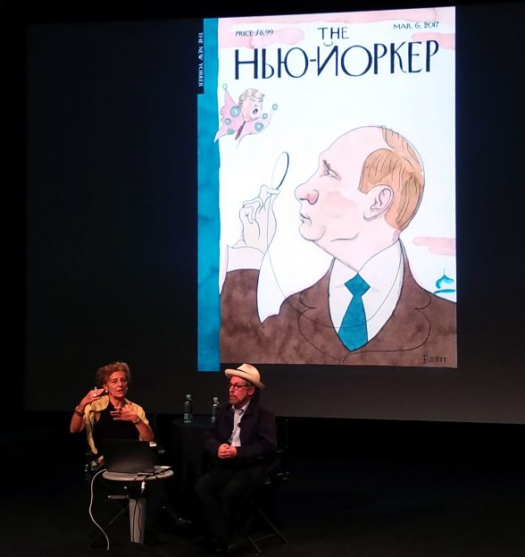
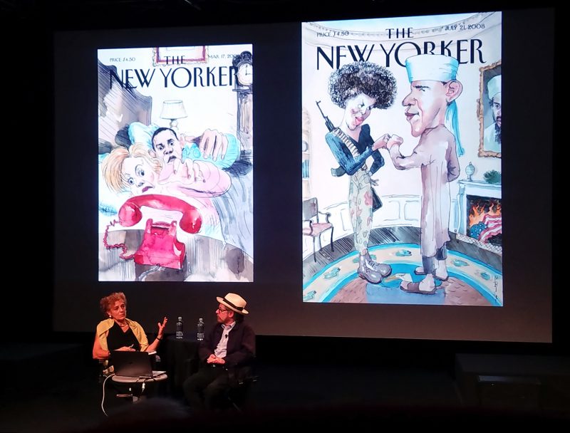
Barry Blitt, an artist who has drawn more than 80 covers for the New Yorker magazine, was invited to participate in an onstage dialogue with the New Yorker’s legendary art director Françoise Mouly. The exchange took place as part of the 2017 New Yorker Festival, one weekend in October packed full of dialogues between significant cultural figures spanning many fields- art, music, politics, literature, and more. I was there in the audience along with about 100 people who wanted to hear some discussion about art, politics, decision-making for cover art and more.
About the artist(s)
Blitt has been a regular contributor at the New Yorker since 1994, shortly after Mouly’s arrival. Mouly, who is famous for drastically revamping the New Yorker’s image through humorous and controversial cover art decisions, presented an extensive slideshow of Blitt’s covers (presumably all of them, though some were glossed over in the interest of time) and questioned him about his creative process -how he comes up with ideas, the drawing/editing process, and his opinions on his work.
The artist is an absolute character; fast-talking, constantly cracking jokes in an awkward, self-deprecating Larry David style. Though he is Canadian-born Blitt is impressively, probably ridiculously, knowledgeable about American pop culture and politics. Mouly, in contrast, is a very self assured and thoughtful speaker. She is native to France, and professed to be very out of the loop when it comes to American culture; Mouly went so far as to say, “My position of strength is that I don’t know anything about anything.” Perhaps this, in part, is what frees her to be so daring when it comes to the magazine’s art.

As far as process, Blitt, the artist, gets inspiration from a few sources. He asserts that he can be found most of the time “filling sketchbooks with nonsense and giggling,” getting ideas from conversations, news outlets, pop culture, sitting outside and observing people, and looking at old sketches. He often lets ideas he sketches marinate for a while, years even, and will bring them back when he feels the moment is right. His work was not always overtly political, though he found his footing cartooning the Clinton-Lewinsky scandal in 1998. These days, most of his covers for the New Yorker chronicle the misadventures of Trump in office. He argues, “The outrageous politics of today sort of begs to be mocked”.
Blitt is most well known for his political cartoons and illustrations that ironically combine disparate contemporary issues. They can get pretty bizarre (e.g. Trump belly flopping into a pool full of Republican politicians), but they certainly do the job of getting people talking. Blitt tends to self edit his work, constantly redrawing and worrying about his work not being respectable enough for the New Yorker, but is generally encouraged by Mouly to go through with even the most outrageous ideas.
Controversial Cover Art
Both the audience and Françoise Mouly herself were very interested to talk to Blitt about his most controversial cover to date, “The Politics of Fear,” published in 2008 during the Obama primary campaign, which shows the Obamas in the White House dressed as if they are Al Queda terrorists. While discussing Blitt’s career with the New Yorker, I believe it is important to acknowledge and discuss the criticism of that piece as well as the praise. Although his intention was to highlight the absurdity of all the rumors circulating about Barack and Michelle Obama’s backgrounds during the election, many found the image tasteless and potentially detrimental to the campaign.

When questioned, Blitt showed a lot of discomfort and regret over how the cover was received and said several times he wished he never drew it. My own knee-jerk reaction to the cover is disapproval, because the depiction to an extent did propagate the long legacy of anti-black racist cartoon imagery by portraying the Obamas in such a seemingly flippant and tone deaf way. But I didn’t get the sense from the mostly non-diverse audience around me that they shared my opinion. And Mouly, who professed to knowing nothing of American culture, perhaps did not think through the repercussions of running the image. And really, do any publications have a diversity-editor or team that can give them feedback? They should.
It’s important to note that Blitt did have good intentions and meant for the image to be satire, though perhaps the thought process was a little one dimensional. It’s also worth noting that Obama, who denounced the image when it was released, afterwards requested several signed prints of other covers Blitt had drawn him in to be hung around the White House.
In this era of ostentatious political absurdity, figures that are willing to highlight controversial issues in ways that mimic the absurdity and comment on it are more important than ever. One of Blitt’s strengths is being able to succinctly summarize and explain a situation through image. In a bitterly divided state of politics, sometimes a laugh is needed. But beyond that, critical thinking is sorely needed. We have to keep talking about the absurdity, bringing attention to it, and most importantly speak out against it. This is timely with the upcoming election day. Advocate for the type of government you’d like to see and don’t opt-out of voting.


