John Vick is a curatorial fellow in the Department of Prints, Drawings, and Photographs at the Philadelphia Museum of Art. He has a Master’s degree in Art History from the University of Pennsylvania.
Successful artworks seem to fall under one of two humors – they can call attention to themselves overtly or be so plainly understated as to provoke curiosity. This has been true of modern art for quite a while. Consider the simultaneous success of the frenetic work of Jackson Pollock and the contemplative work of Mark Rothko. At present, when images, video, and sound are more readily available then ever before, art’s ability to demand attention or stand quietly waiting to be engaged seems all the more important.
This is especially true given the way in which much contemporary art is seen. Most people visit galleries during crowded openings or events. In Philadelphia, the Vox Populi and Copy galleries are perhaps most notable in this regard. First Fridays there are massive parties. (And they have only grown with the arrival of new upstairs neighbors Tiger Strikes Asteroid and Progressive Sharing.) As people work their way through the galleries, looking at and/or listening to what is on display, they are also searching for the people they know. Socializing blurs the art experience.
This is not a repudiation. Art’s social function is one of its most valuable features. It is, no doubt, commendable that any gallery or group of galleries can promote and sustain such events. But in accepting that, another question lingers. How does that social function influence the making and viewing of art? Two recent installations, one at Vox and the other at Copy, addressed this interaction. Though quite different, both seemed to acknowledge the opening night atmosphere, even using it to their benefit.
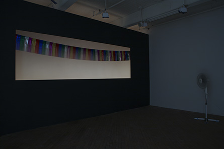
Linda Yun’s It Is What It Is was installed at Vox Populi during the month of February 2009. The piece included three elements: a false wall with a rectangular cutout, a strip of colorful metallic streamers strung in an arc across the cutout, and an oscillating fan mounted to a floor stand. The room was separated from the rest of Vox by a black curtain and was dark except for back-lighting behind the cutout. The fan spun, blowing air around the room. The streamers gently fluttered and flickered in the dim glow. Visitors could circulate through the room to gain different points of view or inspect the apparatus.
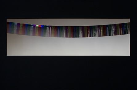
Despite her title’s claim and the simple materials she used, Yun’s installation did not make immediate sense. The cutout was lit to create an optical illusion (in the manner of James Turrell) whereby it appeared to be both a hollow recess and a painted surface. With the lights low and the fan on the room’s far side, the movement of the streamers seemed inexplicable. But these mysteries were eventually revealed. Walking through the gallery, the cutout became more legible as an empty space. A ring of holiday lights could be seen illuminating it from behind. Even the lazy, slightly delayed rhythm of the fluttering streamers seemed less irregular with time. Deception gave way to understanding. The installation was what it was, down to the fan’s exposed cord.
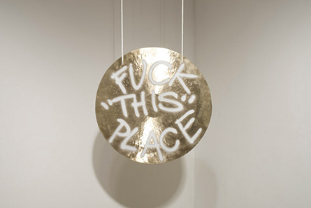
FUCK “THIS” PLACE, by Jamie Dillon, debuted at Copy Gallery on May 1. It too had three main components: a tennis ball machine, tennis balls, and a gong spray painted with the installation’s title. (For technical reasons, the tennis ball machine has since been removed.) The tennis ball machine was positioned in one corner, the gong suspended in another. Triggered by a remote control in the artist’s possession, the machine periodically shot tennis balls across the gallery. Each ball hit the gong, causing a crashing reverberation, and then bounced around until coming to a rest. Chicken wire barring entrance to the space kept balls from rolling out.
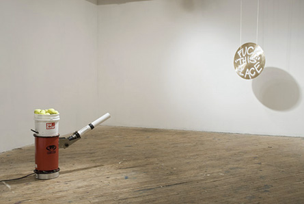
With a thundering bang echoing from the gallery every few minutes, Dillon’s installation could not be missed. Visitors were aware of it being there well before seeing it. If this built anticipation, a look in the space was instantly demystifying. The system was plainly straightforward. This shot those into that – CLANG! Watching from behind the fence as the tennis ball machine rumbled in its pre-launch routine, the viewer felt oddly sympathetic. All that preparation and expended energy for such a brief climax. The gong was right. Fuck this place.
Apart from their use of utterly banal materials, the installations by Yun and Dillon could not have looked less alike. Had they been shown side by side, their differences would have been all the more apparent. The first was hidden from plain sight by a curtain while the second used sound to announce its presence from far away. Darkness or false walls obscured the workings of one, but not of the other. Viewers could walk around the space of Yun’s installation. Dillon’s was fenced off, allowing only one distanced point of view. In terms of time (and sound), the fan blew the streamers with a consistent, predetermined rhythm. The tennis balls were shot at the gong irregularly at the artist’s whim. Even the two titles – one a deadpan disclaimer, the other a vulgar exclamation – were opposites.
Where the two installations did coincide was in their apparent self-consciousness. They were both aware of their own contrived presence and the audiences they addressed. For them, the gallery environment was an opportunity for self-enhancement. It Is What It Is did so with curious optical devices that arrested perception and stimulated inquiry. The viewer had to slow down, ensuring a more engaging interaction with the piece. FUCK “THIS” PLACE exploited the viewer’s imagination and expectations to critique the potential of art. Existing desires and practices were intensified, reinforcing the work’s premise.
The respective interactions between these two pieces and their audiences are significant because they occur via confrontation with the social nature of art. Yun defied the notion that viewers can glance their way through a gallery. Challenging people to explore the tricks of her installation, she also offered an opportunity for relevant discussion. Dillon, on the other hand, mocked the tendency for art to be ignored in favor of socializing. His installation was a center of attention that promised to disappoint over and over again, allowing viewers to keep moving on. Clever, critical, and captivating, both works stood out against the crowds.


