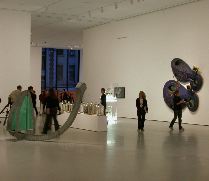
 Libby and I had one of our far-reaching conversations about art and museums and New York and Philadelphia while we tooled along the NJ Turnpike yesterday going to MOMA. We talked about Frank Gehry and his sculptural boxes. Was the art inside irrelevant when the building was such a showboat? We were clearly in a stew about art versus buildings. I guess we thought we were going to do battle with the new MOMA. (image is one of the contemporary galleries. Elizabeth Murray piece on the wall, right)
We have these big conversations constantly and because the issues are complex and there are no rights and wrongs just speculations, hypotheses and lots of blue sky we never come to closure but just move on to the next big issue.
Anyway, we hadn’t expected to find a building of grace and charms in the new MOMA. And that is what we found — a kind of architectural wallflower of understated beauty that is a glorious space for the art.
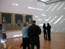
The building is double the size of the former space with some 40,000 new sq. ft. for exhibits (up from 85,000 to 125,000 sq. ft). Designed by Japanese architect Yoshio Taniguchi, in what is his first building outside his home country, the new MOMA treats the art with dignity and gives it room to breathe. (My memory of the old MOMA is that it was claustrophobic and difficult.) (image is 6th floor public space with Francis Bacon on the wall and skylights in ceiling.)
And, in its people-friendly design, the new MOMA has lots of public spaces outside the galleries — an atrium, walkways overlooking it and interior windows looking through one gallery to the next. In fact it feels a little like a swanky mall.
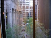
The public infrastructure includes a couple of escalator corridors and that gave the place a kind of department store ambiance. And, just like in those department stores there is no place to sit down except in the cafe. Few of the galleries have benches. And ironically, the benches there were were in front of work that almost repelled you from the room. (One unfortunate space in the Contemporary galleries had a bench but it was surrounded by some difficult and unfriendly conceptual work by On Kawara and Lawrence Weiner and by a screechy video piece by Joan Jonas. It was uncomfortable sitting on the comfortable bench. (image is view out south-facing window)
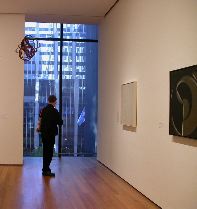
Throughout the museum, the windows — and the urban scene outside — were themselves art objects. People gravitated to them, stared out them at the city, and generally paid as much attention to them (or in my case, occasionally, more) as they did to the art. (look at that gorgeous blue urban light coming through the window.)
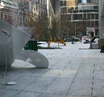
The sculpture garden looks much as I remember it looking — only bigger. (It has indeed been expanded.) By the way, there are now two entrances to the building — on 53rd St. and on 54th St. (image is the sculpture garden seen from the lobby space.)
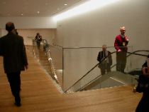
I’ll let my space views end here. I’m sorry I don’t have a decent shot of the atrium, a big space with some huge works in it (like Monet‘s Waterlilies and Barnet Newman‘s Broken Obelisk). But Libby has a shot and she’ll share it with us and weigh in with her ideas. (image is the department store escalator corridor.)
We’ll both dice and slice away at the collection and serve up more chunks as time allows in the next day or so.


