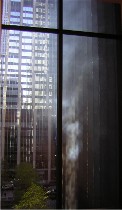
 The good news about MoMA’s new building is that it no longer is like a casino or a big-box mall, blocking out all of the outside world to dupe you into believing that what you see is everything and that you’ve gotta have it (image, steam rising up the side of a building outside a MoMA window).
The truth is, great art, unlike consumer goods, doesn’t need to be replaced in a few years, and therefore doesn’t need any architectural illusion to elevate it.
I suppose what justifies all this splendor (and this new building is indeed splendid) is the value of the art and its need for basic display space. By value, I don’t mean only financial value but cultural value. These paintings and sculptures, especially in the way they are now displayed, are ideas in conversation with eachother. That’s the big, big plus.
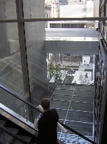 With all that new space and all those windows for swell views of Manhattan, as well as all those interior perspectives for views of the museum itself, MOMA is no longer oppressive. The spaces are elegant and airy, giving the art lots of room to breathe.
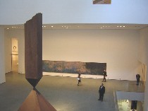
Even mega-size art has a comfortable home here (right, Monet’s “Water Lilies” with Barnett Newman’s “Broken Obelisk” in the atrium).
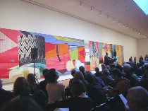
No longer do you have to crane your neck as your visit nose-to-nose with a James Rosenquist uber painting (Here’s Rosenquist’s “F-111” serving as a backdrop for a press conference; room for art, room for mobs of people).
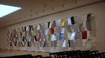 Even the ridiculously huge Ellsworth Kelly “Sculpture for a Large Wall” (approximately 11 x 65 feet) has enough space (right). The piece was originally created for the lobby of the Transportation Building in Philadelphia’s Penn Plaza, and was rescued and donated to MoMA by Carole and Ronald Lauder.
Although Roberta and I tried to see everything, and left under the illusion we had seen everything, it was merely an illusion. As it was, my feet barely held out, and I would have sold the nice little plastic bag that my press materials came in just for a bench every gallery or two.
Just reading through my press packet once I got home, I realized that we had missed any number of galleries–all the more reason to return. So what follows are a few highlights and musings on what we did see.
Photographs
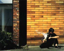 Photographs have been elevated from the nether regions to a nice space of their own (no images; they didn’t allow picture taking in the photo section; I grabbed these off the Web, for better or worse). Photo has lots of new acquisitions, incuding a swell Andreas Gursky, “Tote Hosen,” taken at a rock concert in Germany and pieced together by computer wizardry and weirdness; some Philip-Lorca di Corcia photos that looked staged and candid at the same time; a Jeff Wall giant lightbox of a picture, “Milk,” (left) in which (I think) he continues his salutes to Hokusai by freezing in mid-air a wave of spilt milk emitted by a little milkbox held by a scruffy young man in a scruffy urban milieu;
  a Boris Mikhailov from his “Case History” series in which a fast-living young man is caught in a Pieta pose (right); three pieces by German photographer Marco Breuer of color photo paper scored with different degrees of pressure to show different colors and create landscapey textures; and Gillian Wearing‘s “Self-Portrait at 17 Years Old,” showing the artist wearing a wax mask of her own, youthful face.
According to curator Susan Kismaric of the photo department, who shared with us some of the above information on how the images were made, 218 photos are up now, and the plan is to change the exhibit every six months.
All of the pieces I mentioned touch on the issue of how reliable and truthful photography is.
The new order
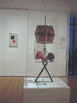 We started at the top, where the collection is strongest, and found wonderful curatorial mixes and matches, now that the old chronology is officially lost (except it’s really there, just rethought). Among my faves were the Dada/constructivist room, in which Marcel Duchamp‘s bicycle wheel is a jumping off point for wonderful images suggesting wheels, circles, and motion from Francis Picabia, Kasimir Malevich and this wonderful “Maquette for Radio-Announcer” from Gustav Klucis (left).
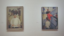 The Post-WWI Germans never looked better, from Otto Dix and Oskar Schlemmer (image, “Dr. Mayer-Harmann” and “Bauhaus Stairway” respectively) to George Grosz and Max Beckmann. Their take on social upheaval is matched with Jacob Lawrence and his takes on American social turbulence. Good thought. Then Mexican political painters like David Afaro Siquieros and Diego Rivera complete the thought.
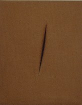
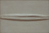
Another nice group: Lucio Fontana (left), Lee Bontecou, and Piero Manzoni (right below); suddenly Bontecou’s black hole becomes anatomized–but not brought down–in this company. On the contrary, she brings up the other two, giving them a seriousness that mere anatomy wouldn’t merit.
And Yves Klein‘s blue obsession suddenly makes sense in the presence of Yayoi Kusama‘s obsessive work. Kusama’s “Accumulation of Stamps, 63” rises above its material presence with its wit and surprise.
Donald Judd for all seasons
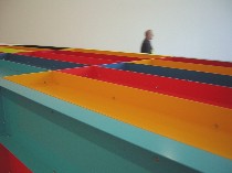 By the way, there seems to be a lot of Donald Judd. I take this as a curatorial statement of his importance. He’s got a newly acquired piece with Playskool colors–a box about the size of an industrial dumpster–that won’t let you play with it, but will let you feel small by its side (left, detail of top of the piece).
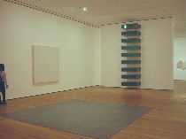 Then he’s got a stack in the Minimalism section near a Carl Andre lead rug (both in view, right); and a dumpster-green segmented floor piece that looks like a sliced dumpster. Also in the Minimalist zone was a plug ugly “Relief,” that was black and dreary, embedded with a banana-bread pan (Roberta’s description) that was a blind alley.
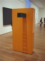 But also in the Minimalism zone and looking fabulous in cheery orange with a real peep hole at eye-height was a Sol LeWitt, “Floor Structure” (left). Two ladders of shadows fell down the orange sides from the industrial black ears.
Miscellaneous observations
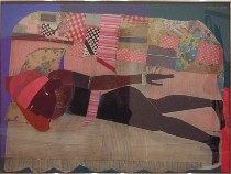
The Pop art looked great, and included Romare Bearden‘s “Patchwork Quilt” (right). What a surprise! Does this make a patchwork quilt made by hand the equivalent of a Campbell’s Soup can?
No surprise but a joy to behold–Ed Ruscha’s “Oof,” Roy Lichtenstein’s cartoon of a drowning woman,
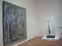
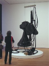
Tom Wesselman’s relief kitchen, and Claes Oldenburg’s droopy “Fan” (left above) which made me think of Louise Bourgeois‘s “Quarantania” upstairs, with its hanging bags suggesting body parts (right, “Quarantania” installed next to Wilfredo Lam’s “The Jungle”, both talking to eachother with their groupings of ectomorphs).

A newly acquired Richard Tuttle actually appealed to me–“Letters (The Twenty-Six Series),” 1966, glyphs of galvanized iron arrayed on a wall like randomly placed petroglyphs (left).
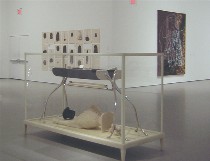
In the contemporary section (right), the proximity of Matthew Barney’s “The Cabinet of Baby Fay La Foe” (front) Lorna Simpson’s “Wig’s Portfolio” (back left) and Sigmar Polke’s “Watchtower, 1984” suggested a theme of inhumane treatment of people.
Well, there was way more of course, but shortly after viewing that, we left. For what Roberta had to see, read her MoMA posts here and here.
The high cost of seeing art
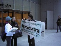 Outside a young man and woman from FrEEMoMA.org were picketing against the high cost of museum admission, now $20.
Well, it does seem high; and membership is also high, at $75 for a single person for a year, $120 dual, and $150 for a family. Clearly, if you don’t have a family, get a friend to go in on a dual (it doesn’t explain what they mean by dual, so I figure that should work; who’s to say you and your buddy are not dual?). So I figure, if you get a dual membership and each of you uses it only 10 times during the year, you are paying only $6 per visit–less than a movie. However 10 is a lot of visits. Three is more like it. No bargains here, unless you’ve got a really large family and they all go to the museum on a regular basis. Is this what they mean by family values?
My favorite line in the freemoma.org screed, which they handed out to anyone who would grab one, was “New Yorkers of middle-class means, families, artists, even students will no longer be able to afford to spend a Saturday afternoon with Van Gogh’s “Starry Night” or Picasso’s “Les Demoiselles d’Avignon.”
The good news is they can go on free Friday nights instead, courtesy of Target, Target, Target, Target. (The corporate sponsorship plugs rained down upon all the journalists listening to MoMA jefe Lowry and anyone who opened their 1″ thick press packet.)
Perhaps MoMA needs a hardship admission rate. On the other hand, I wonder if the protesters balk at spending $10 on a movie. In light of that, $20 for a day of swell art seems like quite the bargain.
Here are two discussions of the $20 rate worth reading:
Tyler Green at Modern Art Notes
Greg Allen at greg.org
Additional links are at both those sites.


