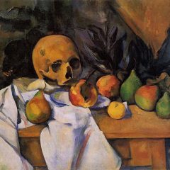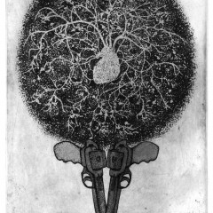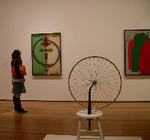
Not to blog on and on about it but Libby and I both loved the interesting way the art has been gathered together sometimes highlighting motifs and other times pushing themes. With its expanded floor space, the galleries are now larger and the groupings can be made broader. And it’s a great exercise to consider the works in the new contexts they’ve been given. (top image is Duchamp‘s bicycle wheel and Picabia‘s “M’Amenez-y (Take me there)”
For example, Malevich’s suprematist paintings sit in a room with work by Duchamp and Picabia; Kandinsky paintings are paired with the decorative Gustav Klimt; one of Jacob Lawrence’s “Migration Series” groupings hangs with German expressionists Otto Dix and Max Beckmann and with the Mexican muralists. And itall makes sense historically and thematically.
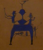
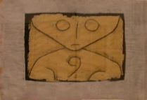
In the Drawings Department, work by self-taught artist Bill Traylor is right out there near drawings by Picasso, Andre Masson and Paul Klee. (image above is Klee’s “Little Ghost”and right is Traylor’s “Figures on Blue Construction.”)
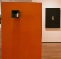
Donald Judd, whose works look super and are seemingly everywhere, is paired in one room with Sol Lewitt (left) in a kind of Halloween twosome — that’s Judd‘s black “Relief” on the wall, a death-imbued piece that makes me want to reconsider his stacks as coffins; and a perky, peek-a-boo orange Lewitt “Floor Acquisition,” 1963, that’s a new acquisition.

The contemporary galleries have been stripped of some walls which gives them an almost scary emptiness. This also allows massive things like Rachel Whiteread‘s “Untitled (Room)” 1993, a plaster casting of an entire room, (right) to float free and light as a bubble. Paired here with Doris Salcedo‘s untitled concrete-filled dresser (far right) and an infinite floor stack of posters, “Death by Gun” by Felix Gonzales-Torres (floor in the middle) the room is almost empty of color and imbued with a downer of an ambiance. It’s the ’90s room and it’s hard. Not only are Whiteread’s and Salcedo’s coffin-like works a reminder of the big D but a black and white medical-torture object from Matthew Barney’s Cremaster sits nearby. (not pictured). And although I loved it, the Jeff Wall “After the Invisible Man” (not shown) a work that envisions the narrator in his lightbulb-filled basement room, is — for all its lightbulby — stunningly dark.
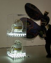
In fact, the contemporary galleries, which hold only a smidgen of the collection according to the press material, will be changed every nine months. I can’t wait. Because except for the Jeff Koons “New Shelton Wet/Dry Doubledecker (1981)” (left) which, after seeing all the Judd stacks and boxes makes me consider it a kind of funny Judd-critique, there aren’t a lot of high points. The whole contemporary painting and sculpture area was big and low energy.
But the pairing of Koons with the nearby Elizabeth Murray relief painting “Dis Pair,” (behind the Koons) is fun and smart and I have to assume the next round of works shown will weigh in with themes other than deathly death.


